Do you really need an author website? YES. THE END.
OK, Let me tell you WHY you need one, what it should contain, and how to make the most of it.
I’ll also outline some trends and ideas to help future-proof your site and we’ll look at how you can make your website sell more books.
![]() OWN IT!
OWN IT!
Your rules, your house.
You need a home on the internet. Somewhere for people to find you, to get in touch, and to get to know you. It’s your hub to create relationships and trust with your reader, a place where you control the design, and the content 100% – This is arguably the only place where this is true. Everywhere else, you must “conform” to the platform. Not the case with your own website. This is YOUR platform.
BE FOUND!
Have a home.
– In many cases readers recommend AUTHORS to their friends.
– Book titles are often more difficult to recall.
– I’ve read every Lee Child book, and every Harlan Coben book, but I would be hard pushed to remember more than a title or two for each.
– Therefore, having somewhere on the internet people can find you is critical for when that reader googles YOUR name.
Readers DO look for you. So be there.
TROPES AND GREAT EXPECTATIONS
It’s not for you, it’s for your readers.
In the same way that a brilliant cover will sell a book, so will a great website Your website should not be for you, but entirely targeted towards your readers.
In the same way you would do your due diligence on what others in your genre are doing on their book covers, do the same for your website. See how others communicate their themes and styles on their website. (Assuming they do!).
It is critical that YOUR website should instantly tell them about you, and what to expect from your books.
Your brand should be clear. Be that author who has a “through line” with their branding. A chosen font for their name, a certain palette of colours etc. And your website is the home for this.
Great article here, taking this point even further – How to Brand Your Author Website for Maximum Impact.
IT’S ALIVE!
There is really no point in creating a website that is not much more than a static photo. Your website needs to live and breathe. It needs to have some sense of intrigue and interest. Crucially, it must draw people in to read and digest the content, sign up to your mailing list and buy books!
THE FUTURE
In the future, our online experience is going to be more and more about engaging content. To gauge the future of web design, we should look at players like Apple, who spend millions on working out how to get people to purchase their products via a website and the most effective way to do this.
Look at the link for Apple Airpods and tell me it’s not an incredible experience! It literally draws you in… and I’m not saying it’s going to make you buy a set of headphones, but let me just turn down my AirPods for a minute 😉 View Apple Airpods site
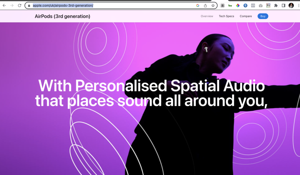
This is page is ALIVE. It ‘breathes’, it has emotion and intrigue. It also screams Apple and is clear who it is, and what it is.
I encourage you to consider using animation and movement on your site.
- Use movement and see how much more interesting the site becomes.
- If books fade in and out, or text slides in from the side, it keeps a user’s attention, it will draw them in to see what happens next.
Just a word of warning–sometimes less is more. You don’t want a website looking like a 1990s PowerPoint presentation!
DIRECT THE EYE
Use energy and movement – Draw people to read something, or notice something by making it move, or appear in some interesting way. It is amazing how you can use the architecture of your site to direct people to look at certain things.
VIDEO, OH!
I nearly always insist on using video for a website background–This instantly brings the whole experience of your website to life.
For example, crime books set on a video background of moody skies, or self-help book with a video of the sun rising, and so on. This will instantly give an atmosphere to your site.
Use a video that reflects the heart of your books, the feel, the emotion, and the overriding SENSE.
(Note* it does not have to feature elements from the book)
Some examples of sites with backgrounds that add to the experience.
https://www.ann-louisegrahambooks.com/
https://www.expressionsofnisha.com/
Video, animation and movement are so important and Book Brush has so many tools to help you introduce video to your content, not just your website–Look here for tips on adding animation to your ads
But don’t stop at ads, think about using video for book trailers, and critically YOUR WEBSITE.
Here is a great article from Book Brush around using video for other content
YOUR WEBSITE • THE MUST HAVES
- Author Bio.
- Author Photos.
- Links to buy.
- Book covers.
- Social Media accounts.
- Newsletter – Sign up forms.
AUTHOR BIO AND PHOTOS
How many photos? Whatever you are comfortable with. You can have a gallery of your life, experiences, and anything else that you want to share, or just one.
LINKS TO BUY
These are critical. You WANT people to buy your books, so your website needs to make it easy for them. So, for example, the most likely layout to encourage purchasing is making sure you include the following:
- Book cover.
- Blurb (book description).
- Buy now button.
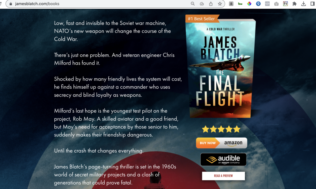
BOOK COVERS
THE most important thing for any author is great book covers.
Your website design should echo your themes, branding, and design – and in some cases can even USE the book cover as a background for your site. By using a parallax effect as well, this can create a wonderful sense of the book floating on itself. Here is an example: https://www.jamesblatch.com/
Here is a “how to” video from Book Brush about How to Create 3D Covers.
WHAT KIND OF BOOK COVER SHOULD YOU USE?
I use “Instant mock-ups 2.0” on Book Brush every day when creating websites. I select “3D” versions of the book cover AND add the cover to various community templates or mockups to see what it looks like in different environments.
This often helps me to work out a style or theme for the website.
See this Book Brush Blog post for loads of Tips and Ideas Around Using Book Designs
WHY USE 3D MOCK UPS ON YOUR SITE?
If you can show your books in the “real world” people subconsciously start to “see it” as a ‘thing’, an actual product and can start to imagine that it could belong to them.
ALSO… Depending on the angle of the 3D mock up, it can also direct the eye ‘into’ the site.
![]() SOCIAL MEDIA
SOCIAL MEDIA
It goes without saying really that you should link out to your social media, not least as it gives readers another easy way to connect with you.
NEWSLETTER SIGN UP
The other thing you really must have, is a way for your readers to sign up to your newsletter or mailing list. This should be front and centre. Some argue that it should have no other distraction at all, so that readers are “locked” into signing up. I don’t buy into this extreme approach, but I encourage you to make it VERY clear where they can sign up, with a compelling reason why they should sign up. Even use a pop up. Although it can be annoying, a pop up encourages the user to sign up, and it gets their attention.
THE COULD HAVES
- A Blog
- A list of your books in order
- A “talking heads” video of you saying, “Hello and introducing yourself.”
- Some questions/free PDF for book clubs
- Behind the scenes stuff
- Quizzes
- Covers that have been made so that kids can colour them in
- Character profiles/ Character Q&A’s
- Links to any podcasts or media where you have been featured.
- Reviews
HELP ME PLEASE?
One great tip for creating a website is to ask your friends and family to look and give you feedback on your site. Sit with people as they look through your site. Watch what they click on, watch the way they navigate and move around. Do all the links work? Watch people sign up to your mailing list so you can see the flow from someone else’s point of view.
And FINALLY…HOW TO GET MORE TRAFFIC TO YOUR SITE.
MAKE NOISE!
No one visits the website that no-one has ever heard of. If you don’t shout in a noisy room you won’t be heard, and the internet is a very noisy room.
One great bit of advice I can give you is that you must behave like a publisher would for you. They would not be ‘shy or scared’ of posting links to your book or website, because they want to sell copies. Think like a publisher trying to sell books!
YOU MUST shout about your website. Here are places where you should put your website address.
- Front AND back matter of your books.
- Email signatures.
- Social media in Bio–this is critical.
- Social media banners/headers – Have your website address clearly on your Facebook cover picture and twitter header etc.
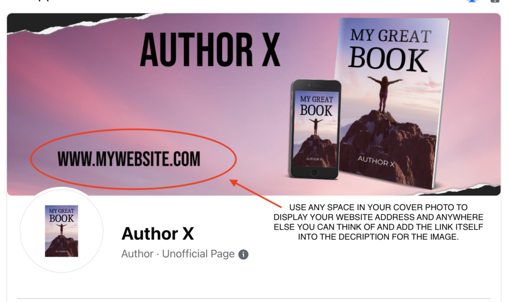
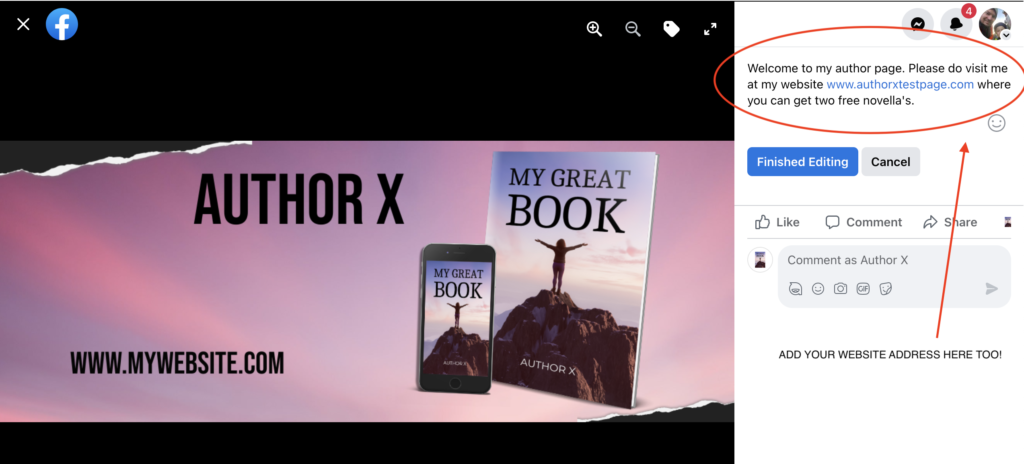
- Do social media posts, on your chosen platforms, and try to include your website in the content.
- Use QR codes to help people find your site. Put them on anything you can think of! Here is an article from Book Brush all about QR codes and how to direct to your site. Don’t forget, you can create your QR code right in Book Brush!
A great author site will help sell books. Work on the design, think like a reader and make sure it makes sense to someone that is not you. Good luck!
 Article by Stuart Grant
Stuart Grant is currently the No1, highest rated Web designer on Reedsy.com. Having created over 160 author sites Stu has amassed a great deal of experience with author sites. He has worked in the publishing industry for the last eight years working with Mark Dawson and James Blatch as part of the behind-the-scenes team that brings the Self Publishing Show to life every week.
If you want to get in touch, with Stuart Grant, either find him on Reedsy or visit Digital Authors Toolkit for a quote for your new site, or to ask any questions!