Have you ever walked by a shop window with a display so gorgeous, unique, or curious that you just had to step inside? In the space of a single glance, the shop proved it knew your taste and piqued your curiosity. With just a few feet of real estate, it convinced you that today you were going to have an experience you’d remember for a long time to come.
This is the power of a strong brand, and it’s entirely in your power to cast a similar spell with your author website. All it takes is a thimble-full of know-how, a dash of reflection, and the grease of a human elbow.
Read on, because in the following few pages, I’ll help you define your author brand and provide you with the secret to expressing that brand through every fiber of your author website.
An Author Brand Makes a Promise
When it comes down to it, a brand is just a bundle of expectations shared by the majority of people who know about it. Most people expect Marvel movies to have six to eight action sequences and a happy ending. Most people expect Apple products to be sleek and intuitive. Most people expect the Dollar Tree to be cheap and, well, cheap.
The question is:
What do most readers expect from your work?
When first asked, many authors go for the generic. “Readers expect sweet romance with a happily-ever-after.” “Readers expect urban fantasy with faeries.” “I write Witch Cozies. What else do they need to know?”
But this is like Microsoft saying, “We make computers.” Or Nike saying, “Shoes. Duh!” These generic statements merely describe your market, not your brand.
True, a strong brand is grounded in a specific market, but the brand must also explain what you bring to the table that’s unique to that market. For instance, “Readers expect megachurch romance with relentlessly quirky humor.” “Readers expect military urban fantasy set in exotic, sometimes otherworldly, locales.” “Readers expect Chicago-based Witch Cozies about martini-sipping gal-pals.”
Upon hearing how specific an author brand should be, many authors worry they’ll exclude too many potential readers. But nothing could be further from the truth. Just think about how many millions of people watched Game of Thrones even though they’d never read a fantasy novel in their lives! The same goes for Harry Potter, Dexter, True Blood, Spiderman, and every other major story universe out there.
When it comes to your author brand, you want to be exclusive. When people walk by your shop, some will be enticed by how familiar you are—how much you get them. But others will be compelled by curiosity, at how fresh and potent your window display is.
So by all means, get specific about your author brand now, before you think about applying it to your website. Because if you know your North Star up front, every single decision regarding your website will come easy.
Take a few moments. Jot down your answer:
What do most readers expect from your work?
With that answer in hand, let’s explore exactly how you can apply it to your website, so that more people feel compelled to explore, and of course, to buy!
Brand Elements of an Author Website
It’s worth remembering that much like any store, a website is primarily about the content. So when diving into the stylistic choices below, above all else, never sacrifice your website’s clarity, organization, or readability. No matter what your individual author brand is, in order to build a career, you must be perceived as professional.
Beyond this single caveat, your chief aim will be to express your author brand through every pixel of your site. This means word-choice, of course, but it largely means color, font, iconography, imagery, and stylistic flourishes. Google manages to sum up their entire brand in a single, colorful “G.” Twitter does so with a sky-blue bird. With a well-defined brand behind it, you can have just as much success in your design elements.
With this in mind, let’s break down the key elements of web design, and how you can use them to make your brand sing…
Author Brand via Color
The crux of every brand palette is a single brand color, with which every other color harmonizes. For an author, your brand color is whichever feels nearest to how your books make readers feel. Sky blue? Crimson red? Sea green? Amethyst? Brushed gold? Neon pink?
Picking Colors for Your Author Brand
Whatever the color is, it should be flexible enough for you to make use of it in a lot of places. Colors that are too close to white or black or colors that are too desaturated will often fail this test because in printed materials, they lose a lot of their character. This isn’t to say every brand color must be bright and bold, but merely that there’s a limit on how close to the edges of the color spectrum you can travel.
Beyond that, here are some additional values to keep in mind:
- Symbolic: Colors are powerful symbols because they trigger emotions. Understand what psychological strings you’re pulling with your brand color beforehand, so you can guarantee the mental connection it brings ties directly with the content of your books.
- Striking: Consider your palette a visual extension of your writing personality. Just as you would never write bland books, you should never settle for a drab color that tells visitors nothing about the highest peaks and darkest valleys of your work.
- Evocative of Your Genre: Your brand color signals to readers that your writing will match their sensibilities at a glance. Use it to claim your spot on the correct bookshelf.
- Unique within Your Genre: Though you should remain within your genre’s color conventions, you must not get lost in the crowd. If everyone in your genre is doing neon green, try going for neon pink. There are 1,001 ways you can catch a reader’s eye. Try one.
Using Your Brand Color on Your Author Website
Remember your visitors are on your site to explore your content. The wrong palette can very easily make your whole site migraine-inducing. Or just plain boring. Much like you never want to give your readers a reason to put down your book, you never want to give them a reason to leave your website!
When applying your brand color to your website, be smart about your choices. Use your brand color sparingly, and lean on matching colors for the rest.
Here are some things to keep in mind:
- Keep text readable: Always put very dark text on a very light background and vice versa. While you may have sharp eyes, an awesome monitor, and good lighting in your computer room, many readers don’t.
- Accent with bold colors: Let your brand color (and matching accent colors) take center stage where it matters. Highlight your author name, your logo, call-to-action buttons, and link text. Using your brand color this way will direct readers attention to what matters most, while still allowing them to explore your content unmolested.
- Be conservative in your palette: Too many colors dilute a brand. If your brand is everything, it’s also nothing. Use a maximum of three strong colors, with a shade of white and black that matches your palette. Any more than that, and I can tell you exactly what your brand will be: a hot mess.
- Use conventional color harmonies: The human eye hasn’t evolved for hundreds of thousands of years. Don’t try to reinvent color theory. Use an online palette generator like Adobe Color, Paletton, or SiteArcade’s Smart Themer to ensure your color choices are battle-tested, even if graphic design has never been your strong suit.
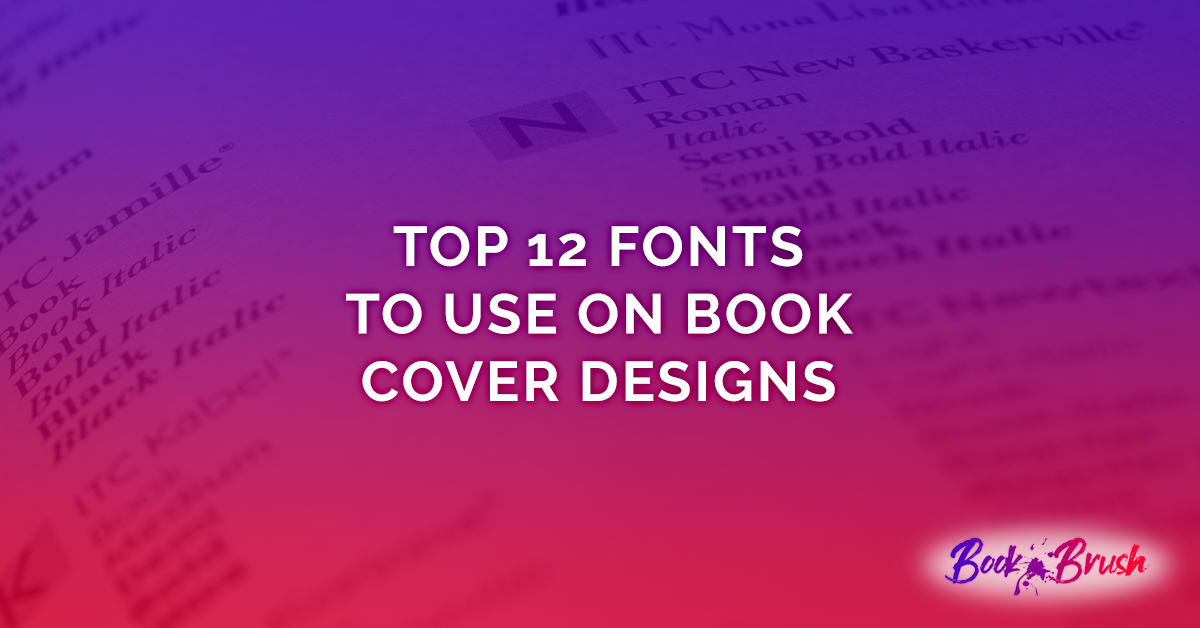
Author Brand via Font Choice
Your font choice is unique among brand assets, because you can use it in every single place your brand appears. It doesn’t matter if it’s a book cover or a black-and-white press release, your font can still speak volumes on your behalf.
A great font choice can speak for your brand even when the text in question isn’t your author name. Apple famously used this strategy with its “think different” campaign, which often didn’t include their trademark macintosh anywhere. As your career evolves, this can be a fantastic way to announce releases to your fans, making them feel like insiders in a private communication.
Picking Fonts for Your Author Brand
As with your brand color, the first rule of brand fonts is to do no harm. Yes, you want to select a potent brand font for your author name that says everything a reader needs to know about you, but at the same time, any other fonts you use must be clear and professional even as they speak to your brand. And just like your color palette, your font choices need to match one another!
Here are some additional thoughts to keep in mind when selecting your brand fonts:
- Readability: For your core brand font, all that really matters is that it’s easy to read your author name. But you can’t use your logo font for everything! So you’ll also need to find one or two fonts you can lean on for the headings and body text of your site (as well as for your business cards, promotional materials, and so on). These fonts should be exceedingly easy to read on screens and in print.
- Right tool, right job: Decorative fonts can be fantastic for your logo or signature, but would be unbearable in a full paragraph. A clean sans serif font will make your text sharp, but might lack the personality to make a statement in your logo.
- Size matters: When building a website, no text should be smaller than 16px, though 20px is even better. That might look gigantic when compared to a book, but believe me, anything smaller will make your visitors squint. So test your top font choices in different sizes before committing.
- Sweat the small stuff: Even conventional fonts can say a lot about your brand. Is a particular font smooth or jagged? Airy or dense? Loose or controlled? These details speak to the subconscious mind, even if readers don’t consciously realize it.
- Matchy, matchy: Don’t test your fonts in isolation. Make sure they work well together. Do you fonts feel like they’d be best friends or bitter rivals? If the latter, keep exploring. Google Fonts and Font Squirrel both have a huge selection of free fonts. Find the right match now, and save yourself a lot of headaches later.
Using Your Brand Font on Your Author Website
In some sense, once you have the right fonts, it’s easy to apply them to your website. Just use ‘em! Here’s a few thoughts to keep in mind as you apply your brand fonts to the your sites three textual elements:
- Logo: Every author’s logo is going to feature their pen name in their chosen font. And since it’s really just a name, you’ve got permission to go a little crazy. But since your logo can appear small (like in the top-left corner of your site) or large (like on the cover of your book), you need to make sure your pen name is clearly readable at any size.
- Headings: Since you only have a few headings on any given page, and since they tend to be pretty big, you’ve got some leeway when it comes to designing them. Try varying the weight (e.g. thin, light, bold, heavy) and style (e.g. italics, letter-spacing) to give an otherwise conventional font a bit of oomph. Doing so not only increases interest, but it’ll make your site easier to scan.
- Body text: The main content of your site should be the most readable of all. Whether you decide a serif or sans-serif is right for your brand, make sure you select a font that includes italics and bold variations. Not all do, and you’ll want to get the maximum mileage out of this font.
When looking for fonts, it’s all too easy to delude yourself into thinking a particular choice is a good one. After all, you know what the sample text says already, so you’ll see all fonts as more clear than they really are. When you have a set you think you’re happy with, get some feedback from people you trust. If you hear any red flags in their response, go back to the drawing board.
Author Brand via Logo and Favicon
Most authors don’t actively design a logo, but everyone’s got one. It’s your pen name in your brand font, oftentimes featuring your brand color. Even if this is the only logo you’ve got, it’s worth formalizing it by creating some PNG files of varying sizes for use across your website and promotional materials. (Book Brush can help with this!)
All that said, it really is worth taking your logo to the next level by introducing a graphical element. If a picture is worth a thousand words, an icon is worth ten thousand, because the more archetypal an image, the more potent an impact it has on the psyche.
Picking A Logo Image for Your Author Brand
The hardest part about designing a graphic logo is accounting for all of the places that logo will be used. If you plan on attending conventions, your logo could be the size of a banner—and it’s got to look good. But it’s also got to look when you squeeze it inside a browser tab on your desktop or mobile device. We’re talking about an area that’s only 16 pixels wide and 16 pixels tall.
If you can’t use your logo image in both of these contexts, you haven’t picked the right one. After all, the point of designing brand assets is so that your brand can be recognized by them. If you’re using different graphics in one context and another, what you’re telling readers is that there’s no continuity in the experience you deliver. That’s a big red flag when it comes to whether or not a reader will entrust you with eight to ten hours of their time!
So with that in mind, here’s a few guidelines for selecting a logo graphic:
- Keep it simple: Since your logo has got to look good as a favicon in your browser tab, you want to select an image that you can clearly discern, even at that size. This simplicity will also come in handy when you reach a point in your career where you want to print merch, such as bookmarks, keychains, pens, T-shirts, and so on. Intricate, textured graphics will fail to reproduce nicely in many formats.
- Use your colors: Your brand color should feature prominently in your logo. Think of the Facebook “F,” the Target target, or the Nintendo Switch “switch.” That said, for the right icon you can consider adding an additional color to boost the first. Pepsi and Shell Gas are both good examples of this strategy.
- Speak with words: With graphic logos, avoid picking an icon simply because you like it. Remember that this icon should be able to speak for your brand lacking any other context. Does this icon evoke the feeling of your brand? Does it represent your genre accurately? Dig until you find the right match.
Using Your Brand Logo on Your Author Website
Much like with your font selection, using your logo within your site becomes a breeze. First and foremost, you’ll want to make sure your author name is well branded wherever it appears, using your brand font and brand color. But you’ll also want to place your graphic logo in a few key places:
- Browser tab: In the context of a browser tab, your logo is called a favicon. Most platforms make it easy to update this graphic.
- Navigation bar: In the top-left corner of your site, you’ll want to either include your logo image or your headshot. In this context, I generally lean toward your avatar, but either will work well.
- Page footer: Every webpage has a footer area to summarize the visitor’s experience and recirculate them around the site. This is a great place to include your logo as a final dash of branding.
- About you: It’s a good idea to create a strong mental link between your author persona and your brand icon. Try to include it discreetly wherever you discuss yourself on the site.
- Press kit: Certainly, you want to lead your press kits with a strong brand, including your logo up front. But a good press kit will also include all of an author’s brand assets somewhere near the end. This way, the media has an easy time putting together coverage of your brand, whether a book review, interview, or event promo. Include your logo in multiple formats and sizes so the journalist or blogger in question doesn’t need to bend over backwards to cover you.
Author Brand via Stylistic Choices
While color, font, and logo are the building blocks of your brand, there are many other stylistic elements you might leverage in making your site utterly enticing to visitors. Consider the following page elements when thinking about adding a bit of flare…
Textures, Images, and Backgrounds
The vast majority of your website’s image assets are going to be book covers, or variations therein. And this should be by design. If you flood your site with JPEGs, the covers themselves will seem far less familiar when a reader pops over to Amazon to click “BUY.” So you want to be conservative with how much visual material you inundate them with.
To this end, we recommend using an image editor to reuse your covers as much as you can when building your site. Assuming you’ve taken the same trouble to brand your covers as you have your website, this double-use will pay off in spades.
Beyond your cover images, you might also try playing with very, very delicate textures and subtle backgrounds. So long as they strengthen your brand without distracting readers from the content, you’ll be tapping a very powerful source of design magic. But if your background images are more interesting than what’s in front of them, cut them. No way do you want the backup vocals outshining the lead singer!
Buttons and Links
Buttons are a tricky element to brand because they have to look, well, like buttons! If they don’t look imminently clickable, visitors will not click them. The prominent WordPress book plugins make this very mistake. Rather than including buy buttons, they merely show book retailer logos. That bad decision is costing lots of authors lots of sales!
Links should also look clickable. By convention, this means using an underline and a bold text color. I would stick to this convention if I were you, but in all honesty, you do have some leeway in this area.
Here’s some advice for designing clickable site elements:
- Set them apart with an accent color. Either your brand color, or a matching accent.
- Tweak the styles: Sharp corners feel different than rounded corners. Dotted underlines feel different than solid underlines. Which design fits your brand better? How does a drop shadow feel? How does a text highlight feel? Do they feel like your books feel?
The World is Your Website
Now that you’ve taken the time to make your author website sing, start thinking about how you can bridge the gap between the potent experience your website offers, and the many, many social platforms you market to.
Your goal here is to make your brand utterly consistent. So that whether readers encounter you on Amazon, Twitter, TikTok, or your website, they have the same experience of your brand. After all, if your Facebook page is branded differently from your website, the reader will feel like they’ve been misled when they click a link from one to the other.
Here’s some tips for making the transition smooth:
- Use the same colors, fonts, graphics, and styles. Yes, by all means vary your social banners and ads based on your current marketing strategies! Just make sure they all still feel like your brand. Book Brush makes it super easy to design these images with your own custom flare, so you have no excuse to botch this step!
- Only one headshot. No matter where a reader encounters you, they should know it’s you. So use the same headshot as your avatar on every single platform. Throw the rest of those fabulously photos in a gallery on your “About the Author” page.
- Only one bio. The same rules apply to your bio. Write it once, then crop it to fit the space provided on each platform. Save each size in a swap file so you can easily copy and paste it again the next time you need it.
A Final Word
I know, I know, you’ve got a lot to go do! Let my final word of advice be this:
Your brand is a creative project, and it can be as fun as writing books. There may be a few rules to the game of branding, but not more than there is to plotting a good mystery. So give your creative brain over to the task, and do your best work. The time you spend crafting a strong brand will multiply the effectiveness of everything you put your hand to, whether your website, your ads, or your book covers and blurbs.
If you have any questions, feel free to contact us. Web design is our jam, and we want to help every author build a fantastic, rewarding career.
After all, we built SiteArcade from the ground up for authors. Not only do we offer an awesome palette generator, logo generator, and font picker, but our websites stay up to date with your career. Every time you publish a new book or run a promotion on Amazon, your website automatically updates, promoting the right book at the right time—all the time. If you need a new author website, by all means, try our free demo!
Now go build that brand!
 Article by Michael Continues
 Article by Michael Continues
Michael Continues founded SiteArcade to help authors spend less time marketing, and more of their time writing. As a writer himself, he advocates free speech, free culture, and free ice cream. He’s a practicing Stoic and avid futurist. Read his thoughts on publishing SiteArcade’s weekly newsletter.