There are two amazing products in Book Brush that can help you design quickly, almost instantly 😊
Instant Mockups and Community Templates. These tools set Book Brush apart from other graphic programs clearly demonstrating Book Brush’s focus on author’s needs.
I’m going to show you some fantastic tips to make these tools even more flexible for you.
INSTANT MOCKUPS
Instant Mockups are one of the flagship tools in Book Brush’s amazing arsenal, but did you know that are so many things you can add to and create with using IMs as the core to build around? Well, you will by the end of this blog. And I’m sure you’ll come up with a gazillion more ideas.
Where are Instant Mockups?
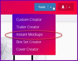
Head to Tools in the menu bar, then hit the down arrow and click on Instant Mockups.
Quick refresher on how to use:
Once you’re in Instant Mockups, it’s a simple 4 step process to create them.
- Pick your book cover
- Pick your size and keywords to filter
- Select the mockup(s) you want to use (1123 to choose from)
- Free and Plus Plan users will see Filter Keyword: Free to access images & try out the tool
- Gold Plan users have access to 900+ images
- Platinum Plan users also have access to exclusive Instant Mockups (marked with a Star) an additional 230
- And we add more every month
- Convert now
If you have chosen only one IM (Instant Mockup) it’s downloaded by itself, which is great for mobile devices as you can immediately place it into social media. If you have chosen multiple Instant Mockups, they are downloaded as a zip file.
- Find a place on your computer that you know you’ll find again, download, unzip and then you can use them as-is which is fantastically fast.
OR use my favorite way and make a composite of them using the CUSTOM CREATOR tool.
I’m going to show you step-by-step how to do this.
Idea #1: Use a partial Instant Mockup
If you read my post about SEO importance, you’ll know that changing up your media and keeping it fresh is important. I have a new release and need to get the info everywhere. What better tool than Instant Mockups to help me create these fast?
This is the criteria I used to create my IM below,
- Step 1 Cover Picked: Brushed By Betrayal
- Step 2 Size: Horizontal because I want room to add to it or move it the IM to the side
- Keyword for sort: Mystery
- Step 3: Selected my IMs
- Step 4: Downloaded to my computer
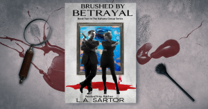
This is the Instant Mockup I downloaded using the above criteria.
Then I popped over to Custom Creator for more magic.
- I picked FB header size.
- Then I uploaded my Instant Mockup image from my computer.
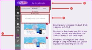
How to upload your own images:
- Then I added a background I liked to the workspace, a gray paper keeping with the theme of the cover
- I clicked on images that I’d already brought by using step 2 in infographic above
- Found my IM in the list of MY IMAGES and clicked on it to bring it into the workspace
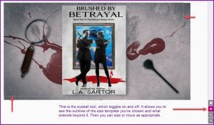
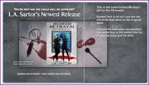
Here is my background with my image enlarged and moved to the right side. I used the eyeball tool to place my IM (more below on the amazing eyeball tool).
How to use the eyeball tool:
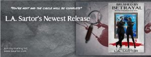
I added my text, and I was mostly done.
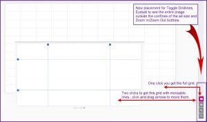
Since this was created for my FaceBook profile and the headshot is now in the center, I opened the gridlines (see the how-to below) to make sure I had nothing in the way that would be covered by it. It was fine, so I saved the project in my templates (always a best practice, just in case I want to change it to convert to another size, which I do), and then I downloaded it.
How to use the gridlines:
Idea #2: Adding To Your Instant Mockups
Did know that you can add other covers to your original IMs? No? Well, you can. It’s a huge benefit and I do this all the time. The tip is to find a rectangle shape with the cover more toward one side or the other.
Here are some blank examples I made to show you what I mean:
Here is a completed IM meme using another example.
I added my second book, choosing a similar look from our 3D templates in Custom Creator.
And last, I added texted and the Amazon retailer stamp. Super fast.
Idea #3: Add Your Instant Mockup To A Video Background
This is about using a video background for your IM instead of a static image.
First make your IMs. I filtered for Summer found these which screamed summer (there were more, but I had to stop someplace 😊 )
I brought them into Book Brush, using the steps in the infographic above, and then started looking for background videos, filtering first for palm tree, then for beach.
Now in all honesty, I admit, this wasn’t fantastically fast, because I got hooked on looking at all the videos, then going back and looking at the various colors of the water in relationship to my chosen Instant Mockups. Too much fun being had.
I added the IM to the video, and put a deep shadow in the background to make it stand out. Since I couldn’t find the ocean in the same color, I punted and used an ocean video to give the vibe, if not the exact color.
- Added text, a stamp, and a call-to-action (join my mailing list)
- Now I can use this in Twitter!
COMMUNITY TEMPLATES
Idea #4: Treat our Community Templates like an Instant Mockup
Community Templates are available to all plans.
You can find them two ways in Custom Creator.
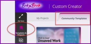
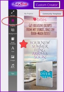
Click Templates & Projects in Custom Creator’s left column, then find the Community Templates Tab and click
OR
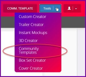
If you click on Tools to get to Custom Creator, click again and you’ll find Community Templates now in the list. Super-fast way to get to them.
Community templates (1250 of them) which are made by our in-house designer, are editable inside the template which makes them incredibly flexible. And many of them already have multiple books! And there are filters to help you search.
For the community template below, I chose Mystery for a keyword and just scrolled through them. This one is great for a series, right?
But I only have two books! No problem.
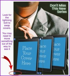
I clicked on the middle tablet, and using the trash can, I deleted it.
To add my cover, I found the lightning bolt to swap out the cover.
- Used the eyeball to make sure they were lined up
- Added a star and Amazon Retailer stamp
- Added a bit to the text.
Now, if I want, I can use this to add to a composite for a bigger social media size as I did above for my FB header, or simply use as is. Fast, simple and did exactly what I wanted. By the way, did you notice that not only does the man in my image have a suit on, so do the characters on my covers.
Tip #5 Match Fonts in Community Templates
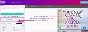
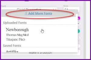
Yep, when you want to have consistency, click on the text box and find the font name, then download it to your font file. Our designer uses the same fonts you can use. Hooray. Find out more about using fonts here.
I found this Community Template by clicking on Templates and Projects. There is not a search function here, just scrolling through them. But it’s another way to look for them.
To upload a font:
To upload a font:
Click in the font box to get the blue “Add More Fonts” hyperlink.
I search by alphabet as I already know the name.
And my call-to-action (CTA) is now in the same font, but smaller.
Idea #6 Convert all your IMs and CTs to all social media sizes.
This can be done fantastically fast. I have my meme open on the workspace, (remember I said to save them in projects?) And I simply choose a new AD SIZE.
Then all I had to do was move and size content to fit in the smaller space.
Instagram:
From This …
To This….
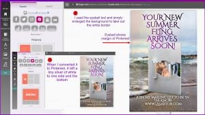
Pinterest:
From this ….
To This …
Twitter:
From this …
To this …
This was done very quickly by filling in the empty background with the color picker used on the original image, and then moving things around and sizing as necessary.
I hope these 6 Tips will help you use Instant Mockups and Community Templates in a variety of ways, expanding their amazingly easy creation to fantastically easy memes.
 Article by L.A. Sartor
I started writing as a child, really. A few things happened on the way to becoming a published author … specifically, a junior high school teacher who told me I couldn’t write because I didn’t want to study grammar.
But the muse couldn’t be denied, and eventually I wrote, a lot. I learned a litany of new things and published my first novel. My second book became a bestseller, and I’m absolutely on the right course in my life.
Please come visit me at www.lasartor.com, see my books, find my social media links, and sign up for my mailing list. I have a gift I’ve specifically created for my new email subscribers.
