Mockups, meaning an image that is already composited into a scene with room for the object you want to add, are huge timesavers.
At Book Brush, we call these various tools Instant Mockups and Community Templates. I thought it would be fun for you to see just how I selected what I did from over the 1163 (and growing) Instant Mockups in a wide variety of genres, tones and concepts.
Today I’m going to show you Historical Romance and how you can go outside what you might think is a trope design for this genre.
The basics of using an Instant Mockup in Book Brush
- Select the Instant Mockup Tool
- Bring in your covers if they aren’t in the tool already
- Selecting the shapes you want to preview (and I usually select all if I’m starting IM’s for a new book, b/c I want cover all the platforms for memes.)
- Selecting various keywords to help you sort through the vast variety
- Have fun looking at all of the IM’s (Instant Mockups)
- Download.
Since I’m highlighting Historical romances, I used Historical, Romance, Platinum, Christian, Fantasy, Urban Fantasy and City for the keywords.
Additionally, the images I’m showing are exactly as they come from Book Brush. You have the option then to bring these into the Custom Creator Tool and add text, stamps, and use as is, or add them as the major image into a larger meme.
Instant Mockup Ideas 1, 2, 3
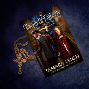
This cover has rich colors, in addition to the characters and the sword setting the time period. I wanted to play up the tone and color. A reader will immediately know it’s historical, and generally a couple on the cover shows it’s a romance.
So for these 3 choices, I looked for a royal blue color, giving the sense of richness, and red giving a sense of fight.
Created With Book Brush’s Instant Mockup Tool
In the first image, the gold in the cover is mimicked by the gold of the pendant which feels like the time period.
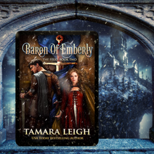
Created With Book Brush’s Instant Mockup Tool
I don’t know if the book is set at winter, but the arch immediately caught my attention and felt period correct. And brought in the blue.
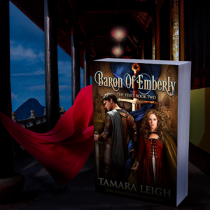
Created With Book Brush’s Instant Mockup Tool
I bet you can guess why I chose this one. The red of the fabric and the blue of the sky? Right on.
Does the mockup need to contain imagery of what the story is about? Personally, I don’t think so, as the cover does that immediately in this case. I’m going for powerful colors and images.
My takeaway is that you shouldn’t ignore an image because it may not scream out that period in history.
Instant Mockup Ideas 4 & 5
With this cover, everything on this IM (Instant Mockup) seemed to click for me, the colors, the tone and the fact that this is time travel historical.
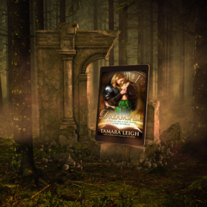
Created With Book Brush’s Instant Mockup Tool
There is plenty of room in this mockup to add any extra verbiage the author may want to tell you. But the cover tells me it’s a time travel and the characters tell me when. This image is all about ambience.
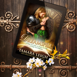
Created With Book Brush’s Instant Mockup Tool
This image jumped out at me. This one felt historical, and the colors were spot on.
My takeaway was that I could use both a fantasy/time travel mockup and an historical looking one. Additionally, I was looking for an IM that would allow for room to add either a retailer stamp or tagline about the story.
Instant Mockup Ideas 6 & 7
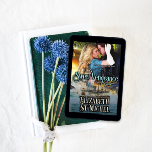
Created With Book Brush’s Instant Mockup Tool
This meme is again about color, and simplicity of the design. The cover tells you it’s an Historical Romance, and the meme reinforces the feeling of romance.
There is plenty of room of you want to add a few lines of text or retailer stamp. But because it’s so clean, I wouldn’t add much.
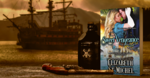
Created With Book Brush’s Instant Mockup Tool
In contrast, this image uses the idea of the sailing vessel in the cover and definitely showing it’s an historical and must have something to do with ships. There is room for light colored text and a stamp or two.
My takeaway is that you never know which meme is going to appeal to a reader, so don’t box yourself in with only one kind of image. These are completely different.
Remember Instant Mockups make your promotion life quick and easy.
Instant Mockup Ideas 8 & 9
When I saw this cover, I had no doubt this book was about the Civil War.
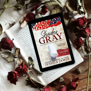
Created With Book Brush’s Instant Mockup Tool
And as I was scanning the memes this one jumped out at me. Dried flowers for so many reasons. Lost love, lost innocence … the list goes one. And this doesn’t feel like a happy meme, but it’s poignant and pulled at me. The color that drew me was not the red in the flag, but the red revealed by the torn paper.
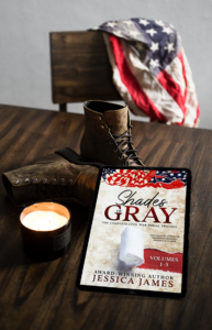
Created With Book Brush’s Instant Mockup Tool
This image speaks for itself. It could be a WW image, but it feels older and by adding a few stamps that enhance this period in time, it’s evocative and immediate. This would be great by itself, but I can see having this be central to a larger meme created for any social media.
My takeaway is not only look for an image that is spot on, but ones that pull at your heartstrings as it will pull at your readers as well. And again, don’t limit yourself for one or the other, create many and use them widely as you never know who will see what and respond with that buy click.
Don’t let a mockup that may not be perfect scare you off.
Instant Mockup Ideas 10 & 11
This cover screams turn-of-the-last-century, and the colors are rich.
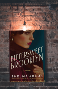
Created With Book Brush’s Instant Mockup Tool
While the light bulb may not be era correct, the feeling to me evoked the time frame and the city.
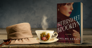
Created With Book Brush’s Instant Mockup Tool
Again, this doesn’t scream turn of the last century, it does make me want to buy the book and settle in with a cup of tea. And isn’t that what we want as authors?
My takeaway, I chose these, because while they may not be era correct, they make me want to know about the book and I can imagine myself in an earlier time or cozying up and letting the book transport me back.
Instant Mockup Ideas 12, 13 & 14
This book cover clearly states the time frame, and the colors are subtly patriotic.
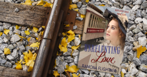
Created With Book Brush’s Instant Mockup Tool
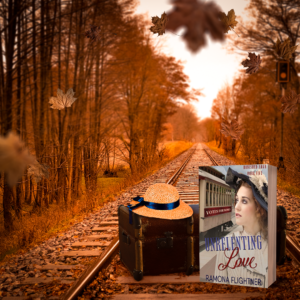
Created With Book Brush’s Instant Mockup Tool
These are two completely different train track images. Which do you like? I picked the upper image because the color in the cover is close to the color of the railbed rocks. The bottom image was chosen for the sense of a bygone era. You could add more of the color in the cover using text boxes and stamps.
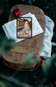
Created With Book Brush’s Instant Mockup Tool
This IM has a sense of a slower time, and the colors make me want to grab the book, a blanket and read in the park. There is room on all of them to add extras like tag lines and retailer stamps and I don’t think you need anything more than that on these to help express the story.
My takeaway, remember we want readers to feel something with the memes, not simply scream BUY, BUY, BUY.
Instant Mockup Ideas 15, 16 & 17
This is a Christian Historical Romance. Notice that the cover doesn’t denote the genre, but the costuming of the heroine says historical.
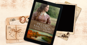
Created With Book Brush’s Instant Mockup Tool
Doesn’t this give you a sense of the past and even of dreams that may not have come to fruition … yet? I didn’t use a Christian element in this meme, I just thought the colors, images and tone were evocative of the title.
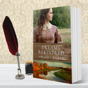
Created With Book Brush’s Instant Mockup Tool
I’ve echoed the historical period in this image as the colors and textures feel right for the period. The author could easily add a tag line mentioning the genre and story line if she wanted.
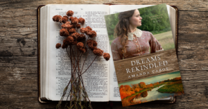
Created With Book Brush’s Instant Mockup tool.
For this meme, I specifically chose an open bible, and the colors and tone matched cover so well. Wherever this is used, the text in in the meme could explain more if the author thought it was needed.
My takeaway is that the the colors, feel and texture tell us so much in a single glance, and if needed a single line of text or scripture could enhance the meme.
Instant Mockup Ideas 18,19, 20
Historical Western Romance. The cover tells you this, even though a date isn’t listed.
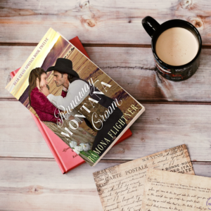
Created With Book Brush’s Instant Mockup Tool
This IM reinforces the historical aspect gently with the older postcards, which again may have nothing to do with the story, but it feels good and tells me it’s historical. The author can add a snippet to pique our curiosity and set the theme.
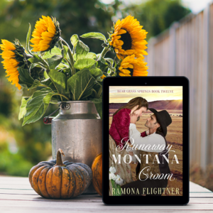
Created With Book Brush’s Instant Mockup Tool
I chose this because of its tone and color. It grabbed me right away. Rustic and feeling old time.
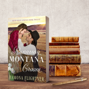
Created With Book Brush’s Instant Mockup Tool
This meme gives us the flavor of historic in the bookstack, and room at the top to add a snippet of log line text.
My takeaway is simply to use images that portray a sense of time and ambiance even if it’s not “old looking”.
Final Thoughts
I’ve created 20 Historical Romance Memes that use color, tone, texture and senses. And that’s what we want. To evoke emotion in our potential reader.
Remember, readers will react differently to the memes you create, so change them up to make sure you hit various readers’ perceptions, as well as letting them have a moment to enjoy your meme and then reward you by clicking that all important buy button.
 Article by L.A. Sartor
I started writing as a child, really. A few things happened on the way to becoming a published author … specifically, a junior high school teacher who told me I couldn’t write because I didn’t want to study grammar.
But the muse couldn’t be denied, and eventually I wrote, a lot. I learned a litany of new things and published my first novel. My second book became a bestseller, and I’m absolutely on the right course in my life.
Please come visit me at www.lasartor.com, see my books, find my social media links, and sign up for my mailing list. I have a gift I’ve specifically created for my new email subscribers.
