Book covers have the power to sell more books. It’s the first thing a reader sees before they even decide to read your blurb. To give you a leg up on grabbing that much-coveted reader attention, I’ve compiled 6 tips to help you on your own design journey!
#1: Think Like a Reader
When you’re designing your cover you need to put away your author hat and don that of a reader. Covers are meant to convey mood, emotion, and ambience more so than be an exact replica of a scene or characters from your story. We are showing rather than telling, in a way. Make your readers feel.
Designing is a lot more fun (and has better results) when you detach yourself from that idea of exactness or “accuracy” and come at it from an angle of genre and mood. Genres have conventions or reader expectations, much like tropes do. You and your readers should be able to look at your cover and immediately know what genre it is.
#2: Look Up Comp Titles
It is never a good idea to steal another book’s design, but it is smart to study the bestsellers in your chosen genre. These are called comparable titles, or comp titles for short.
- Head over to the bestseller Kindle chart on Amazon.
- Look up your genre among the ones listed on the left side.
Find the books that would be comparable to your book (same trope or subgenre, for instance). - Study the titles. What features are most common? Maybe using a serif font is what sells best in your niche. Or objects are featured rather than people. Or shades of orange are popping off in most of the covers listed. For instance, a few years ago, teen girls in gorgeous ball gowns were selling like hotcakes in Young Adult—both in historical and paranormal subgenres. Trends matter. Readers love trends.
- Take that information and let it inspire the direction of your design.
This isn’t law, of course, but it will help you get an idea of what readers in your genre are used to and resonant with. Getting the attention of readers is what you want, and being novel (pun intended) isn’t always the way to achieve that.
#3: Imagery & Color
Since your cover is the first thing to draw readers’ attention, make the imagery impactful and stunning. You want to pick images that make a statement. Think about mood, contrast, and/or how much whitespace it offers (so you have room for your text without too much of the image competing for attention).
Science fiction, thriller/horror, fantasy, and mystery tend to use images that are darker or images that create an air of intrigue or spookiness (regardless of color). Romance, Christian, and Nonfiction lean more toward the lighter side of shades (unless it is a dark romance, then it tends to be dark and moody to convey a tone of danger).
Some examples from our community templates in the Cover Creator:
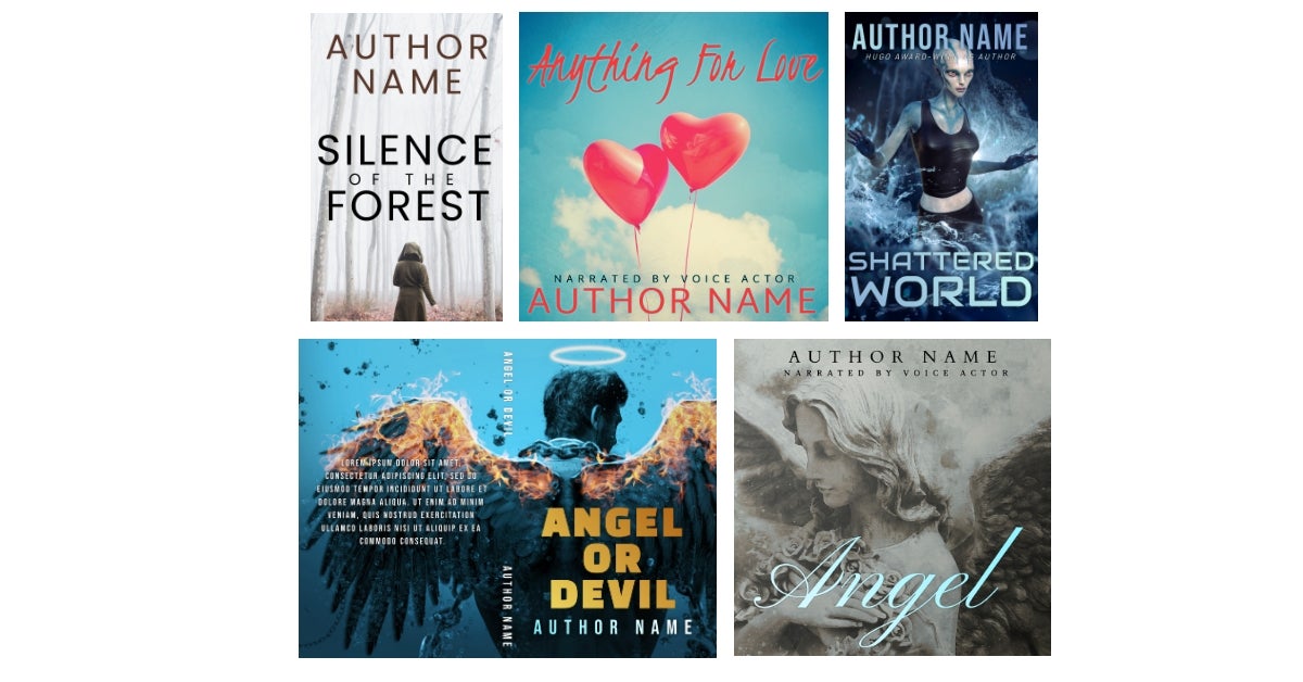
click on image to enlarge
Use colors for the text that complement the shades in the image itself. This use of a color palette creates cohesion. I always take a little color from the cover images themselves to bring into the text, even if it’s a lighter or darker version of the shade for readability. If a cover image is neutral, like black and white or sepia, I’ll sometimes use a bright color to make the title pop away from the background, but this isn’t necessary.
BONUS TIP: Use gradients to add a little more visual interest to your book title, but don’t overuse this feature or it can quickly look amateurish and garish.
You can find out a little more about color theory here and step-by-step instructions on creating a print cover here.
#4: Less Is More
Clarity is so important with cover design. Don’t clutter up your book cover with too many images, typefaces, colors, gradients, and other design elements. Say no to visual noise and create a design that is minimalist and sleek if you want it to look as professional as possible. Decide on just a couple features to use. You want the title—and preferably the author name as well—to be readable even as a thumbnail on retailers and other websites, so leave ample room for them.
BONUS TIP: Use drop shadows (sparingly!) or fade the background image a little if the text isn’t as visible as you’d like it. We want people to remember your name, so make sure they can see it! Let’s look at the following covers:
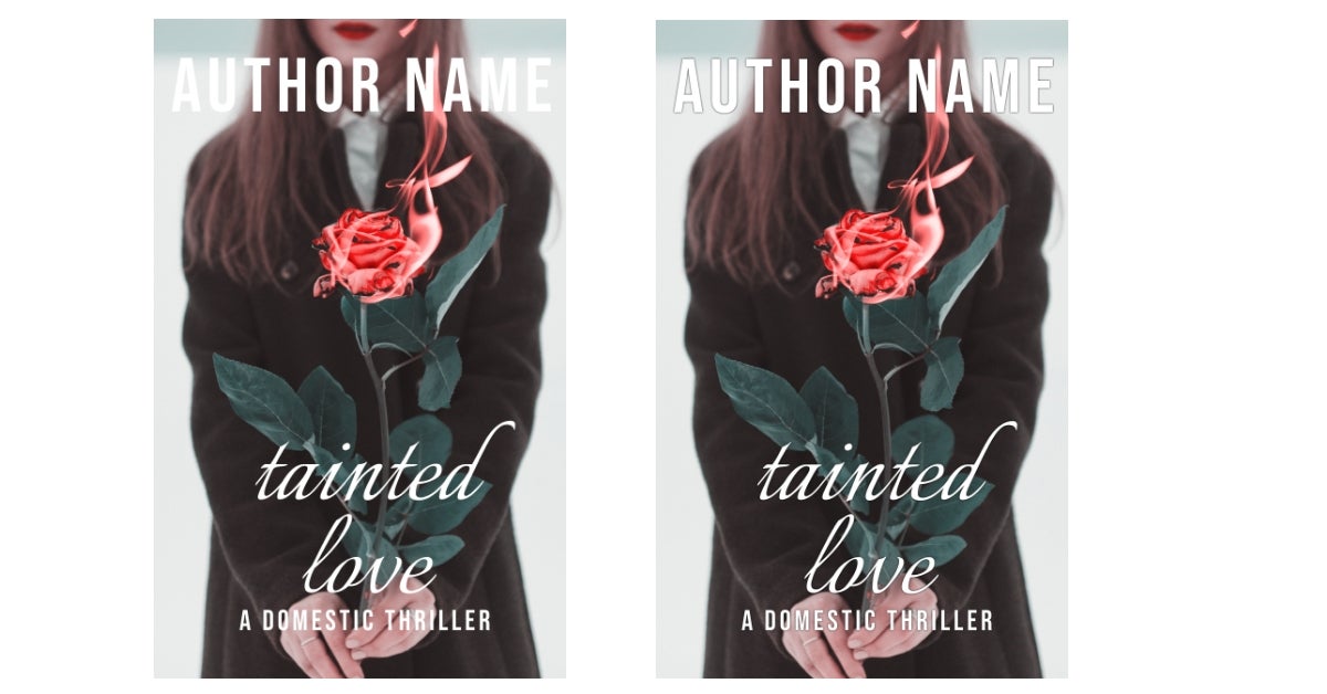
click on image to enlarge
On the left, all the text is flat and due to the nature of the cover image, this makes some bits of it difficult to read, namely the author name. Compare that to the one on the right, which has subtle shadowing added to the text.
#5. Mix Up Your Fonts
Typography can make or break your cover and is often more important than the image(s) used. Nail this skill and you’re already miles ahead of most DIY cover design.
Two fonts should be the maximum featured on a book cover. This keeps your design looking cohesive and professional. That being said, they don’t need to be in the same font style. Dress things up by mixing them!
Nice font combinations include:
- Sans serif and script
- Serif and handwritten
- Display and sans serif
- Sans serif and serif
But don’t mix a script font with a brush lettering/handwritten font or a script font with another script font, for instance. You want to keep the same mood. This mix often creates a very messy, amateur look because script, display, and handwritten fonts have very strong personalities, and you want to use only one for the best punch (preferably in the title of your book).
For ideas in combining fonts, check out Font Pair, which gives combinations of Google Fonts that complement each other very well. Book Brush is integrated with Google Fonts, so you’ll be able to find all the suggested font pairings on our site.
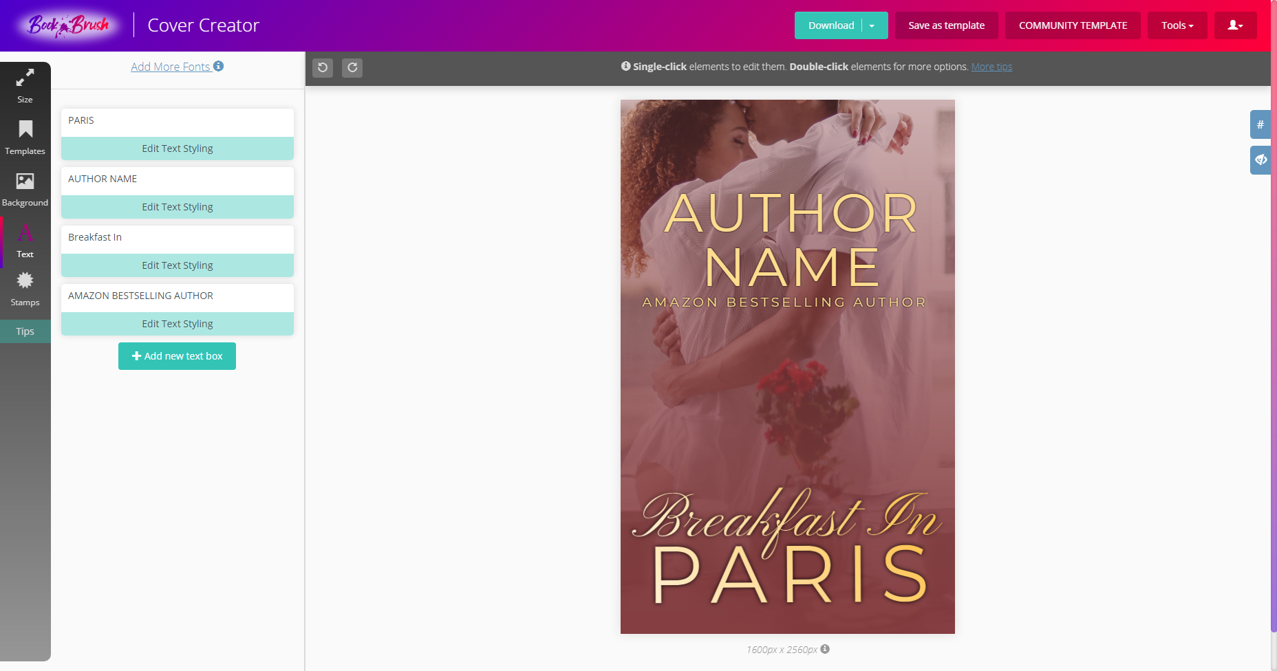
click on image to enlarge
In the above example (which is available as a template in the Cover Creator), I mixed a script font (Pinyon Script) with a sans serif font (Montserrat) to bring more dimension and interest to the cover. I also kept the same sans serif font and used it for the author name and bestseller line. This creates the overall cohesion I spoke about above, resulting in something sleek and harmonious.
- BONUS TIP: Consider sizes of your fonts as well. An author’s name that is more prominent like bestselling authors (versus small and tucked away) conveys confidence to readers. A series name or a bestselling author line (strapline) doesn’t need to be as dominant as the title and author name.
#6: Try Using Stamps
If you want to bring your cover to the next level, stamps are an excellent addition for creating designs with more of Photoshop-like feel to them—without the steep learning curve.
click on image to enlarge
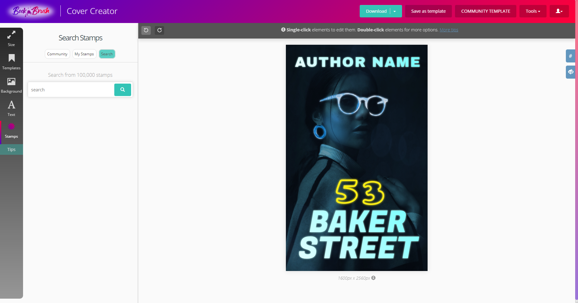
In the cover above (also available as a template!), the 5 and the 3 are actually stamps I found via the Search function in the Cover Creator (Stamps > Search). I loved how their glow complemented the model’s neon glasses and had to use them.
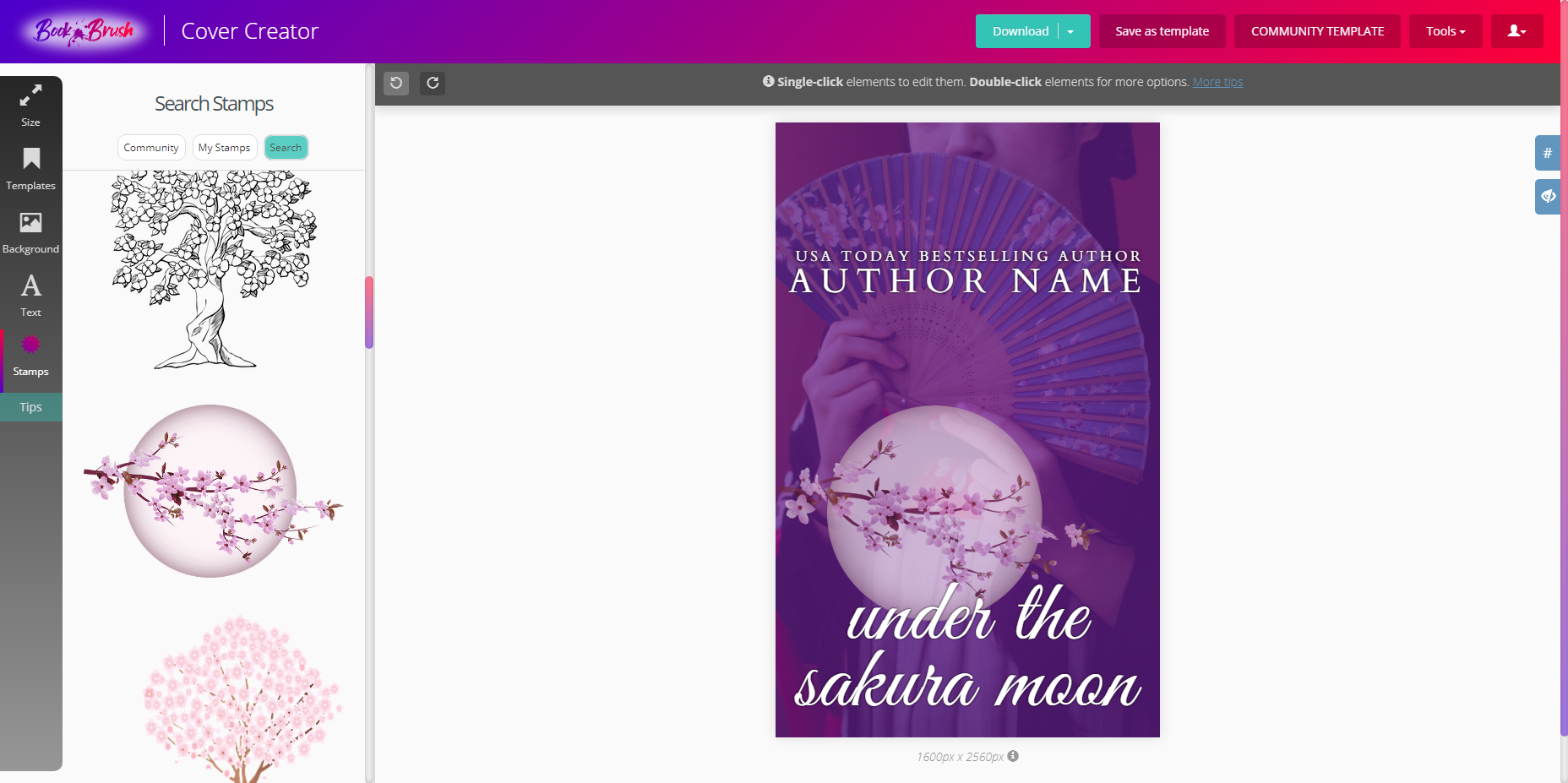
Some search terms for finding fun stamps can include: Filigree, Neon, Corner, Decor, Elements, Historical, Vintage, Grunge, and Effects. But, of course, this isn’t an exhaustive list by any means, and you should search for whatever you think might pull up what you’re after. I found the moon used on this cover below (another available template!) simply by searching for “cherry blossoms”.
click on image to enlarge
And don’t forget you can always upload your own stamps as well! To upload your own, click on Stamps > My Stamps, and then click on the dotted box (or drag a file into the box).
- BONUS TIP: Stamps work best if they have a transparent background.
Register for an account with Book Brush today, and check out our awesome collection of Cover Templates that can easily be customized for your book’s specific genre and vibe! Once your cover is complete, use our Custom Creator or Instant Mockups to create 3D images and graphics for promotional purposes ☺
![author image]() Article by Teresa Conner
Article by Teresa Conner

Teresa is a freelance cover designer and lead Graphic Designer here at Book Brush. When not creating graphics for Book Brush or book covers for indie authors and traditional publishers, Teresa can be found writing erotic romance under her pen name Torrance Sené.
You can find her social media accounts and learn more about her at https://www.wolfsparrowcovers.com/ or https://www.torrancesene.com.