Using predesigned templates can save you a huge amount of time and energy in the marketing side of your author business.
At Book Brush, we call these Instant Mockups, and I use them all the time.
For this post I’m going to show you how I used 3 criteria; the book’s title, the cover imagery and colors in choosing templates for three vastly differing books.
Using The Title
I wouldn’t do much except add a retailer “stamp”.
My takeaway: This image jumped out at me. It feels right for the title. It could be used for the imagery and the color, but I have other ideas for those.
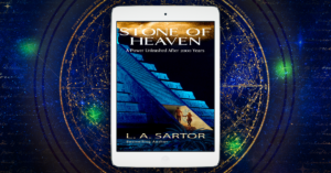
Well, I love this template. This book is action/adventure/romance.
My takeaway: I would definitely add some text, perhaps the tagline, as the image could be construed as science fiction. It does involve myths of the Maya, and this book has an Indiana Jones meets Romancing The Stone vibe.
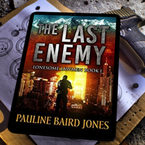
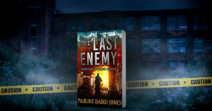
This also felt right. The target behind the book showing the hero wasn’t taking any chances that this would indeed be The Last Enemy.
My takeaway: it fits the title and the subtitle perfectly. Nothing more than a retailer stamp is needed. One and done. Fast!!
The Imagery Of The Cover
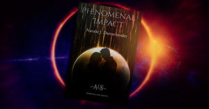
Showing the craters of the moon, the darkness of the earth.
My takeaway: this mimics the imagery of the cover, and while not exact, it feels the same to me. I would add the tagline bottom left and the retailer stamp bottom right, not obscuring any of the image details.
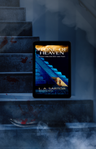
I was actually surprised and unsure whether it would fit when I found this. But now I love it.
My takeaway: this mimics the stairs of the cover’s Mayan temple, there is a blood sacrifice (no worries, the heroine is saved) and it has the mysterious mythic quality that I like. I’d add the tag line at the top and a retailer stamp at the bottom. Boom, done.
There were several crime scene tape memes in instant mockups which is a great bonus.
My takeaway: it works for the sense of darkness of the enemy and the mimicking of a city style building behind it the book. The caution tape immediately tells that a crime has been committed…meaning “lawman” solving the problem or maybe vengeance taken? I don’t read the books, just go by the covers 😊
Using The Colors From The Cover
Wow, almost perfect. This could be used in any of the 3 criteria!
My takeaway: The colors are phenomenal and could be overwhelming at first glance. However, I think using text in the upper left corner, pulling the color from the cover, either blackish or that brown that’s there will balance the ad as well as mute a bit of the yellow. Also, the broken rock seems to be “impacted” and the planet behind seems to indicate something is going to happen to someone as we have a couple on the cover. Which usually indicates romance.
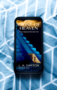
I chose this because it plays off the blue tones in the cover.
My takeaway: There is enough room on this top and bottom to add a tag line or a call-to-action (CTA) at the top and the retailer stamp below. It’s interesting that Amazon’s smile is nearly the same yellow/gold color as in my cover. Book Brush has stamps for most of the retailers which again makes this a fast and easy meme to create using Instant Mockups and then going into Custom Creator and adding the finishing touches.
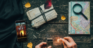
This image replicates many of the colors in the cover.
My takeaway: While the map may not be important as it’s a world map the author could easily put her text box over that with an opaque background to hide the map. The match seemed to tie into the yellow as well as does the leaves, and the letter stack could be blurred out so the text isn’t legible. So don’t disregard an image because it’s not perfect. This may not be boom, done, fast, but it still feels right.
When looking for instant mockups or templates I’ve shown you that can use these 3 criteria; title, imagery and the color in your covers to help you search for the right template. Then add as little text as possible so the image of your book stands out.
I hope this helps you look at templates in a different way.
 Article by L.A. Sartor
I started writing as a child, really. A few things happened on the way to becoming a published author … specifically, a junior high school teacher who told me I couldn’t write because I didn’t want to study grammar.
But the muse couldn’t be denied, and eventually I wrote, a lot. I learned a litany of new things and published my first novel. My second book became a bestseller, and I’m absolutely on the right course in my life.
Please come visit me at www.lasartor.com, see my books, find my social media links, and sign up for my mailing list. I have a gift I’ve specifically created for my new email subscribers.
