What makes a book cover sell? Analysis of bestselling covers
Have you heard the saying, “Great brands sell emotions not products”?
It’s up to debate how true this statement is, but good books sell stories and emotions. If a reader wants to feel scared, they choose horror; the rush of adrenaline — thriller; the sense of wonder and adventure — fantasy.
And a book cover is essential at conveying both: the content of the book and its mood. The covers that do it with nuance, accuracy, and a sense of style have better success with a target audience. The industry has its golden standards that help create effective book covers. Still, the artistry evolves to incorporate new trends and fit the zeitgeist better.
So, let’s take a look at some of the recent bestselling books, and see whether they have to offer something new.
Analysis of Bestselling Book Covers
For this task, we’ve chosen the three most popular fiction genres: thriller, romance, and fantasy.
As for the books themselves, we had the following requirements:
- The covers should reflect the modern trends of graphic design;
- The books’ authors shouldn’t be worldwide popular;
- The books should sell well.
Bestselling Thriller Book Covers Analysis
Let’s start with J. P. Pomare’s In the Clearing.

click on image to enlarge
J. P. Pomare stated that book covers to him are like business cards to Patrick Bateman. And it shows. The cover for In the Clearing is enthralling, intriguing, and beautifully done. Let’s dissect it piece by piece.
Art and Composition
Here’s a general breakdown of the art:
- It’s a photo-based cover with the main subject in the center of the art;
- Most likely, a few photos were combined to create an illusion of a single beautiful shot;
- The focal point of the cover is the book’s title. It dominates a third of the cover.
The important part of the art is a rough paint stroke that crosses out the girl. It adds a disturbing quality to the overall wholesome picture. As a result, the art goes from the carefree “everything is fine” vibe to “something went wrong.” A great example of how a single element can drastically change the message of the imagery.
Colors
Colors are the emotional language of the book cover design. Here, we see two dominating hues — yellow and blue represented by the cozy sunrise gradient.

click on image to enlarge
Depending on your culture, they can carry different meanings. But for us, they symbolize a new beginning, hope, life. Which goes in contrast with the content and genre of the book. Such contextual contrasts are effective when done well.
Typography
The font is simple and minimalistic sans serif (a font without little hooks at the end of the letters). The spacing between the letters is substantial enough to not feel claustrophobic, yet not too big to feel too airy.
The color is slightly transparent white with no texture. The text as if fades away in the rays of the morning sun: a nice touch. It’s also a smart choice because there’s plenty of text on the cover, and the semi-transparency makes it less obtrusive.
Safe Place
Our next subject is Anna Downes’s debut novel Safe Place.

click on image to enlarge
In her review of the book, Amantha Barret described the cover as “the inviting summer feel cover” that “definitely exudes a sense of escapism.” It’s a vibrant and bold cover that’s quite tricky to pull off for the Thriller genre. Let’s see why it works.
Art and Composition
The cover is either a masterful photobash or made from a single image. The imagery itself doesn’t have a clear focal point. Though our eyes are drawn to the horizon, and the guidelines point there as well.

click on image to enlarge
Torn out of the cover’s context, this imagery wouldn’t make much sense for a tense thriller. However, in combination with other elements, it clicks.
Colors
The colors of the Safe Place’s cover are of the tropical heaven — blues, greens, and yellows — a symbol of a safe and carefree life. However, what matters the most is the only red element on the cover.
When our eyes are drawn to the horizon, we see the text:
“No Escape.”
Red is often the color of danger, threat, and fear. Combine it with the text and context, and suddenly the imagery doesn’t seem as careless. The feeling of danger and suspense encroaches.
Typography
The font is also a minimalist sans serif. The title of the book is the biggest element that dominates the cover. Though this time, the title is stylized to create an illusion of submersion. It helps the text to blend with the cover well, enhances the feeling of depth and perspective, and creates a nice visual metaphor.
Conclusion on Thriller Book Covers
Both these covers show the trend that has become quite popular in thriller and other genres — playing with contrasts. Often, artists choose imagery that isn’t associated with suspense, thrill, danger, or crime. And then, they create the required result by adding small detail and nuance.
The question is:
“How do you build the tension?”
The answer is “with subtlety.”
Bestselling Fantasy Book Covers Analysis
Fantasy is a peculiar genre in regards to trends — it doesn’t seem to have any. Just like the genre itself, its art has no limits. The only common denominator we noticed is that the majority of covers are illustrated.
Let’s take a look at two examples.
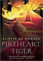
Fireheart Tiger
Fireheart Tiger by Aliette De Bodard is an instant-classics romantic fantasy, with the cover that does the book justice.
As a Twitter user eloquently put it, “OH MY GOD THIS COVER.” Let’s take a closer look at it.
click on image to enlarge
Art and Composition
The cover is decorated with an illustration that reminds of classical hand-drawn animation. It has a few interesting nuances:
- The focal point of the cover is the teacup of fire — the brightest and also thematically important piece of the cover and the book;
- Notice how it’s not centered but located on the upper-left part of the cover— a rare decision, which creates a unique composition;
- The art wears its symbolism on its sleeve literally. We see beautiful architecture “peeking” through the folds of the characters’ clothing. People make cultures, and cultures make people.
Colors
The main colors of the art are yellow, orange, and red, which are the hues of fire. Usually, they’re associated with passion, love, life, as well as danger. The background is blank and dark, which creates strong contrast with the warm colors. It’s great for the impression of heat and brightness. Here’s a bright (pun intended) example from our work:
click on image to enlarge
Typography
Fantasy is no stranger to well-ornamented fonts, but on the cover of Fireheart Tiger, we see a minimalistic serif without any texture or color. And it’s a great choice, considering how lush and rich the art is. The vibrancy of the drawing and the minimalism of typography create a pleasant harmony and ensure legibility.
A Master of Djinn
When you look at P. Djeli Clark’s A Master of Djinn, you feel overwhelmed in a good way.

click on image to enlarge
It’s a rich cover full of detail you can spend a lot of time exploring. How does it manage to balance such dense visuals successfully?
Art and Composition
Again, we see an illustration, but this time:
- It’s more modern-looking;
- The art is brimming with detail and feels massive in its scale and execution;
- To handle the visual load, the artist divided the image into two parts, using the text as a separator.
The latter is a popular and handy approach, which significantly increases the amount of visual storytelling you can fit on a single cover without confusing people.
Colors
There’s plenty of colors, yet the majority are represented by the pastel hues of a desert. We’d argue that the main hues of the cover are blue and purple. Though rare, they create a nice contrast as well as a feeling of mystery and wonder.
Typography
A Master of Djinn cover sports an angular bold font slightly similar to the bartender condensed serif press. It’s a bit rough-looking typeface that can easily suit a sci-fi book. However, the combination of art and the book’s title help to avoid any confusion regarding the genre of the book.
Conclusion on Fantasy Book Covers
Unlike thriller covers, fantasy ones don’t call for subtlety. They continue to be imaginative, lush, and often loud. Writers and artists experiment with different styles but mostly stick to hand-drawn or concept art styles. Regardless of the subgenre, the main aim of fantasy book covers is to intrigue with the rich worldbuilding, interesting characters, or both.
Bestselling Romance Book Covers Analysis
Romance book covers can be roughly divided into two groups:
- A more numerous one — the unapologetically in-your-face romance book covers.
- A more subtle group of covers that imply rather than exclaim romance. They’re often illustrated.
Blame it on the Tequila
Blame in on the Tequila by Fiona Gale is a bright example of the first group.

click on image to enlarge
The cover is immaculately put together and has a few nuances. Let’s check them.
Art and Composition
Art is the photo-based custom cover. It uses the preferred composition of the genre — the characters in the center. The imagery serves two purposes: shows who are the protagonists and depicts the setting of the world. The clearer the cover conveys these two subjects, the better.
Color
The cover uses “realistic” color-grading with accents on warm hues of the golden hour. A great choice if you want to create a feeling of warmth and fuzziness. Another popular color scheme you can often see in romance is black and red, which symbolizes passion and danger.
Typography
The cover for Blame it on the Tequila breaks a rule of typography: don’t use more than two fonts. The title consists of two fonts, each of which is highly stylized, and the third font is used for the author’s name.
Romance is the only genre where this rule is broken often enough that it ceases to be a rule. We won’t suggest you do it in any other genre though. Also, if you want three fonts on your cover, do it under expert supervision. It’s easy to mess up.
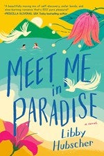
Meet Me in Paradise
A debut novel of Libby Hubscher, Meet Me in Paradise sports a heartwarming illustrated cover.
click on image to enlarge
It’s a peculiar and catchy cover that masterfully balances all its elements.
Art and Composition
The Meet Me in Paradise cover is a bright illustration with a retro-poster style. Here’s an example:
click on image to enlarge
Despite all its vividness, the art is subtlу compared to the previous group. The obvious hint at a romantic relationship — a man and a woman in the water — is in the background.
Even though the cover is full of detail, it doesn’t overwhelm because of the masterful composition. Additional elements, such as flowers and birds, point at the title and people.
Color
Blue and pink are the main colors of the cover — they have the most prominent positions and draw attention. Pink is often associated with youth, passion, love, while blue — with tranquility, and calm. Yellow and green nicely complement the main colors and add to the “tropical paradise” atmosphere of the art.
Typography
Meet Me in Paradise uses a font that would suit a retro beach poster. It’s quite possible that the title was fully hand-written without using any premade fonts. While some letters are identical and differ only in size, the others are sufficiently different. For example, the letters E in the words meet, me, and paradise.
Another important aspect of the book’s typography is the uneven positioning of the letters. It gives the title an impression of riding the waves.
Conclusion on Romance Book Covers
We’ve shown you two approaches to romance book covers. While the first is the most prevalent one, the second is gaining in popularity. Illustration helps to get noticed in the saturated market of the genre.
Regardless of the preferred approach, romance book covers rely heavily on typography. Picking a proper font and customizing it accordingly amplifies the atmosphere of the cover and is essential for its success. Here’s another example from our works:
click on image to enlarge
Summing Up
A book cover is an important marketing tool. If you want a book cover that helps sell more copies our advice — don’t be afraid to experiment with novelties, contrasts, and composition.
But…
Remember that cover should communicate the genre of your book and intrigue the reader. Thoughtful color, typography, and imagery approaches will help you achieve the desired result.
What’s your favorite book cover of recent years? What do you think makes it special?
 As a part of MiblArt marketing team, Mykhailo Bohdan helps authors on their self-publishing journeys by creating content on marketing, graphic design, industry trends, and advice from the experts.
MiblArt– a book cover design company for self-published authors. We offer ebook, print, illustrated, and animated book cover design as well as author branding design. We believe that a book cover is a strong marketing tool and help authors get the most out of it.