After I started writing, for a brief moment in time, I thought all I had to do was write the book. Publish it. And then people would buy it. Like magic.
If only that were true. But it isn’t. Writing is both an art and a business—which means marketing.
I discovered my least favorite part of marketing was the pre-order stage. It’s where we need to let our future readers know that our super-duper book will arrive soon. Ugh.
However, since discovering Book Brush, I no longer dread that pre-order stage. Using Book Brush, I now enjoy creating images I can use. It’s easy, fun, has a low learning curve, and doesn’t take much time.
The best part is, I can let potential readers know my new book is coming, without beating them over the head with it. Instead of constantly telling them, they can see for themselves.
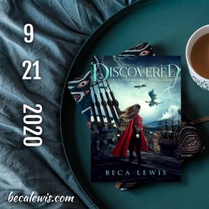
Here are samples of some images I am using to let people know that my next book is on the horizon.
And if you don’t if you don’t have a BB account, you can register here.
Headers:
I made two different Facebook headers, one for my personal page and one for my group page for fans.
- For the personal page, I made a simple header, intended to let my friends know that I have a new book coming out soon.
- For the fan page, I knew that I could do more. After all, they are fans!
I used the template sizes found under Facebook in the custom creator to do both sizes. Before Book Brush, this was a hit and miss approach trying to get the headers to fit. Now it’s easy.
To be consistent in the pre-order, or launch, stage I kept many of the details on all my launch images the same.
- For every background, I used the search term “ocean” to find images in Book Brush.
- Because I wanted to stick with a color theme, I used the same filter and the same overlay.
- What makes them look different is I used the transparency slider to get the color closer to what I wanted, depending on what background, or filter, that I chose.
If you are thinking of advertising on Facebook using your Book Brush images, this is a great how to do it article.
Steps for my Facebook personal page:
>Start with Custom Creator
>Choose Facebook: Cover Photo for the ad size.
This image has only a few elements in it: A background, an overlay, the book, and some text. That’s it!
- I added the font OptimusPrinceps to my font library after asking my cover designer what font she used for my name on the cover. I thought it helps with keeping a consistent look.

Steps for Facebook group page:
>Start with Custom Creator
>Choose Facebook: Group Header for the ad size.
Besides the background, overlay, filter, book, and text, I used three stamps in the image. I made them all made within Book Brush: my logo, the girl, and the book title.
- To get the girl, I used the image removal tool and took her right out of the cover of the book.
- For the book title stamp, I cut it out of the book cover using Paint 3D, and then uploaded it into Book Brush and turned it into a stamp.
- The Shifting Stories personal logo I made in a book brush template. First, I experimented with fonts until I was happy, and then I turned it into a stamp.
The words I used are from the blurb for the book.
BONUS: I used the same image again in a square. All I had to do was choose the Instagram square ad size while I still had the image up and then resize the elements to fit within the new size.
![Image for Fan Facebook]()
BLOG HEADER
Steps for Blog header:
>Start with Custom Creator
>Choose Amazon: Billboard for the ad size.
A few weeks before I release the book, I send out emails to the people I have tagged as interested in my books. I tell stories about how I wrote the book or share teasers from the book.
I use a book header for this instead of my normal blog header.
Besides the background, this header has an overlay, a filter, a stamp, the book, and text.
It might seem as if this would take forever to make, but it took me only fifteen minutes. It’s just a matter of putting the pieces together until they look the way you want them to look.
![reveal for Blog Header]()
SQUARES
Steps for squares:
>Start with Custom Creator
>Choose Instagram: Square for the ad size
Except for Facebook and blog headers, I stick with the Instagram square. That’s because Squares work for Facebook, Instagram, Twitter, Pinterest, and even blog posts and websites.
If you want to know more about using images to advertise on twitter, this article from Book Brush is very helpful.
Reveals:
Book Brush has many excellent Book Templates to choose from that we can use want to tease the cover. And this article has more about how to use them.
Here is an example of how I used one of the Book Brushes reveal templates. This sample uses an additional font that I uploaded to the font library. It’s called 28 Days Later.

Teasing with a quote and a stamp:
In this example, the turned up corner at the bottom of this sample is another stamp provided by Book Brush. Cool illusion, right? The teaser here a quote from the book.

Using Animations:
The possibilities are endless with this tool. This image is an example of how using just a few elements, but animating them can make an enormous impact.
I played—literally—with the animations until I found the one that makes it look as if the water is moving.
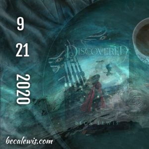
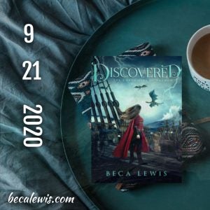
Transparently Revealing:
This reveal is the same picture, but with the overlay becoming more and more transparent.
Mockups:
And last—but not least—it was time to let people imagine themselves reading the book. I used one of Book Brushes’ fantastic mockups to make this image.
Then I added the text after uploading the image back up into Book Brush and choosing the Instagram square template size. This article explains how to make mockups.

These images were super simple to make. I loved being able to vary the background with each image, and then with the use of filters and overlays, keep the same the color story.
The best part of using these tools is that our imagination is the only limit to what we can do using what Book Brush provides. And magically, that even makes marketing more fun.
![Beca Lewis image]() Article by Beca Lewis
Article by Beca Lewis
BECA LEWIS always wanted to be a writer, but there were a few pit stops along the way. She has been a dancer, teacher, stockbroker, certified financial planner, club dancer (read this any way you wish), waitress, artist web designer, headhunter (the civilized kind), and a diamond broker to just name a few. All this while trying to be a decent mother to three kids, a step-mother to five more, and a grandmother to the five, almost grown, best-looking grandchildren in the world. All these experiences are the perfect fodder for book writing!
Beca’s non-fiction Shift Series covers the system she developed and has coached for over thirty years. At this point, she is going to claim there is no time, so she doesn’t have to think about age. She’ll show you why you don’t have to either in this practical and inspirational series.
Beca’s fiction explores stories around the concepts of other dimensions, love that transcends time and space, and where good always triumphs over evil.
The best part of writing? Being an introvert on purpose, living in imagination, and then sharing it all with readers and friends.
Find more at becalewis.com ~ Shifting Stories, Writing Stories
