Newsletters are the only way authors can directly reach their readers without relying on paid marketing on a social media platform. It’s a super important part of an author’s brand. You want your newsletters to get opened and most importantly—you want them read. So, I’ve come up with five great tips to whip your newsletter into shape!
(Personally, my favorite newsletter service is Mailerlite. You can find more about them here: Save Your Sanity & Your Pocketbook With MailerLite. I’ll be using screenshots from my own author newsletter below.)
Simple Typography
Typography is style and font choices used in your layout. Legibility is so important in newsletter design. All design, really. Stick to standard font choices. Don’t pick a script, handwriting, brush lettering, or display font for your main content text. Keep that simple, clear, and clean.
Fancier or bolder fonts can be used for headings, but keep your main text to a serif (example: Times New Roman) or sans serif (example: Helvetica) font. Also, don’t mix more than 2 fonts to create a more professional and stunning look. Too many font varieties make things cluttered and disorganized.
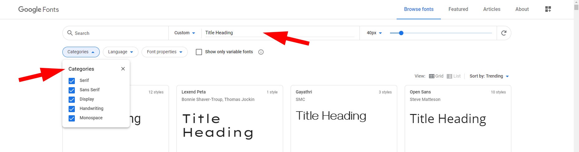
Most email services are going to have Google Fonts built into them. To get an idea of how your text could look, head over to Google Fonts and test them out.
1) Type some text in the area I have written “Title Heading” to try out fonts for your headings.
2) Use the categories menu to choose your type of font.
click on image to enlarge
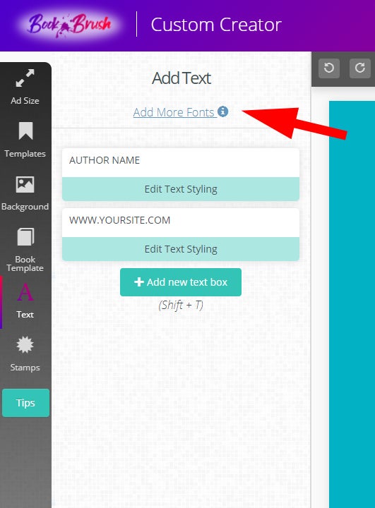
Book Brush also uses Google Fonts, so if you want to create graphics that match your newsletter look, it’s super simple to replicate. We even allow you to upload your own fonts (.TTF or TrueType and .WOFF or Web Open Font formats only) to match your existing branding!
1) Open/create a graphic in the Custom Creator.
2) Click on “Text” from the sidebar menu.
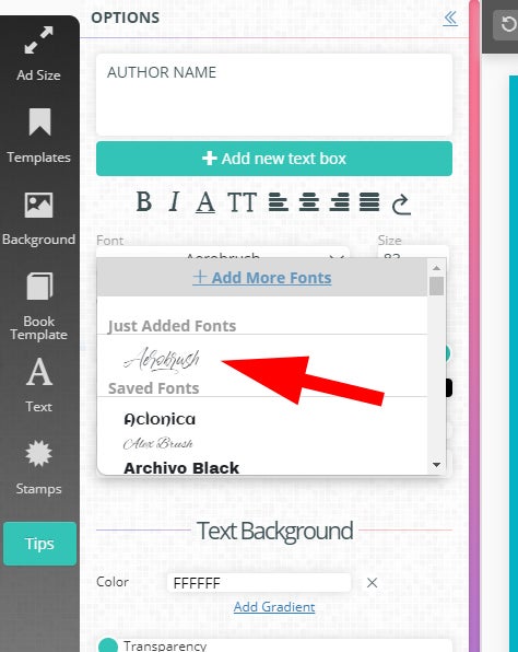
3) Click on “Add More Fonts.”
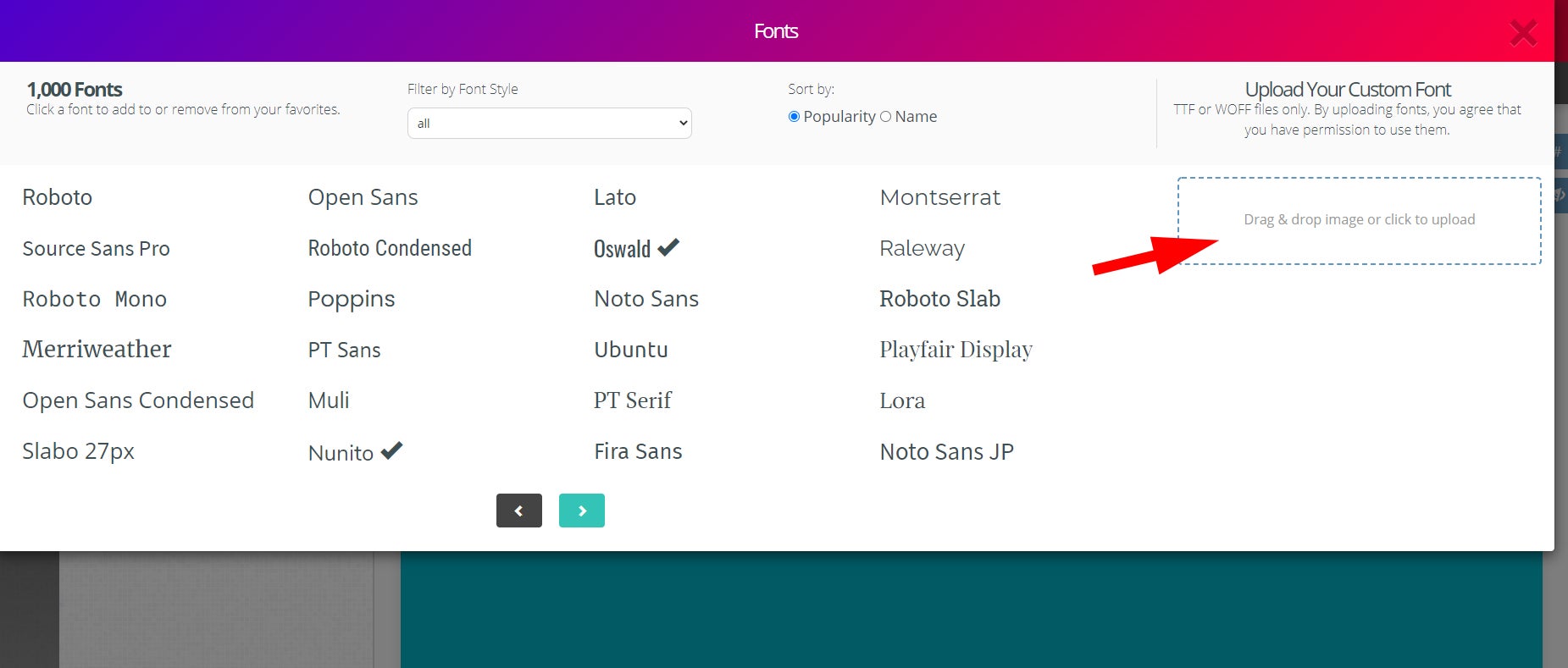
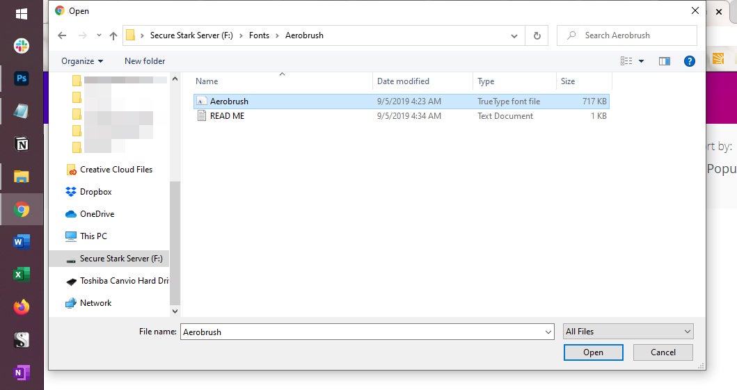
4) Under “Upload Your Custom Font,” click the dotted box and find the font on your computer and click Open.
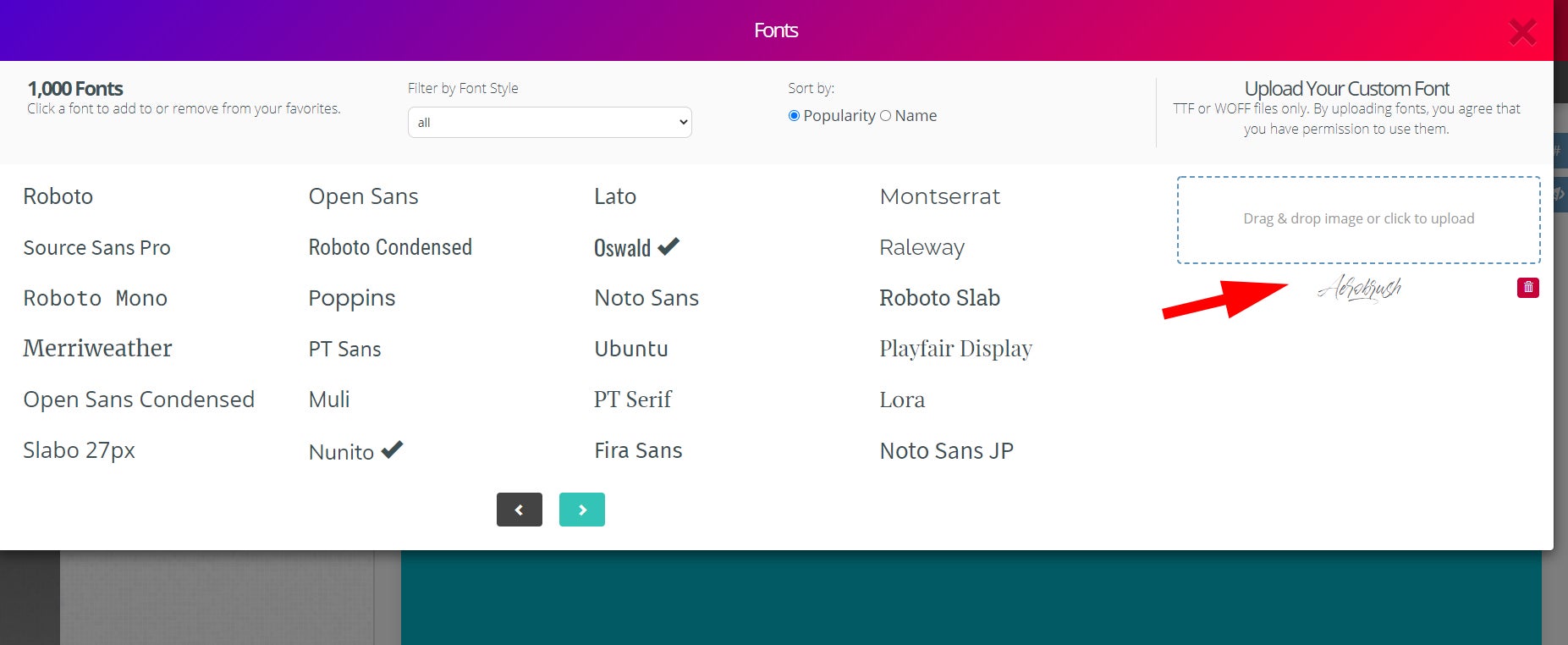
- The font will upload to Book Brush and be visible on the side.
5) Close the “Add More Fonts” box by clicking the X in the top-right corner.
6) Double-click on some text on your graphic.
- You’ll now be able to apply your custom font to the selected text. (It will be listed under “Just Added Fonts.”)
click on image to enlarge
click on image to enlarge
click on image to enlarge
click on image to enlarge
click on image to enlarge
Eye-Catching Visuals
Humans are visual creatures. We respond better to images, videos, and colorful buttons better than text alone. Use this natural inclination to your advantage! Add in a header, teaser images, 3D mockups, and more to catch subscribers’ eyes.
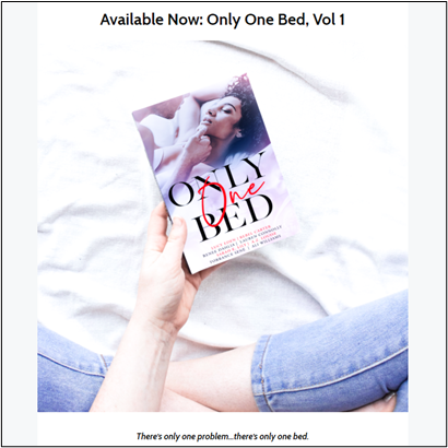
Instant Mockups make this tip so simple! Just upload your book cover, click the images you want it added into, and presto! Done! No design experience required. Read Instant Mockups: Your Book Cover In Amazing Scenes to learn more about this feature and how to instantly (and easily) bring a touch of realism to your marketing graphics.
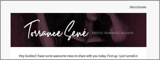
You can also use Book Brush to design a header for your newsletter. Create it once and use it every time to help in creating your brand.
In the Custom Creator, click on the email icon ( ✉ ) under Ad Size.
Then click on the orange “Email Header” option that appears.
Design your header from there, just as you would other custom images.
click on image to enlarge
(An Instant Mockup used in my newsletter)
click on image to enlarge
(Header used in my newsletter)
Graphics are amazing, but don’t bog your newsletter down with them. A maximum for 3 is good. This helps the load time of your newsletter but also doesn’t create a lot of visual clutter. Which brings me to my next tip…
White Space
Refrain from using too many font types and graphics in your newsletter. Clutter is a death sentence for email. If there’s too much going on, subscribers will close it without reading. Let it breathe. Less is more. A clean, organized newsletter is going to keep readers scrolling (and hopefully clicking on your buy links)!
- Stack your content vertically to make sure it’s user-friendly for mobile devices. Most newsletter services will have this automatically built in, but it’s a good thing to keep in mind when designing your layout.
- Keep your text short and sweet whenever possible. Brevity is king in a world of declining attention spans. This also doesn’t overwhelm your readers with too much information to process, especially if you want them to act on something.
Colors
Ideally, your existing branding/logo should dictate what colors are used in your newsletter. If your graphic designer didn’t provide you with hex codes of your colors (example: #000000 is the code for black), you can use a free service like Palette Generator to pinpoint them and bring that color palette into your newsletter.
These colors can be used for your links, headings or subheadings, and more. However, I suggest leaving the actual context text portion of your newsletter a neutral color, like black or dark gray. This makes it easier for subscribers to read it. Same with your newsletter’s background color; keep it neutral. A black newsletter background with white text on top is going to give your readers a headache.
Research has shown that certain colors will get more clicks, namely blue and green. Use these in your buy and other call-to-action buttons to draw your readers’ attention and up your conversion rates.
Consistency
Once you have a look for your newsletter, keep it consistent. Same fonts. Same colors. Same header. All elements tied together with a pretty bow. A different look each time doesn’t create any resonance with your subscribers. Consistency sets expectations, and overtime, they will learn to attribute a certain aesthetic to you.
Consistency also helps to leverage usability. This ties into expectations. If a subscriber knows that your buttons are always blue, clicking will become more of an intuitive action. It eliminates confusion.
Bonus Tip: Test Emails
Always send a draft copy of your newsletter to yourself (or your assistant, if you work with one) to check how it looks on both a desktop and a mobile device. If you see any places that could be improved, adjust your newsletter accordingly to make it an enjoyable experience for your subscribers—no matter what device they read it on.
To do this in Mailerlite, there are two ways:
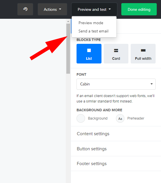
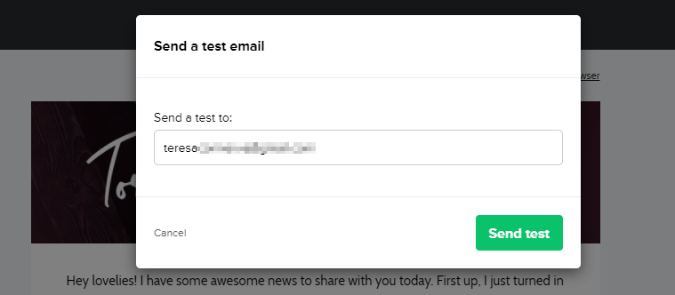
- When editing the content of your newsletter, in the top-right click on “Preview and test”. A drop-down menu will open. Click on “Send a test email.”
- A dialogue box will open up. Simply type in your email address and click on “Send test.”
click on image to enlarge
click on image to enlarge
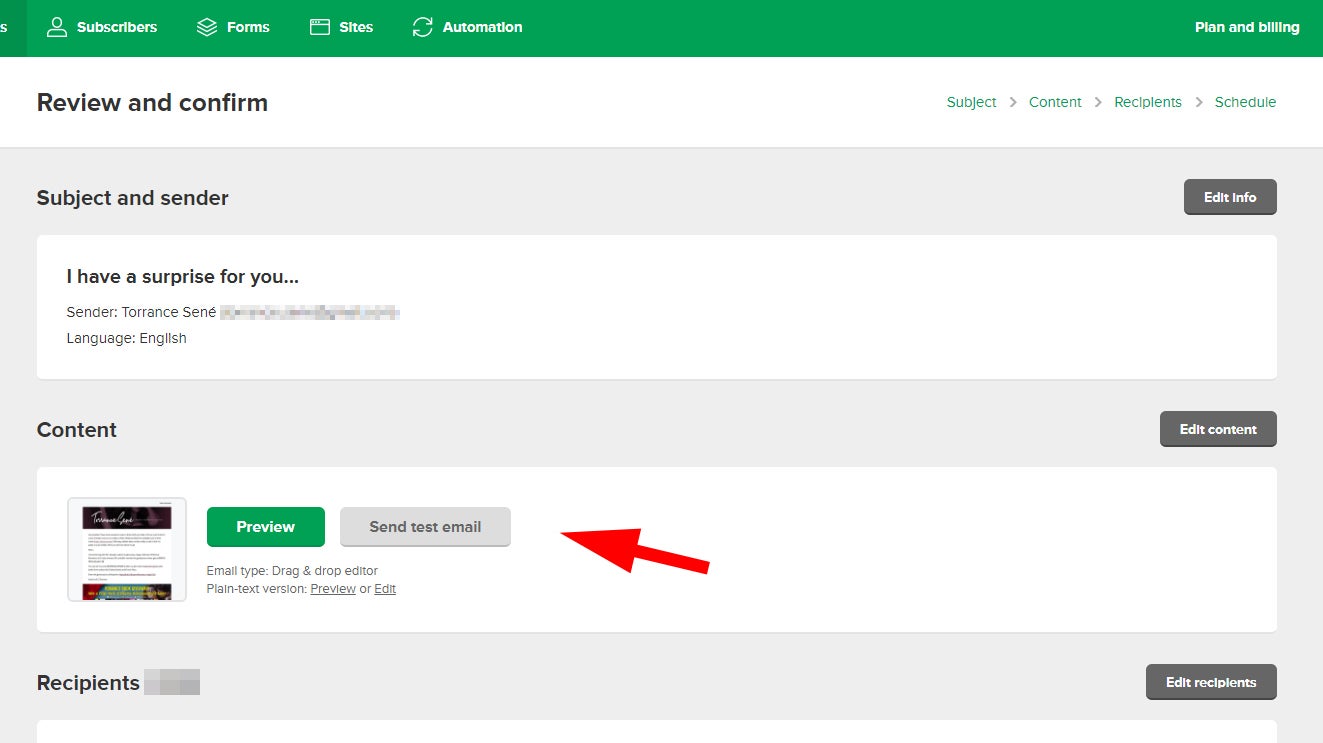
Another way is on the “Review and confirm” page:
- Click on “Send test email” in the Content section.
- The same dialogue box will open for you to type in an email address.
click on image to enlarge
Register for an account with Book Brush today, and check out our awesome collection of Community Templates and Instant Mockups that can easily be customized for marketing books to your newsletter subscribers.
![author image]() Article by Teresa Conner
Article by Teresa Conner

Teresa is lead Graphic Designer here at Book Brush. When not creating graphics for Book Brush or book covers for indie authors and traditional publishers, Teresa can be found writing erotic romance under her pen name Torrance Sené.
You can find her social media accounts and learn more about her at and here.