Welcome to a new series of Book Brush blog posts that are dedicated to a specific how-to on one of our tools. This time it’s the Cover Creator.
Inside this tool is the availability to create E-book, Print and Audiobook covers. Today we’re going to focus on Print Covers.
PRINT COVERS
Kindle and Ingram Spark have very specific requirements that need to be followed or your cover will be rejected. The idea of this post is to alert to those issues.
Let’s begin.
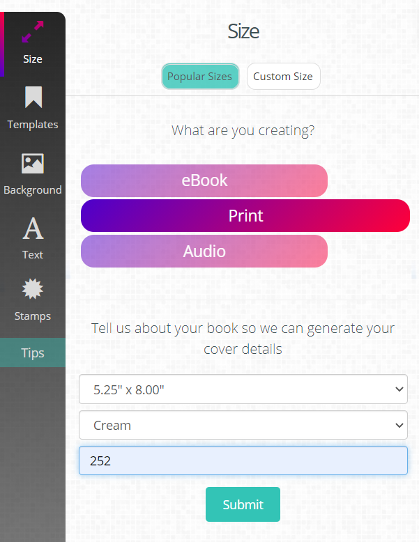
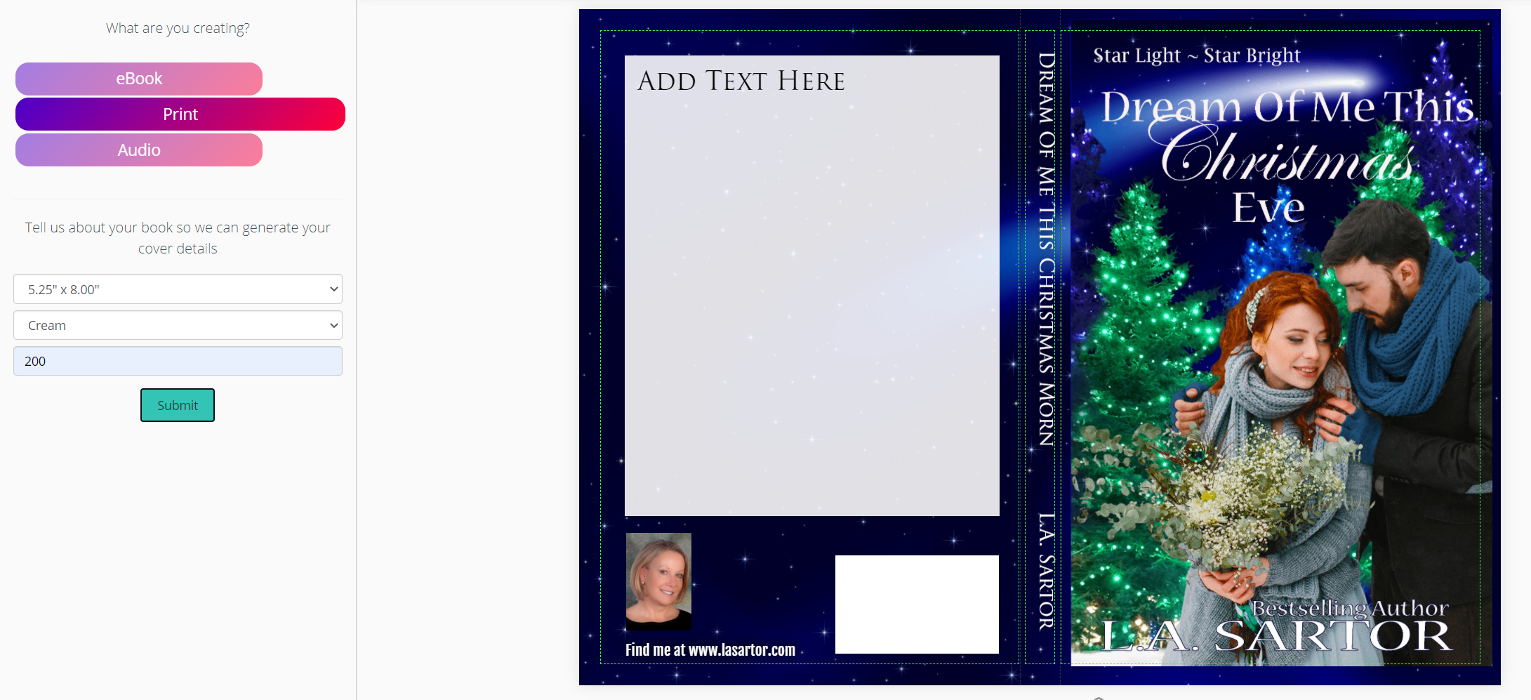
1) Open Cover Creator
2) Choose Print
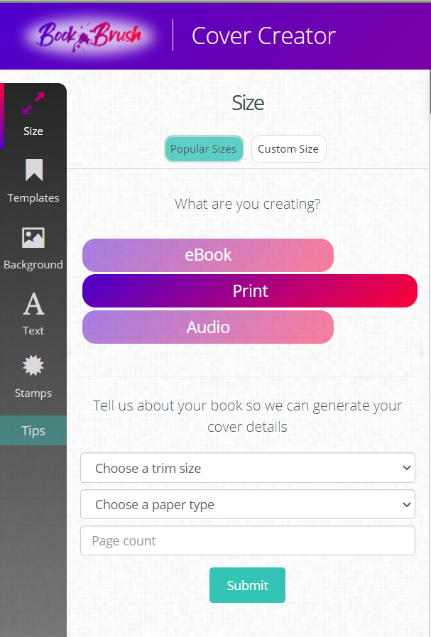
You’re offered two drop downs
- TRIM SIZE which is literally the size of your paperback, and Book Brush has all the sizes that Kindle/Ingram Spark offers. Mine is 8×5.25”
- PAPER TYPE, White, Cream or Color. I always choose cream, it’s a bit thicker, and less hard on the eyes. The reason you need to decide this is because the spine measurement is calculated on the paper thickness and the number of pages you’ve already formatted for your print book.
PAGE COUNT is the last box you’ll need to fill in. This includes everything inside the book, including front and back matter.
Note: If you change your font size or have added/removed something you will need to edit the page count which will enlarge or reduce the spine. More on fixing that later.
3) Click submit.
The program calculates your workable areas and very importantly, the bleed line for your images. This is where you can run into trouble and get rejections from Kindle and Ingram Spark
Here I’ve brought in my background. I uploaded it earlier in Custom Creator, but you can upload it in Cover Creator as well.
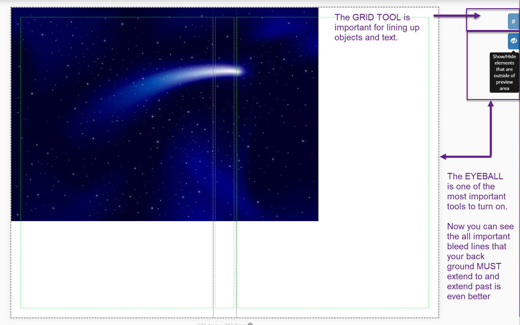
Notice the eyeball tool. This is very important to turn on
- A reminder for uploading and SAVING. Be sure to click the arrow in the upper right corner of your image after you bring it in to backgrounds or it won’t save.
My background doesn’t fill the page, but while holding the SHIFT key, I can drag it proportionally. Then at some point I’ll just drag a side, top of bottom which is increase the size, but not proportionally. For this particular cover, I don’t need to worry about proportion.
Here it is with the bleed lines.
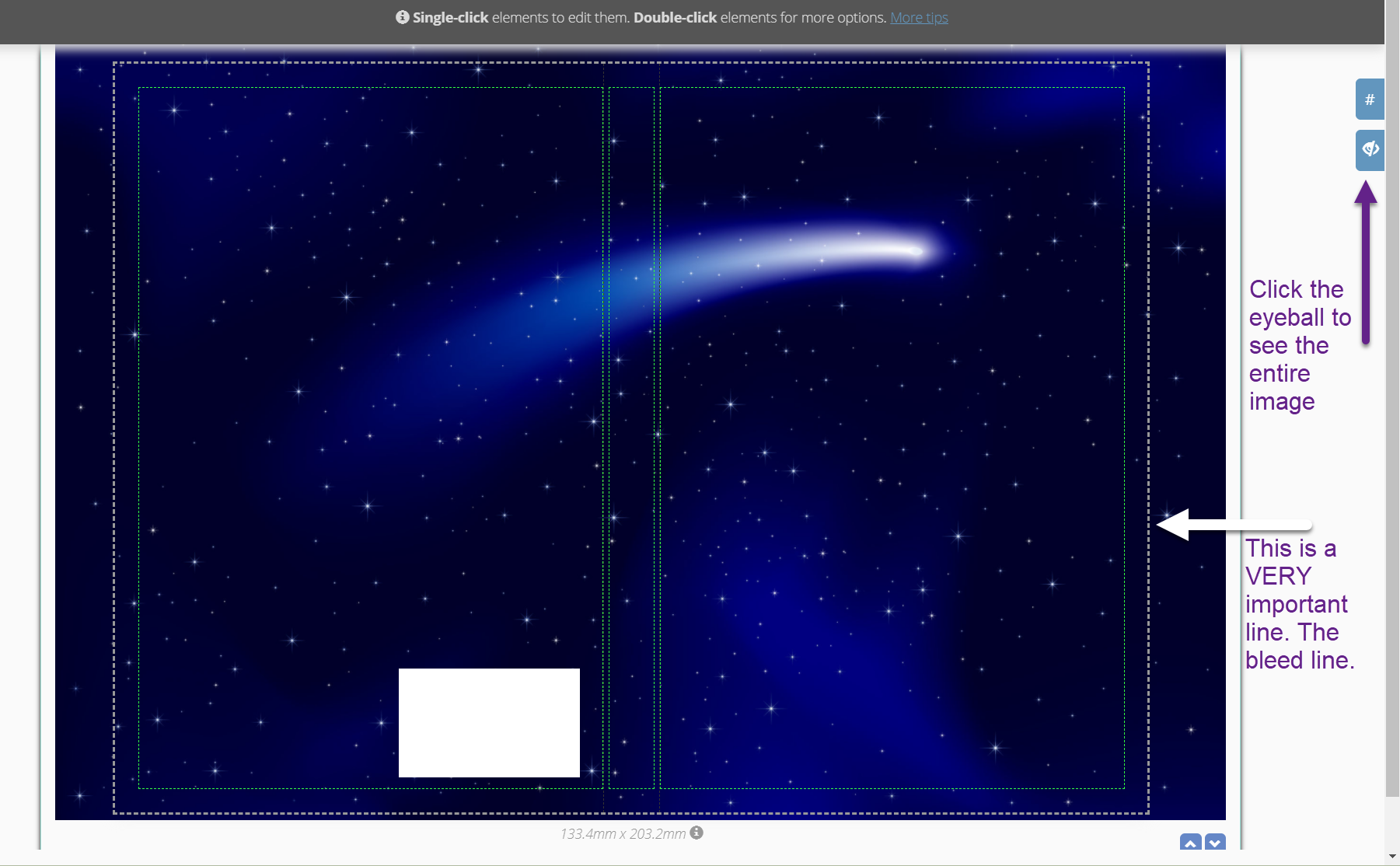
- Notice that my background far extends past those gray lines. And you can only see those all important lines when you have turned on the eyeball.
- Also notice that my bottom is just barely extending past those gray bleed lines. I’m fairly confident that while I had larger extensions on the side so I could show you what it looks like, that a narrow extension of color beyond the gray lines is acceptable.
NOTICE I SAID COLOR
If you have a white cover or large areas of white, I highly suggest you put a color background in first. It can be pale gray, anything as long as it’s not white.
- This way you can see if you have any gaps in that all-important bleed once you add in your flat (or ebook) cover.
- Sometimes Kindle/Ingram Spark will assume your white background isn’t extending past the bleed lines and reject it.
Once your background is set, then you can start adding elements to it.
ADDING ELEMENTS
I’ve brought in the flat cover from my computer. And I’ve sized it to fill to the GREEN DASHED lines.
- Those lines denote the safe areas to add text/images so they won’t be cut off in the printing or folding phase.
THE SPINE
1) I created a text box.
2) Then added my text, rotated and spaced the words it to fill the space within the GREEN LINES. I left the grid lines on so you could (almost) see them to help with the spacing. You can also bring in a spine you’ve created in the Box Creator, saved as a template (so it can be adjusted here) and downloaded to your computer.
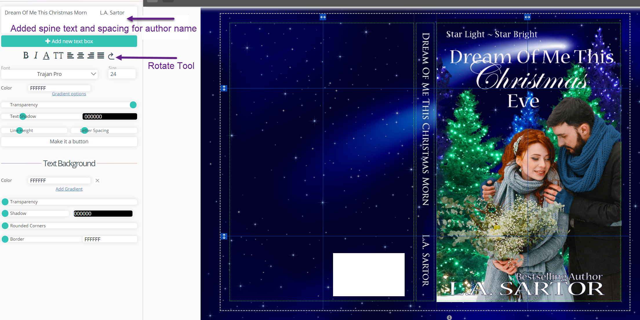
BACK COVER
I didn’t add an additional back cover image, I’m continuing on with the big background I brought in.
- I usually don’t add anything but text unless I want a tiny author image in the far left corner.
TEXT BOX
I’ve added a big text box to the back. I could add white text and make it work, but often reading the font size necessary for back cover copy is difficult with white on color.
1) To make the text box big, I simply pulled the corners to the size that I wanted.
- I added a white background (color ffffff for white) and lowered the transparency.
2) Add your back-cover text. I usually use a readable font, nothing fancy.
- I aligned the text box with the center guidelines
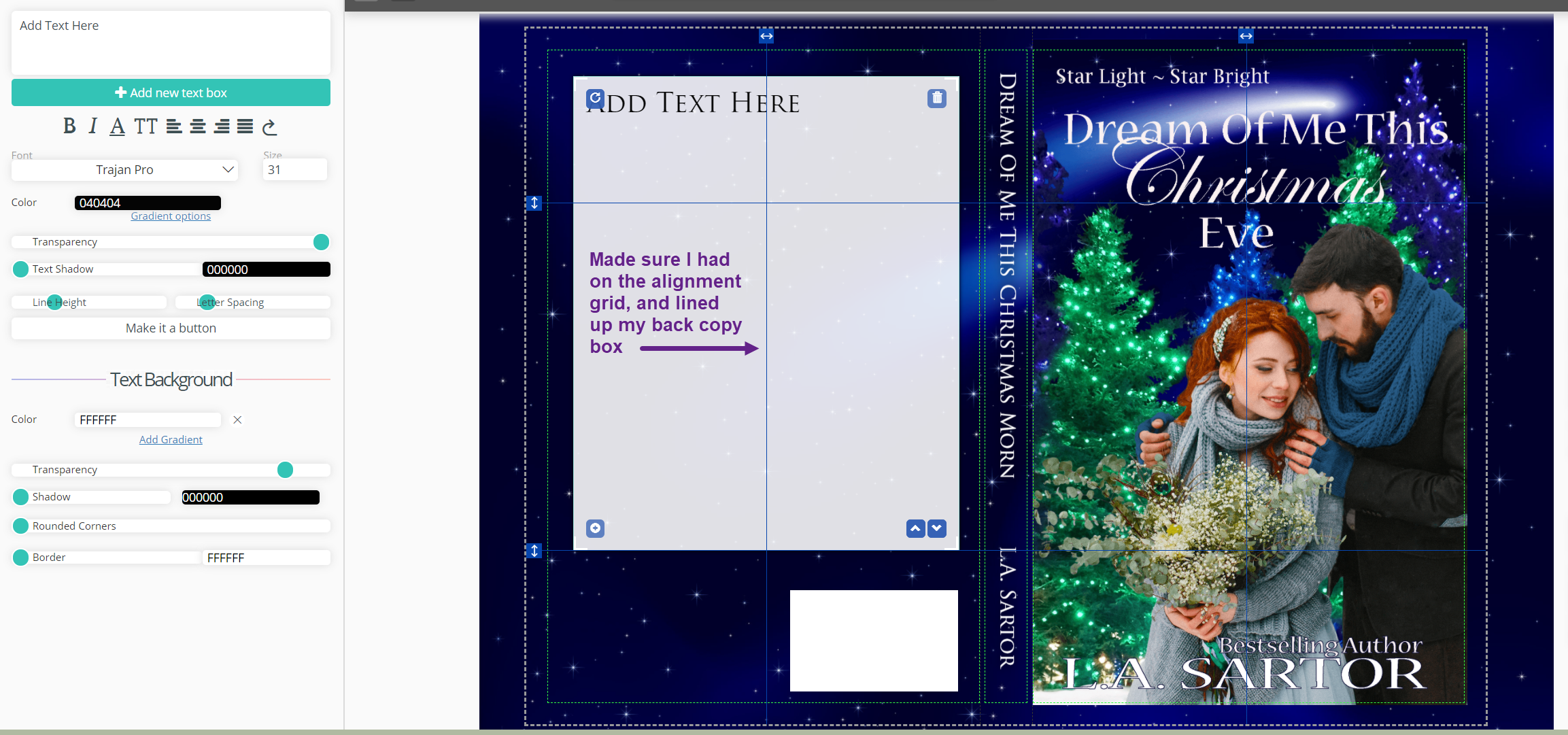
Note: the white square on the back cover lower right. That is simply a place holder for the ISBN number that Amazon inserts, either theirs or yours. It’s there to make sure you don’t place something over it. However, if you want to upload your own barcode, you can place it behind and view it on the PDF version.
If you have loaded something you want to use from Stamps, now is the time to add it.
And is a tip for you. Under Stamps in Custom Creator and Cover Creator, you’ll see this. It’s an on-the-fly help guide.
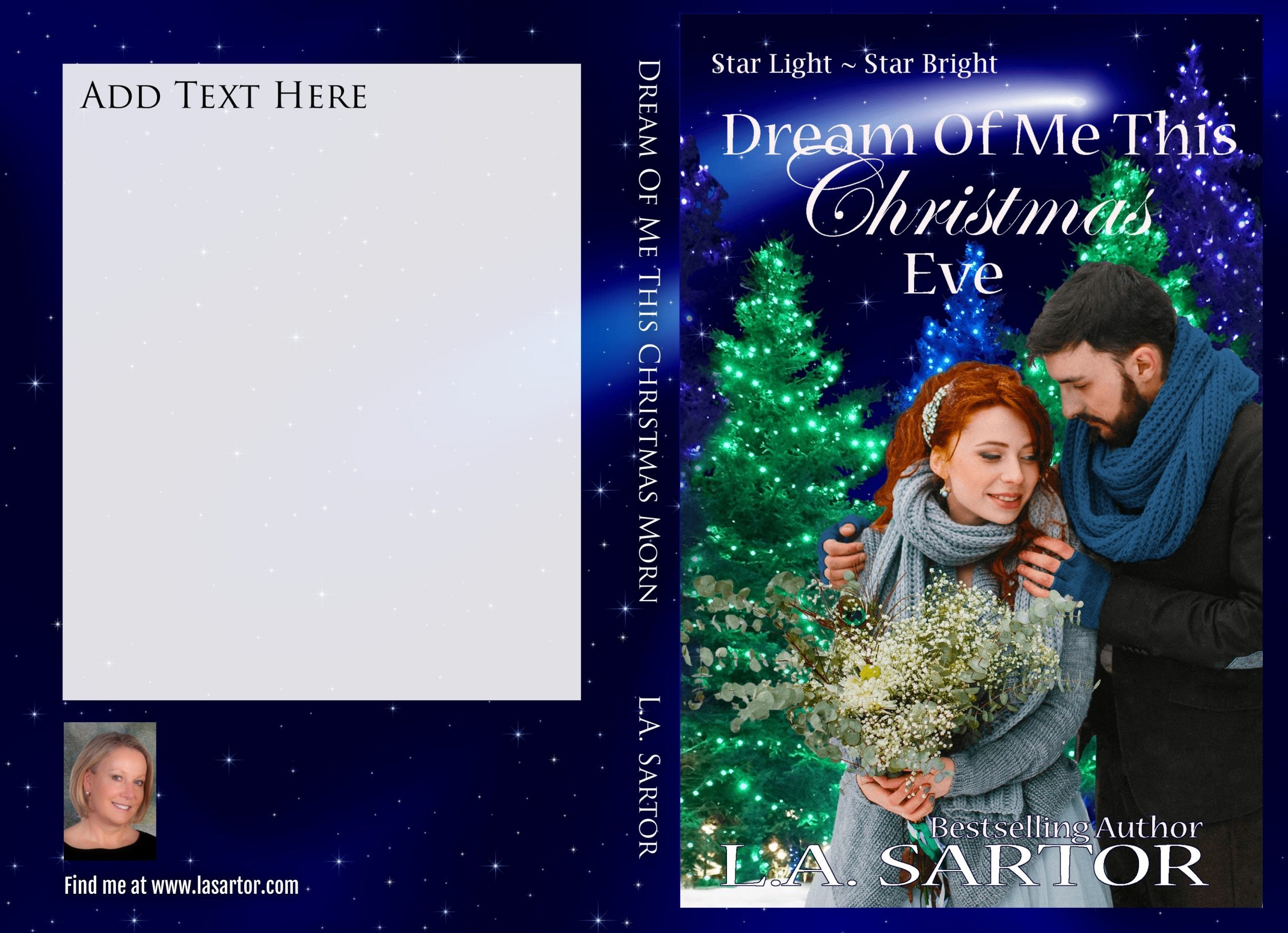
All done! Now you’re ready to upload to Amazon or Ingram Spark. You’ll see the bleed that the publishers expect. And notice the white placeholder box is gone. (unless you added yours behind)
Note: if you download a .png file, which gives you the best quality, you can convert it for free at https://png2jpg.com/
SIZE CHANGED
What happens when you need to change the size of the interior pages?
Simple.
1) Open up your template
- Then on the “details” change the page count and hit submit.
Notice that all the elements have moved a bit? Luckily, it’s all quickly fixable by moving all the images back to each area’s center.
- Turn on the grid lines and move each object until they’re centered. The easiest way to do this so you don’t move them vertically by mistake is to use your arrow keys.
- Then save the template, download and you’re done.
I hope this helps you design your paperback cover quickly and efficiently. Wait until you hold it in your hands. It’s an incredibly special moment for an author. And be sure to take a picture of you with your book. Post it everywhere.
 Article by L.A. Sartor

I started writing as a child, really. A few things happened on the way to becoming a published author … specifically, a junior high school teacher who told me I couldn’t write because I didn’t want to study … urk … grammar… That English teacher stopped my writing for years. But the muse couldn’t be denied, and eventually I wrote, a lot, some of it award winning. However, I wasn’t really making a career from any of this. My husband told me repeatedly that independent publishing was becoming a valid way to publish a novel. I didn’t believe him even after he showed me several Wall Street Journal articles. I thought indie meant vanity press. I couldn’t have been more wrong. I started pursuing this direction seriously, hit the keyboard, learned a litany of new things and published my first novel. My second book became a bestseller, and I’m absolutely on the right course in my life.
Please come visit me at www.lasartor.com, see my books, find my social media links, and sign up for my mailing list. I have a gift I’ve specifically created for my new email subscribers. And remember, you can email me at Leslie@LeslieSartor.com