Fonts are one the best ways to convey genre to your readers. And as such, the wrong font can make even the most gorgeous artwork look messy. Don’t worry, Book Brush is here to help! We recently ran a series on our Instagram of font pairings to give authors some inspiration and direction when making their graphics and book covers.
And now we’re bringing that insider knowledge to our blog, plus 6 great tips for working with typography.
Typography Tip #1:
Keep your graphics accessible and legible by using a distinctive font for your title or headline and the simpler, clearer font for everything else. I talk about this more in my blog post on DIY book covers, but as a refresher: Two fonts should be the maximum featured on a design. This keeps things looking cohesive and professional. If readers cannot read your fonts, they are likely to move along and forget about your book. Keep things easy for them.
Typography Tip #2:
Pay attention to font weight. Font weight is how thick or thin a font is. Fonts will look more pleasing to the eye if you pair a chunkier, thicker font with a skinnier one. This provides contrast and a clear visual hierarchy.
Typography Tip #3:
Stick to one mood. This tip is a little more subjective than the others, but try to stay with fonts that have the same feel (genre) to them. You wouldn’t want to be designing a sci-fi cover and use a font that pings more of a historical vibe. I’ve seen things like this happen where an author used a historical font (Bleeding Cowboys, in this instance) on a contemporary romance cover that had nothing to do with the west or cowboys. This is where the font pairings below come in handy.
Typography Tip #4:
Don’t use fonts that are too similar. This plays into tip #1. If you use a handwritten font and then a script font, you’re creating visual discord. Stick to one “fancy” font and one clear one to keep clutter to a minimum.
Typography Tip #5:
Can’t go wrong with basics. You can also skip using a distinctive font entirely, if you’d like, and just play with weights, styles (underlined, case, italics, etc), and sizes of the same font to convey your hierarchy.
Typography Tip #6:
Study your genre. Trends come and go. What’s popular one year might completely shift the next. When designing your book cover, check out the bestsellers in your genre. Take note of what font families are being used and emulate them to up your chance at catching readers’ eyes. Is brush lettering all the rage? How about using gradients or not? These are things to be mindful of.
Font Pairings
The pairings below (chosen from fonts available to Book Brush through Google Fonts) feature one decorative font + a simpler serif or sans serif font.
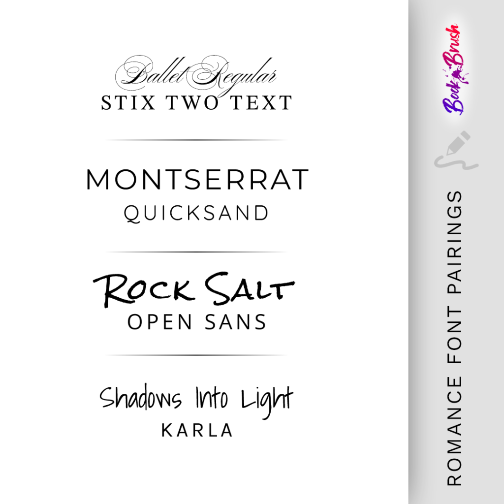
Romance Font Pairings
Ballet Regular + Stix Two Text | Montserrat + Quicksand | Rock Salt + Open Sans | Shadows Into Light + Karla
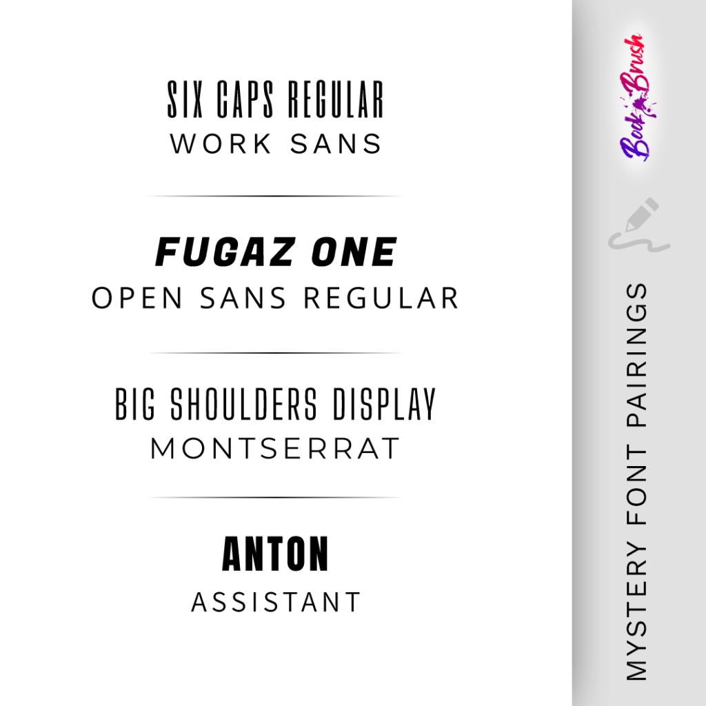
Mystery Font Pairings
Six Caps Regular + Work Sans | Fugaz One + Open Sans | Big Shoulders Display + Montserrat |Anton + Assistant
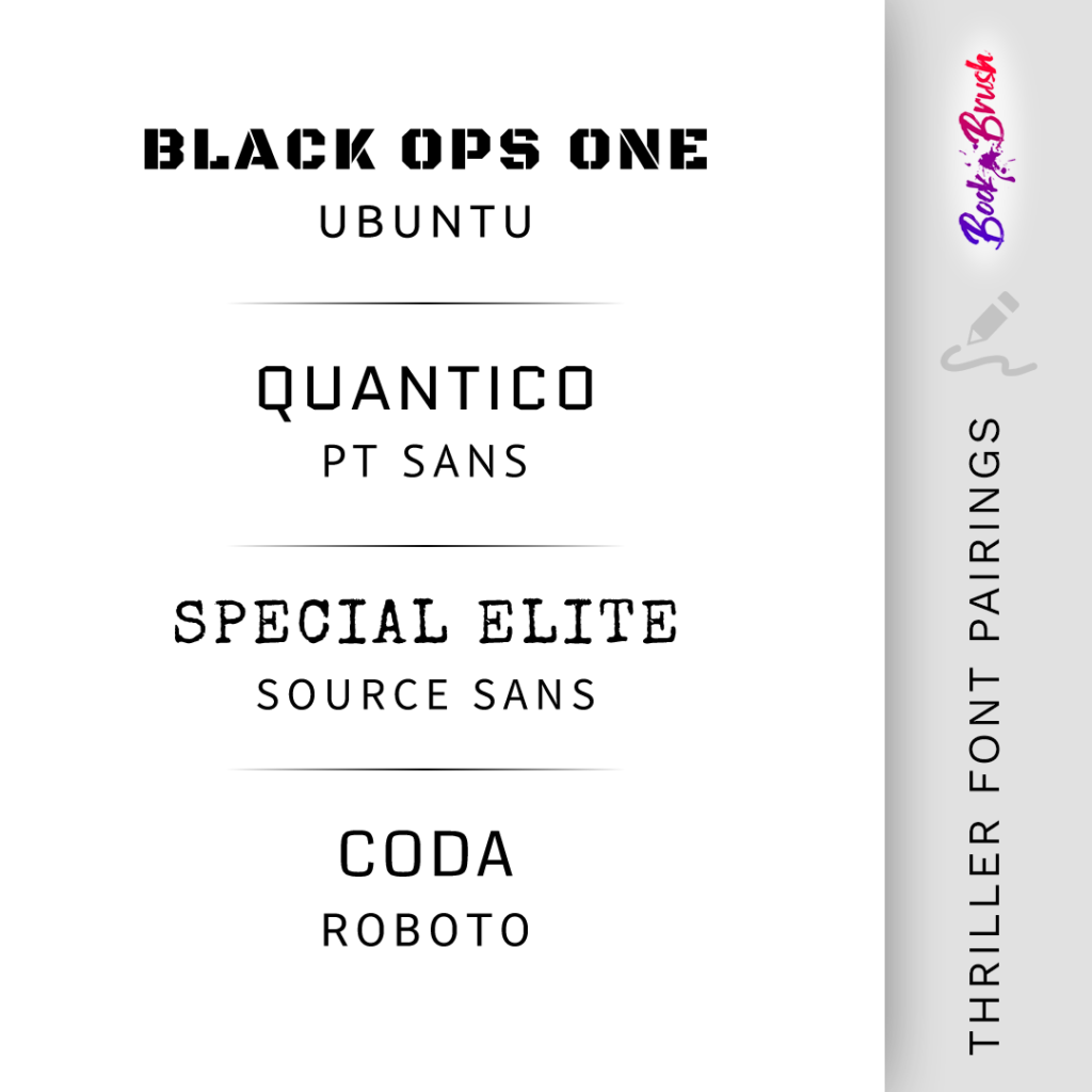
Thriller Font Pairings
Black Ops One + Ubuntu | Quantico + PT Sans | Special Elite + Source Sans | Coda + Roboto
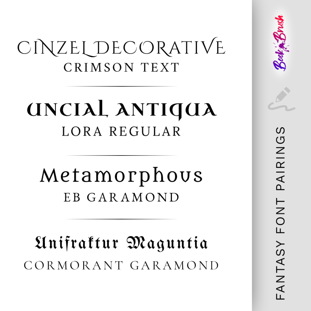
Fantasy Font Pairings
Cinzel Decorative + Crimson | Uncial Antiqua + Lora Regular | Metamorphous + EB Garamond | Unifraktur Magunita + Cormorant Garamond
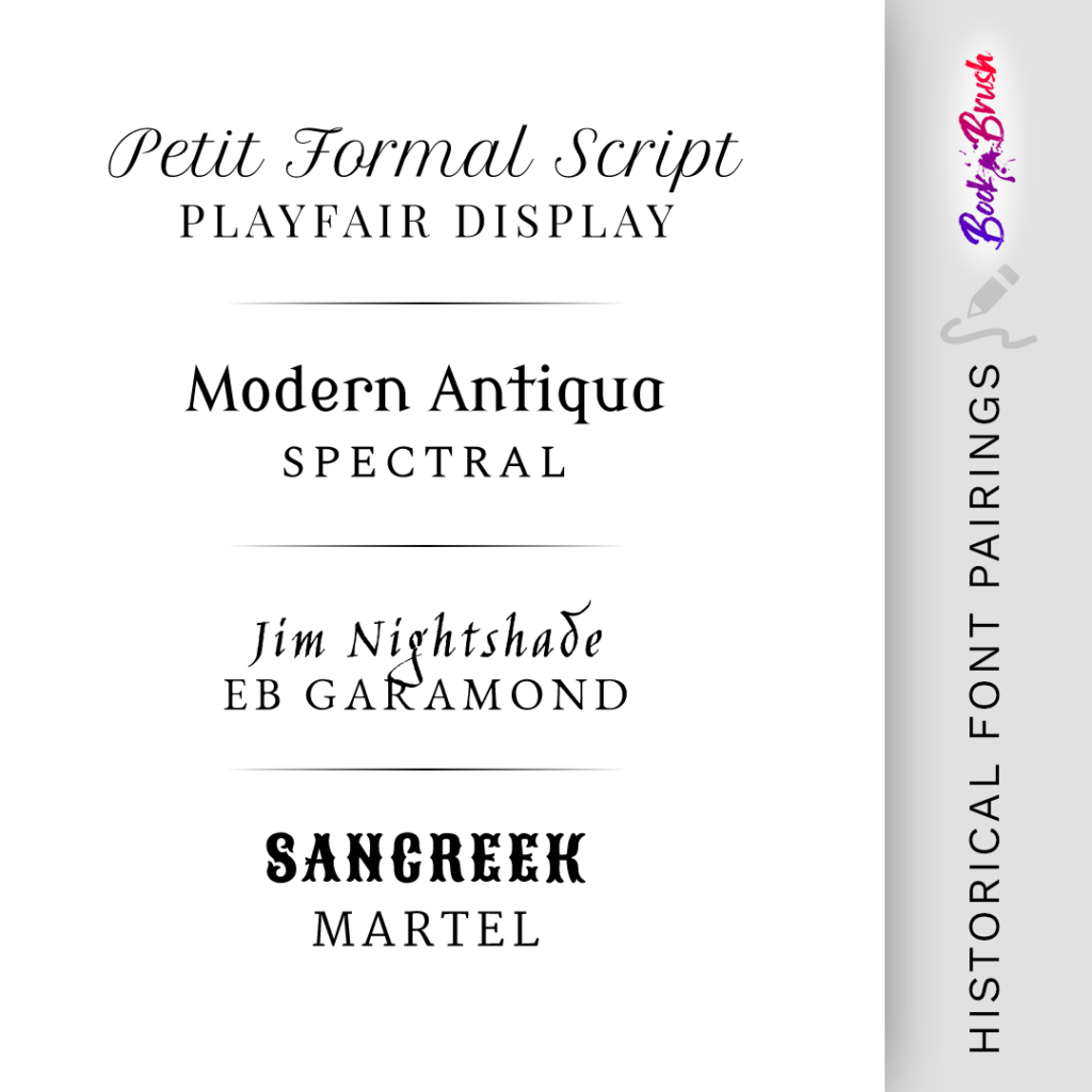
Historical Font Pairings
Petit Formal Script + Playfair Display | Modern Antiqua + Spectral | Jim Nightshade + EB Garamond |Sancreek + Martel
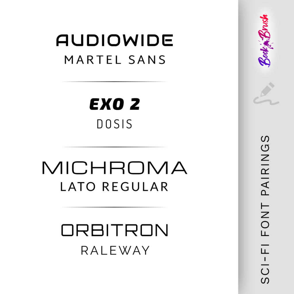
Sci-Fi Font Pairings
Audiowide + Martel Sans | Exo 2 + Dosis | Michroma + Lato Regular |Orbitron + Raleway
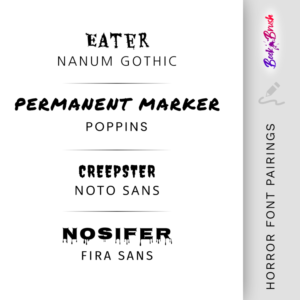
Horror Font Pairings
Eater + Nanum Gothic | Permanent Marker + Poppins | Creepster + Noto Sans | Nosifer + Fira Sans
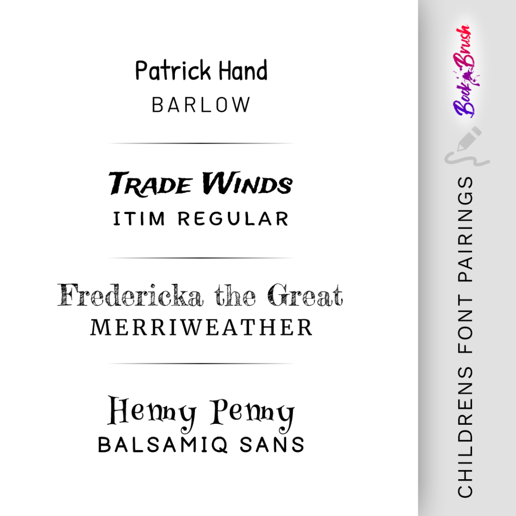
Childrens Font Pairings
Patrick Hand + Barlow | Trade Winds + Itim Regular | Fredericka the Great + Merriweather | Henny Penny + Balsamiq Sans
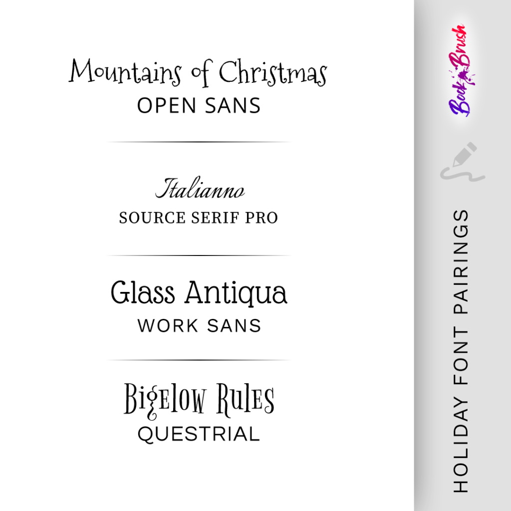
Holiday Font Pairings
Mountains of Christmas + Open Sans | Italianno + Source Serif Pro | Glass Antiqua + Work Sans | Bigelow Rules + Questrial
There are over 1,000 fonts available in Book Brush via Google Fonts. Additional fonts can be uploaded by users. This includes fonts that you’ve purchased from places such as Creative Market or fonts available on free sites like 1001 Fonts or Font Squirrel.
Looking for more genre specific font pairings? Find over 45 more font pairings in this blog post: 12 Genre Font Pairings for Graphics & Book Covers
 Article by Teresa Conner
Teresa is a freelance cover designer and lead graphic designer here at Book Brush. When not creating graphics for Book Brush or book covers for indie authors and traditional publishers, Teresa can be found writing erotic romance under her pen name Torrance Sené.