Do you use Instagram to promote you and your books?
I do. And today I’m here to show you ways to use mockups for your Fantasy or Sci-Fi novels with a different twist and make this great social media platform work harder for you.
- Tip: I’ve been studying Instagram and recently found out that when the poster (you) adds a somewhat lengthy caption, the post actually gets more interaction in the comments than a short caption. We all want that. So, talk about your book and maybe why you chose this image.
Book Brush gives you a super-easy way to create memes (we call them Instant Mockups) that are exactly the right size for Instagram. Easy how-to steps at the end … but don’t skip the examples. 😊
Fantasy Instagram Mockup Ideas 1-4
Looking for a corresponding color
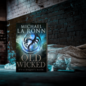
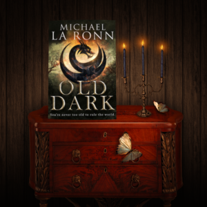
Michael La Ronn uses rich colors in his covers which is what I used to choose the Instagram meme examples. And he has a tag line on the cover: It’s A Dragon’s World, which can feed into the feel of the image.
This cover looks gritty, and maybe you wouldn’t think it was a typical fantasy image, but it could be, who knows what time period a dragon’s world is in, and I can’t imagine a dragon is a pristine creature. The tag line could be added if wanted as there is room at the top.
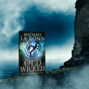
This cover uses color from the cover and a sense of fantasy.
My takeaway is to look for colors then the content.
Looking for complementary imagery
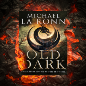
This color and fantasy image feeds into the tagline of It’s A Dragon’s World. While there is room, I don’t think you’d need to add anything more.
Everything feels right about this cover and its tagline; You’re Never Too Old To Rule The World. And adding that text to the meme wouldn’t take away from the instant appeal of this meme.
My takeaway is that the imagery can allude to the story or entice the viewer to read the caption and realize they just have to buy the book. And hopefully, the comments will reinforce that.
A Different Kind of Fantasy Novel Mockup Ideas 5-9
Using images to evoke emotion
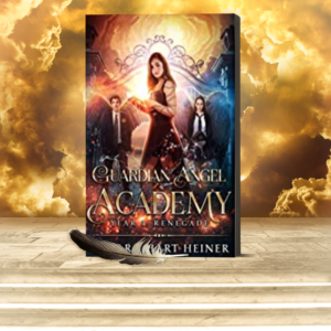
When I went to Amazon to look at the tagline in the description, wow, this fit almost perfectly: Evil exists. I know—I was created from it. But the title suggests something else. The tagline could be used easily in the meme, but I think it would serve better in the caption. Draw people in.
What does this image say to you after reading the tagline in the caption? Maybe bars/jail/captured/escape from those?
My Takeaway is to look at your tagline and see if you can find images that evoke emotion. Remember we all see things differently, so don’t just settle for one idea, expand your horizons, and post often.
Plant a sense of kinship between the viewer and you
Strategic images used in a meme can also plant a sense of kinship in the reader.
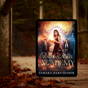
In this image, the model has long hair as does the heroine.
There is a touch of romance and yet maybe a love lost in this image. The author can play on this with either a bit of text in the meme or in the comments/description and appeal to folks who want or have experienced this.
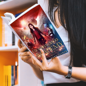
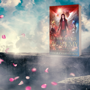
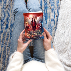
This shows a hip young-looking female reading, which may be Tamara Hart Heiner’s target audience.
My takeaway is that people will connect with images that give them a sense of kinship or belonging.
Sci-Fi Instagram Mockup Ideas 10-13
If you read the blog from MiblArt on Book Brush last week, you’ll notice they talk a lot about colors and genre. I found that post illuminating and started noticing that indeed there are trends in genre covers that are important to study.
As I was searching for covers to highlight for Fantasy and Sci-Fi, I noticed that many seem to be a hybrid of illustrations and photographs.
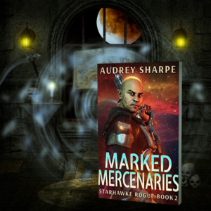
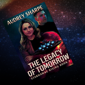
With that concept of illustrations in mind, I focused on images that centered on the science fiction aspect to enhance the sci-fi cover. This one feels futuristic.
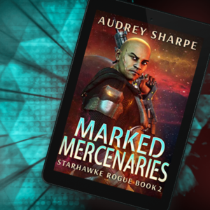
Here is a color similar to the cover’s font. And it has a Sci-Fi feel.
My takeaway is to use colors that enhance the cover and specific images that feel genre-specific.
Textures Verus Images
For this cover I wanted the color to play from the cover into the meme. I think this makes the cover pop. And the meme needs nothing else as the cover fills the meme.
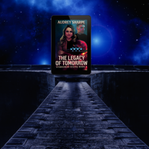
This was chosen as the opposite of the above. The eye is drawn to the image. This one felt the story was about a journey or a path to tomorrow. I wouldn’t add anything to this one.
My takeaway is that you can play with the cover being the focus with the meme being simple or find a meme that gives the symbolism for the story which works so well for Sci-Fi.
My hope is that these examples give you some new ways to look at creating memes for Instagram. Don’t get stuck on one idea, find many and see how your Instagram audience reacts.
The basics of using an Instant Mockup in Book Brush
- Select the Instant Mockup Tool
- Bring in your covers if they aren’t in the tool already
- Select the square shape as that is what is needed for Instagram
- Selecting various keywords to help you sort through the vast variety
- To have fun looking at all of the IM’s (Instant Mockups) don’t select any keywords
- Download

Article by L.A. Sartor
I started writing as a child, really. A few things happened on the way to becoming a published author … specifically, a junior high school teacher who told me I couldn’t write because I didn’t want to study grammar.
But the muse couldn’t be denied, and eventually I wrote, a lot. I learned a litany of new things and published my first novel. My second book became a bestseller, and I’m absolutely on the right course in my life.
Please come visit me at www.lasartor.com, see my books, find my social media links, and sign up for my mailing list. I have a gift I’ve specifically created for my new email subscribers.
