Twitter is an amazing platform for writers to connect with readers and writing colleagues. Accessed worldwide, 500 million tweets are sent each day. 326 million people use Twitter every month. And connecting is what it’s all about. Through the use of hashtags and lists, you can network with new people daily as opposed to other social media platforms where connections are made through people you already know. Twitter can help you to grow your reading community and increase interest in your books.
Research studies have shown that tweets with images get double the interaction than using a link’s preview picture. Besides getting more clicks and favorites, not only do images get double the interaction, tweets with images tend to get double the retweets. Get an influencer to retweet your tweet and your images have a chance to go viral.
Book Brush makes it easy to create fantastic images, not only for advertising your book covers but also for branding yourself as a retweet-worthy author. With eye-catching images and community-building tweets, you’ll find more ways to further your book-marketing than just sharing your blurb with a link to your book on Amazon.
Get started on building your Twitter community using Book Brush
- Register for a Book Brush account.
- Upload your 2D book cover(s) from your computer. Learn more about this in the Book Brush post, 3D Book Cover Creator: The Easiest Way to Convert Your 2D Book Covers.
- Choose the ready-to-use Twitter image size in Book Brush’s custom creator.
- And use Book Brush templates, background, and text options to create a stunning book graphic!
The Life of a Tweet
One of the important things to remember about Twitter is that the feed moves quickly. The half-life of a tweet is twenty-four minutes. But that fact allows you to post often without wearing out your audience. Images can be repeated on Twitter, but it’s best to keep your posts fresh and varied.
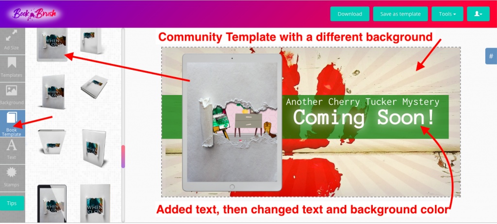
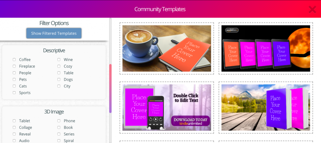
With Book Brush, you can create a variety of images quickly. In “Templates,” you’ll find community templates that are ready to go as well as a way to save your original creations.
Why Use Book Brush?
With an easy switch to your background or text, you can use the template feature for a continual stream of new graphics. Then you’re set to schedule tweets throughout your day and check in on them at your convenience.
You might already do this with a service that uses the same image for all your social media platforms. Facebook and Instagram photos crop oddly in Twitter. Instagram images won’t post Twitter images unless they’re cropped. And if you’re tweeting from Facebook or Instagram, the visuals don’t show up natively in Twitter at all.
By using Book Brush to make separate images for all your social media, you can easily convert the same images into the proper ratios for each platform. Plus Book Brush already has the proper image ratios with a simple tap on a button.
Let’s get started on creating images for Twitter. We’ll cover what makes a great profile and ideas for in-stream photos that will keep your tweets interesting and eye-catching. And more importantly, how visuals and Twitter etiquette can help you to build an audience of readers.
Size Matters
Each social media platform prefers a different image size. Twitter likes horizontal rectangles. Instagram squares. Pinterest vertical rectangles. Facebook likes horizontal rectangles and squares.
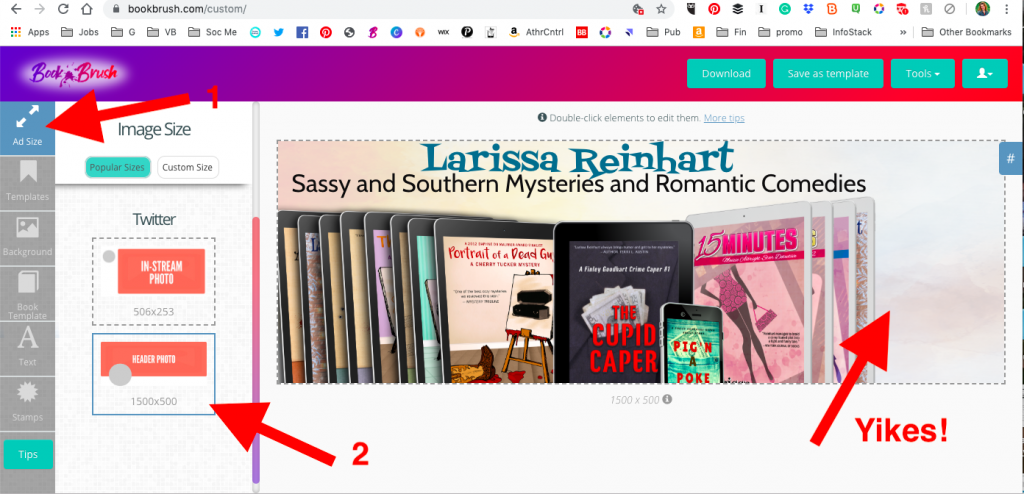
When you’re trying to save time by sharing content to multiple platforms, this feels like a pain. However, the size of the image is determined by the parameters of the platform. Therefore if you use an Instagram image in Twitter, this is how it will appear in the feed.
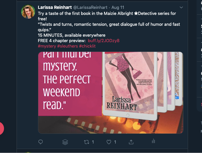
Yikes!
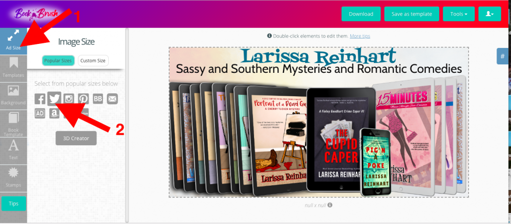
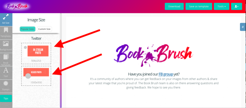
But don’t worry, Book Brush has you covered. Under Image Size, tap the Twitter (bird) icon.
![]()
Below you’ll see two choices. One for an In-Stream Photo and one for a Header Photo. The correct dimensions are below each one.
Branding Matters, Too
One of the great things about Twitter is that repeating images is acceptable, although you should also keep them fresh. One way to do both is to create a theme for your brand. You can brand a book series, your author platform, and/or your blog.
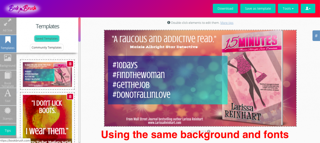
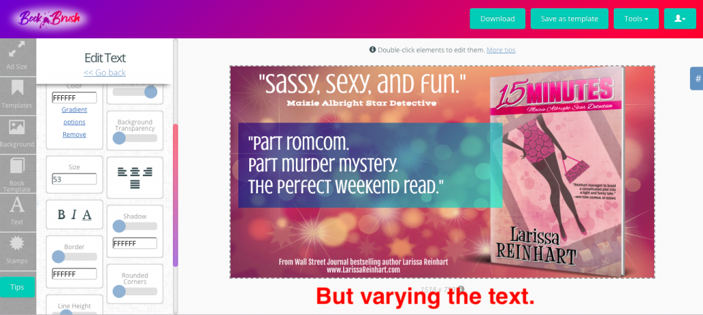
The easiest way to achieve a brand is in the use of consistent color, images, and fonts. Uniformity and simplicity are the keys. If you think of branding as a way to link your images together using color and font, it loses the “marketing fear factor” that makes writers like me panic.
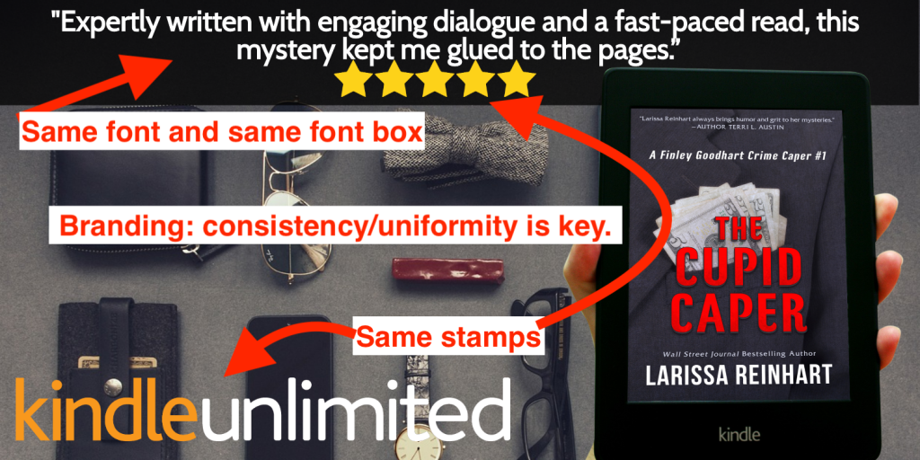
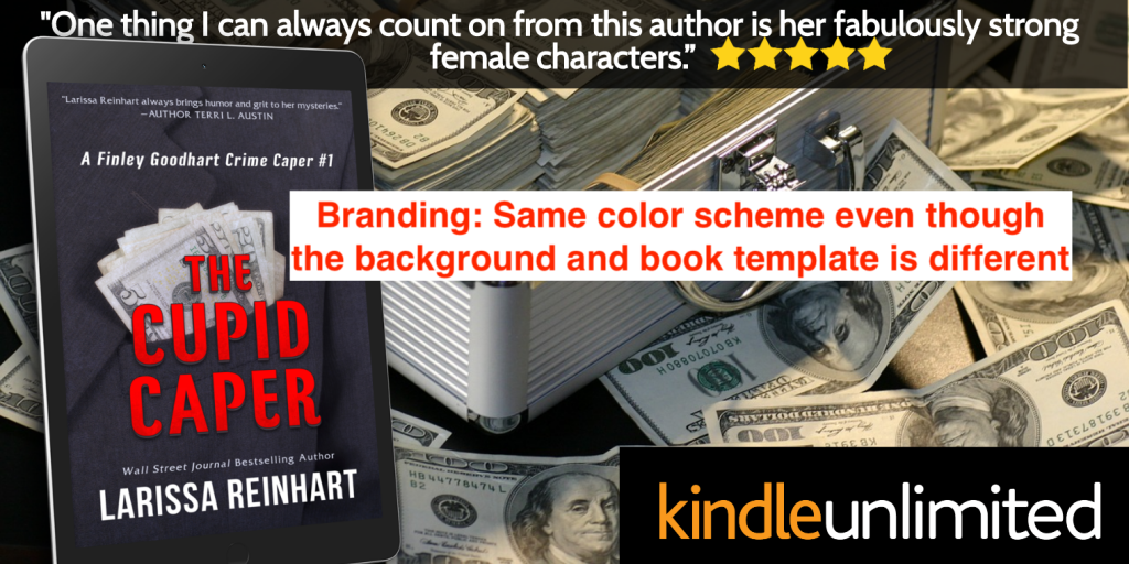
- Use Book Brush’s saved background function to easily find images that fit your book’s theme.
- Pick fonts that reflect your genre and style but are readable, particularly for an image that’s seen in a quick glance on a small screen. A Twitter feed moves quickly. Don’t make the reader work hard. A good rule of thumb is to not use more than two fonts. If you use a playful or creative font, make the other font standard.
![Twitter background and font]()
![Twitter varying text]()
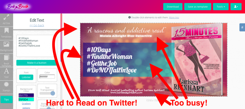
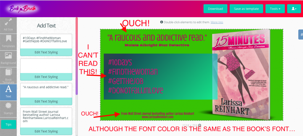
- Legibility is extremely important. Fifty percent of US consumers spend social media time on a small screen. Make your font size large and easy to read.
![Sample image hard to read]()
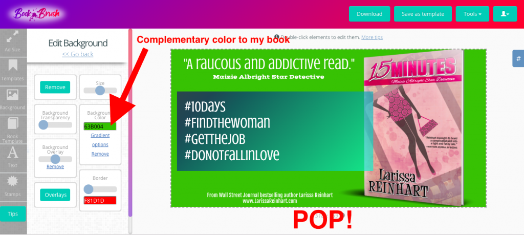
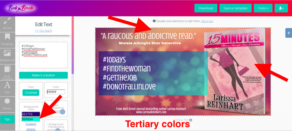
- Stay conscious of your color choice. Be bold but make sure the right images pop. You want your cover to be noticed, not an accent in the background. Be careful of mixing color—particularly font on a background—where there’s not enough contrast. Lack of contrast makes it difficult to read. Think light on dark or dark on light.
![Image with Complementary Color]()
- Mixing complementary colors—opposites like red/green, purple/yellow, and blue/orange—for fonts and backgrounds will make your letters pop, but only if you use the light-on-dark/dark-on-light rule. If they’re too close in shade, the colors will appear to vibrate. Vibration hurts the eye.
![What to avoid in your image]()
- If you don’t feel confident in choosing colors yourself, there are color calculators on the internet. Find your book cover’s main color on a color wheel and the calculator will give you its related colors.
Using Book Brush for an Amazing Profile
Your Twitter profile should be complete and optimized to make a good impression and grab attention. If your tweet catches someone’s eye, your profile is where they will learn more about you.
Use an easily recognizable profile picture. Remember it’s a thumbnail—tiny on a Twitter feed, particularly if read on a device. If you’re an author, a cropped closeup of your portrait will do. Put a link to your website or newsletter sign up in your profile description. Include keywords about yourself or books. Also, make your contact information clear.
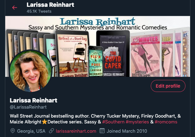
If you’re new to Twitter, make your Twitter name work for you. If you’re an author, use @yourauthorname. Cute and humorous names are fun, but if you want Twitter readers to find and recognize you, use your pen name. When using Twitter for another business, like editing, then use a Twitter handle that alludes to your business. @AwesomeEditing or @BookReviewsByMe.
Book Brush will help you to create an eye-catching header photo. With the pre-sized header, you can easily change it as the need or mood strikes. What to put in your header? The possibilities are endless, but here are some ideas:
- A review quote with a 3D image of your book. (Learn more about making a 3D cover here.)
- An invitation to download your lead magnet with the link in your profile.
- Your book series in 2D or 3D with your logo and/or website URL.
- Your upcoming/new release book cover and dates with the link to preorder in your profile.
- A Kindle Countdown or other sale with the books offered and dates.
- Cute kittens reading books. Type in “Kittens Books” in Book Brush’s background search. You get the idea!
Making an Easy-Breezy Header with Book Brush
- Open custom creator in Book Brush.
- In Ad Size, choose Twitter, then Header Photo.
- Use a template you have saved or a community template. (See my sizing hacks below.) Or start with an original background. Remember to keep your brand theme in mind.
- For my Twitter header, I want to present my series and author logo. I don’t want a lot going on in the background because the books will take up most of the foreground. I love Book Brush’s overlays because they offer subtle imaging.
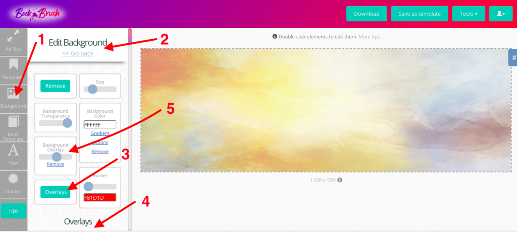
- In Background, click “Edit background,” the green bar at the top of the column. (If you page down to look at backgrounds, this will disappear. Just page up to find it again.)
![How to make a header]()
- In Edit background, I click on the green “Overlays” button, then page down to choose my overlay. I can adjust the transparency of the overlay using the “Background Overlay” toggle. This is the same area where you can change the size and transparency of your background photo. You can also use Background Color for a flat or gradient color if you don’t want any imagery.
![How to make a Twitter header]()
- Following the far left column, choose Book Template and add book covers. I already had all my covers saved on Book Brush, so no need to upload them. Want to know how I did this? Check out the Book Brush post, 3D Book Cover Creator: The Easiest Way to Convert Your 2D Book Covers.
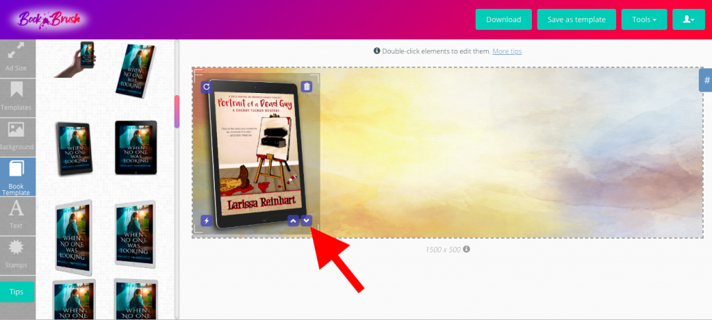
- I want to show all the books in my series, so I’ll keep adding books in the book template pane. And because I’m going to layer my covers, I’ll use the tiny arrows that appear in the bottom right of my book to help me stack them.
![Use Book Brush to feature many books in your header]()
- Moving down the far left column, add text. When the header is finished, save it as a template, then download it. Saving it as a template, allows me to easily change the header later.
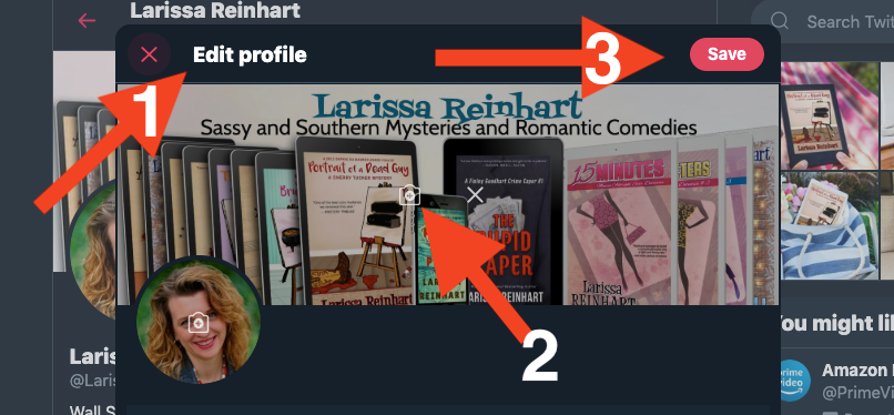
- Upload the downloaded Book Brush header in Twitter. In Profile, click the edit profile button beneath the header. In the header box, tap the camera icon, find the file on your computer, and open it. Be sure and tap save in your Twitter profile before exiting!
![Save your Twitter profile]()
Up Your Profile Game With a Pinned Tweet
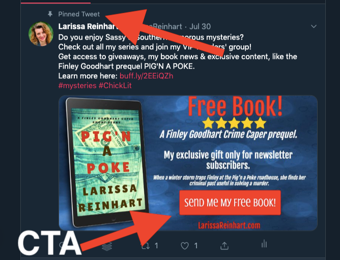
Another attention-grabber for your profile is a pinned tweet. This is a Twitter feature similar to pinning a post in a Facebook page. If someone views your profile, the pin will be the first post they see.
Use Book Brush for an eye-catching post with a “call to action.”
For example:
- An invitation to download your free lead magnet with a newsletter signup.
- A graphic with your first-in-series covers or book covers and a buy link (or link to your website) in the tweet.
- An invitation to review your books.
- Your latest release with the appropriate links.
- A catchy graphic to invite people to visit your website.
I change my pinned tweet periodically. Right now I have a call to action to download my free prequel by joining my newsletter.
Make a Tweet Collage with Book Brush
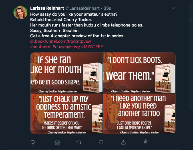
Another unique Twitter photo feature simply made in Book Brush is a collage. On Twitter, you can add up to four photos with one tweet. The images can do the storytelling you might find hard to type in 140-characters.
To create a collage on Twitter:
- Compose a new tweet.
- Click “Add Photo,” and choose an image.
- Click the “Add More” button and attach up to three more images.
I made this collage using Book Brush Community Templates by searching with the filter’s “descriptive” options. For some photos, I adjusted the images to fit the Twitter In-Stream Photo size (see my hack below on adjusting templates for another size.)
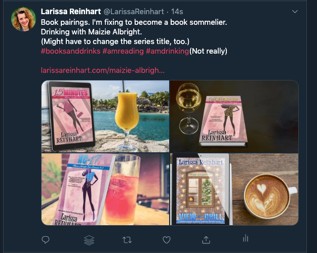
In this collage, I uploaded my background (the boot from my cover) and used the gradient feature in Background Color. After uploading my 3D book cover and adding text, I saved this graphic as a template. Then I only had to change the text and text sizing for each photo.
Get More Blog Views With Tweet-Worthy Images
Twitter is about making connections. This is the place to introduce new people to your brand as an author, as well as your humor, your interests, and your passions. Through the use of #hashtags and @mentions, you can find and be found on Twitter (see the Twitter tips at the end). With consistent tweeting, you can find your people and build an audience.
Use impactful images to gain attention and interest. Here are some ideas for using Book Brush to socialize with your Twitter audience. Have fun with these!
Twitter Hits—Quotes
Quotes are a popular retweet, easily proved by the trending daily hashtags like #MondayMotivation, #TuesdayThoughts, and #WednesdayWisdom.
Use Book Brush to make a quick quote to fit one of those popular hashtags with a simple background and text.
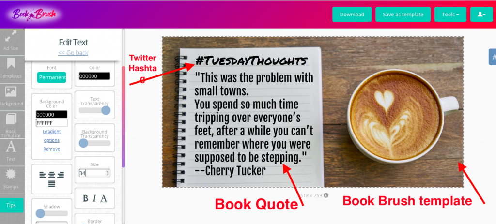
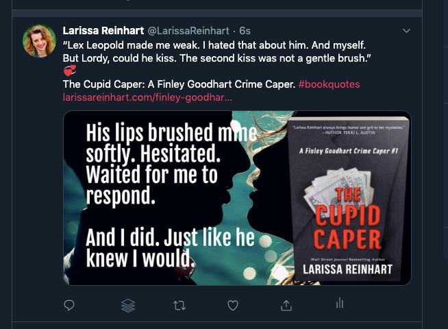
Quotes from your books can entice readers to learn more. They’re great promo tools for new releases and backlist titles. Tease readers with snippets and reviews without giving too much away.
Using Book Brush to Socialize With Readers
Similar to posting quotes, you can make quick photos with Book Brush to reach out to readers without pushing promotion. Images can create opportunities to make those connections that are so important in Twitterverse.
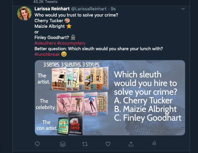
- Post a question in a graphic to encourage a twitter chat.
![Post a question on Twitter]()
- Share the love and make a quick graphic celebrating your writing friends’ releases and good news.
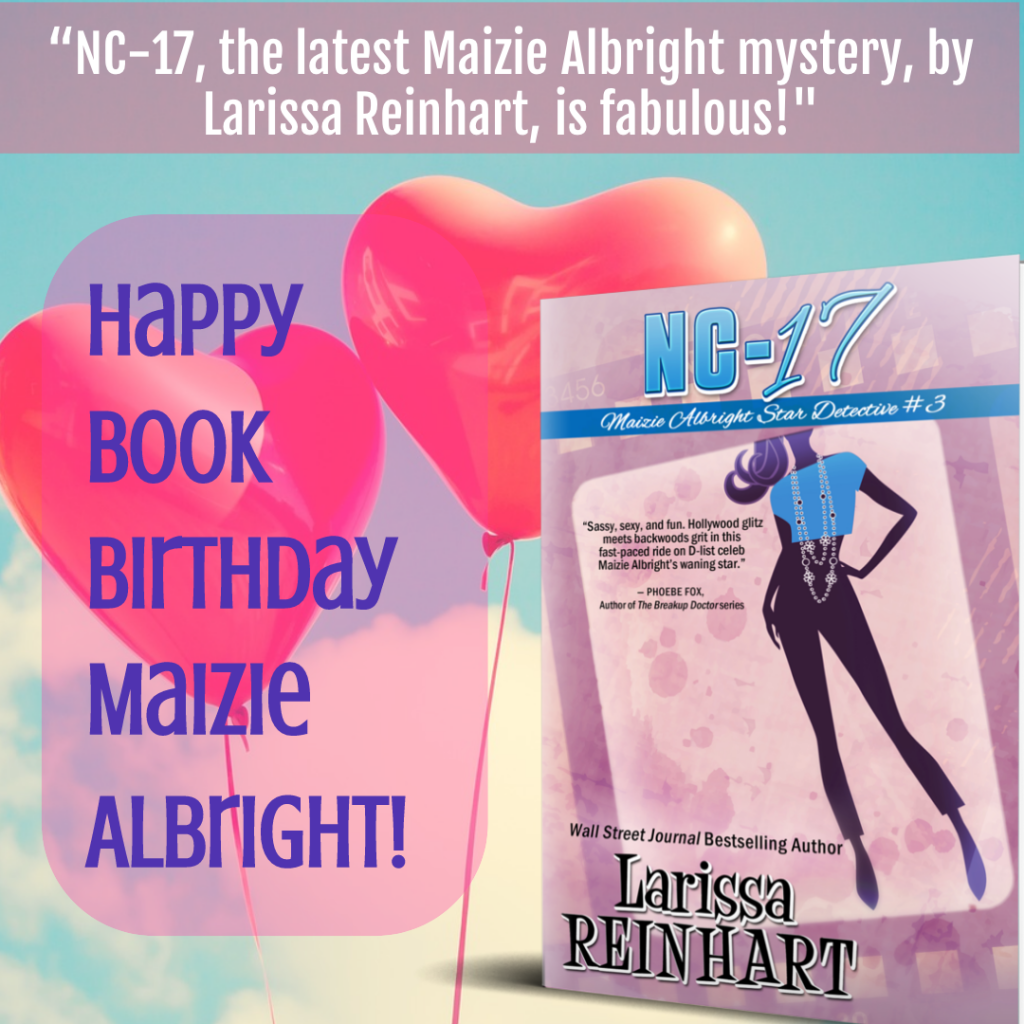
- I made the following photo on Book Brush in less than two minutes. After choosing the Twitter In-Stream photo size, I searched backgrounds, using the search term “birthday.” In the Text window, I typed a quick message, then downloaded it.
- Promote other people. Thank them for retweeting (RT) your tweets and RT their tweets.
- Share others blog posts, books, and resources. When you read a post you enjoy, tweet it and @mention the author, if you can. They’ll appreciate the share and so will their fans.
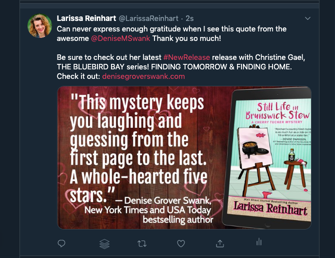
- Send thank-you notes when someone @mentions you. If a reader or reviewer @mentions you in a review, use the opportunity to show them your appreciation with a photo quoting their review. Pay it forward by giving them some free promo at the same time.
![Twitter Thank you note]()
Build Reader Audience Interest
A great way to share your new release is to create a buzz before the release happens. Like Facebook parties, you can party on Twitter without leaving your couch. Hashtags invite new people to join in the fun.
- As you’re writing, share information about your research and writing subjects by tweeting from internet sites and posts.
- Create a Twitter party with a cover reveal. Announce the time and accompanying hashtag for your reveal—like #mynewcover or #mybooktitle—in a series of tweets preceding the reveal. Use Book Brush book templates with short quotes from your book to tease your audience. Hashtag your genre, like #amreadingromance or #cozymystery, to draw in more interested readers.
- Upload your new cover in Book Brush to take advantage of all their 3D Creator tools. Learn more about converting your 2D cover to 3D in the Book Brush blog.
- Book Brush has a variety of cover reveal book templates to add a layer of mystery to your upcoming release. You can make a quick tweet photo by using their templates with a few adjustments as I did in this image.
![Use a cover reveal on Twitter]()
- Continue to build the buzz to your release with a series of countdown images. Use #newrelease along with a hashtag for your book or series. Tip: Remember to do a quick hashtag search on Twitter to check that the hashtag isn’t used for something unrelated. Include a preorder link.
- If you have early reviews or author blurbs, create graphics to share them with your audience. Remember to @mention the reviewer or author, if you can.
- On release day, share your excitement with prepared photos. Keep the posts interesting with a variety of images. For example:
-Your cover celebrating its book birthday. Use “birthday” in the Book Brush background search.
-Your book cover with a thank you to your readers for their support.
-Review blurbs with your cover.
-A photo or video of your pet or family member with your new book.
-A Book Brush graphic showing your 3D cover in all its available forms—ebook, paperback, hardback, and audio. Or present the cover in a grouping of the all the electronic availabilities: Kindle, phone, iPad, etc.
-Book Brush even has a template for showing your cover on a Smart Watch!
-Create a collage using Book Brush templates that show models reading your book in a variety of settings.
![show your book cover in a variety of settings]()
- Continue to celebrate your new release in tweets throughout the month. Brand the book by maintaining consistency in your color, font choice, and graphics.
-Create a Book Brush template with a review quote alongside your book.
-As you get more reviews, make new images by simply changing the text.
-Do the same with quotes from your book. Use Book Brush Instant Mockups (see below) for an even faster solution to a variety of images.
- Promoting sales and discounts for your books are another great way to garner reader interest. Eye-catching images will pique more curiosity, likes, and retweets than sharing from a buy page. You can easily reuse a saved template and add a call-to-action button stating the reduced price.
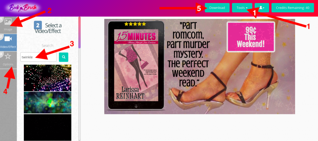
- Use the Book Brush Video Creator to introduce a special effect to your ad.
-Download your Book Brush image.
-Click the green Tools button in the top right of your screen and select Video Creator.
-In Image, choose your downloaded Book Brush photo. Tap Video/Effect in the far right column.
-Search for the effect and choose one appropriate for your image.
-Adjust the visibility of the effect in Options.
-Download your video and upload it to your tweet:
![Add a video effect on Twitter]()
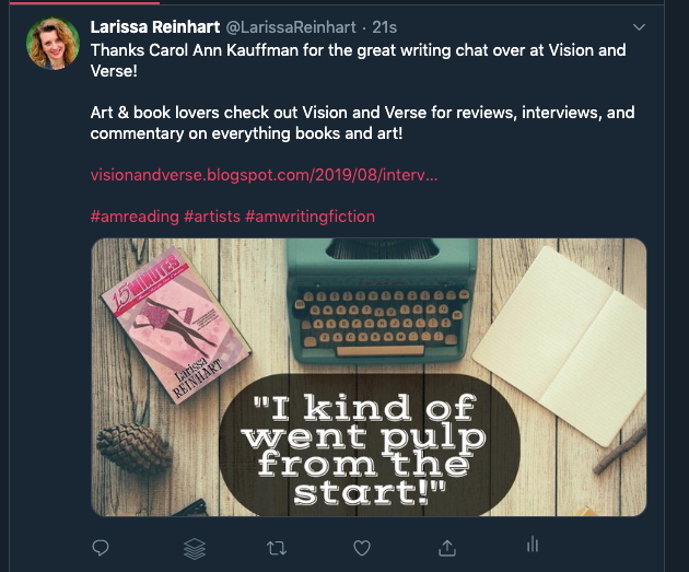
- If you’ve written a blog or have appeared in a blog for an interview or review, don’t limit your tweet to the images on the blog. Many times, it’s just your author photo or book cover. The size doesn’t always translate to Twitter dimensions, nor do the photos stand out in a Twitter feed. If you want people to click on the link, use Book Brush to make a clickable image.
- Use your book cover or an image that’s relatable to your blog piece, along with a catchy title or quote from the piece.
- If you’re writing the blog or are featured in a blog, why not design images that can be used for social media? Use Book Brush to create a graphic for the blog. The blogger will appreciate your effort.
A Book Brush Size Hack
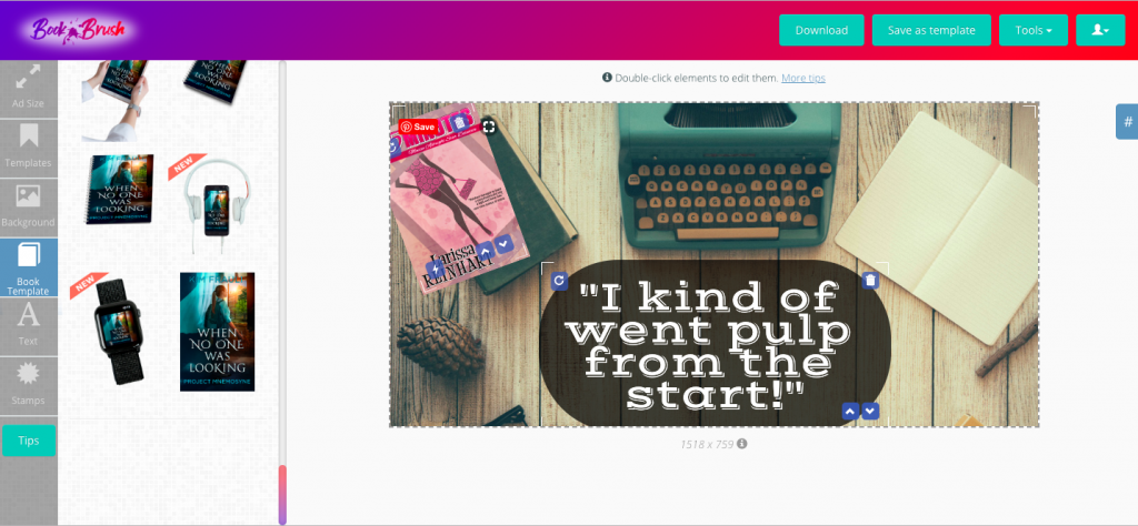
What if you’ve found a Community Template on Book Brush that you love, but it’s the wrong size for Twitter? Don’t despair. You don’t have to search through backgrounds to find one in the template.
I’ve found a hack for reusing templates I’ve saved. It’s a lot faster than starting from scratch, although it requires some modifications.
- Choose Custom Creator on the Book Brush homepage.
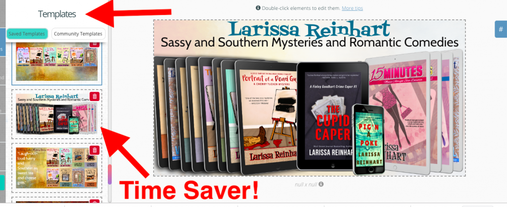
- Instead of first choosing your ad size, click the second box in the far left column, “Templates.”
- Choose a saved template.
![Saved Book Brush template]()
- In this case, I’m picking one of my saved templates that shows all my series. I have all my book covers uploaded to Book Brush. I used the book template feature to stack them in one photo so readers could see the relative number of books in each series without taking up too much space. This was a good one to save since adding all those books in one image takes a little time. However, I want to make a Twitter header and this is the wrong size.
- Now I return to the first box in the far left column, “Ad Size.”
- Under Ad Size, in the far left column, tap the Twitter icon.
![Twitter ad size saved template]()
- Choose your size. In this case, I’m going to modify a header photo for Twitter. Click on Header Photo.
![Choose your ad size]()
- As you can see, everything fits in the header space, but it’s not aligned well. I can’t have my profile picture looking like this! But all I have to do is slide the ebook templates to fit into the space more neatly. Therefore I can skip the “Book Template” button.
- I tap on the “Text” box on the far left and adjust my text. I need to reduce the size and center the text so it looks more appealing.
![Change your ad size for Twitter]()
- Voila. I’m done. I didn’t have to recreate the wheel, I just adjusted. With this Book Brush hack, it took me less than five minutes.
A Book Brush Background Hack
This tip is not an actual hack. It’s a genius time-saver that doesn’t cost you extra from the good folks at Book Brush.
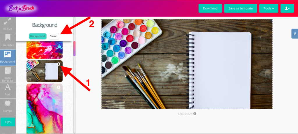
- If you click on Background in Custom Creator, at the top of the Background column, you’ll see two buttons: “Background” and “Saved.”
- Choose your background. I have a series where the protagonist is an artist, so I often type in “paint” for a background search. When I find a background that I like, I save it by clicking on a tiny arrow icon in the top right of the image. That background can be found in my “Saved” backgrounds.
![Book Brush saved backgrounds]()
- Next time I want to use that background, I look in my saved backgrounds. Easy peasy! If I feel it’s overused, I click the trash icon in the upper right to move it out of my “Saved.”
Yet Another Book Brush “Keepin’ It Fresh” Hack: Instant Mockups
Besides Community Templates, Book Brush also has Instant Mockups. These are great to use in a hurry. Just remember that these mockups are available to the entire Book Brush community. Use them sparingly or they lose their effect.
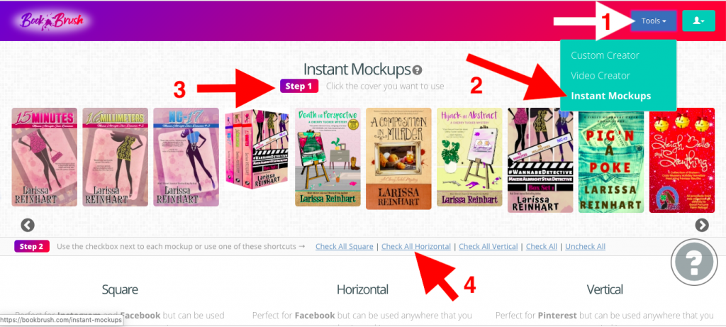
- Click on the Tool Box (green box in upper right hand corner of the Book Brush screen).
- Click on Instant Mockups.
- Choose the Cover You want to Use.
- Pick the shape of the mockup. Since we’re tweeting, we’ll choose horizontal.
![Book Brush Instant Mockups]()
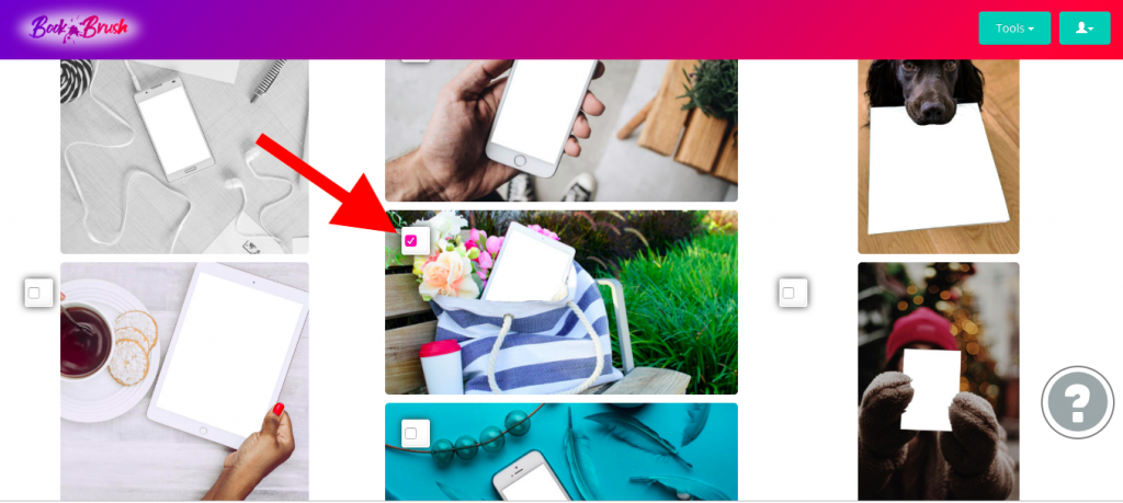
- You can check all horizontal (which will download your book in all the horizontal pictures) or scroll down to pick one horizontal image. I’d rather choose one. I’m thinking of a staycationy, take a little time to relax-type of tweet. I found a background that would appeal to busy women who might want a quick coffee-break read (my kind of people).
![Relaxing images in Instant Mockups]()
- I click on the picture and choose to download.
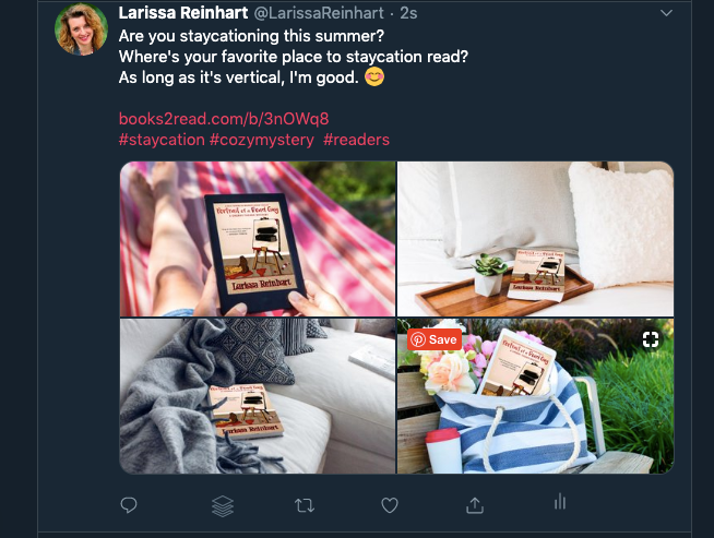
- Now all I need to do is compose my tweet and upload my download to the tweet. Since I’m going to do a 140-characters on why relaxing with my book would be such a treat, why not show different ways to do that in a collage? I quickly repeated steps 1-4, but this time I chose 3 more “staycationy” pictures and downloaded them all at once.
![Use Instant Mockups to tweet]()
Twitter Tips
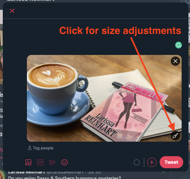
- If you have issues with your post’s image size, Twitter has a media edit function. After uploading your photo in a tweet, a paintbrush icon will appear in the bottom right corner of your picture. Clicking on the paintbrush will reveal a screen where you can crop or resize your image.
![Adjust ad size onTwitter]()
- Use the @mention tool as much as possible. Think about who you can mention when writing a tweet. Twitter is all about making connections.
- Use the right #hashtags. They’re meant to help people find you and for you to connect with others. Don’t use more than one or two in a single tweet, three at most.
- You can easily Google “Twitter hashtags for writers” to get popular hashtags options. If you use a hashtag and aren’t sure of the connection value, use Twitter’s search feature and test it. If the hashtag is too obscure, you won’t make connections. If it’s too popular, it might be difficult for your tweet to be found.
- Use lists (curating your own groups of Twitter users) to make it easier to connect and spend less time wading through tweets.
- Don’t forget to thank people for their retweets. Be gracious and retweet others’ posts, too!
- Have fun on Twitter with all these ideas for images using Book Brush. Remember the 80/20 rule of social media etiquette. 80% of your tweets should be entertaining, informative, and educational. Be gracious and retweet others. Only 20% of your posts should be directly promotional.
________________________________________________________________________________________________________

Article by Larissa Reinhart
A Wall Street Journal bestselling author, Larissa Reinhart writes the Cherry Tucker Mystery, Maizie Albright Star Detective, and Finley Goodhart Crime Caper series as well as romantic comedies and women’s fiction. She loves to tell funny stories about Southern women looking for love (and sometimes dead bodies) in all the wrong places. You might have seen Larissa and family with their little dog, Biscuit, on HGTV’s House Hunters International “Living for the Weekend in Nagoya” episode, but they’re back in Georgia now. Visit LarissaReinhart.com to learn more.
