A book release is an exciting time for authors. It’s also nerve wracking and filled with tasks that must be done for a successful and engaging launch. I’m going to help make the graphic part easier for you.
COVER REVEAL IDEAS
I usually start my launch or pre-release with a cover reveal or a sequence of reveals.
Idea 1
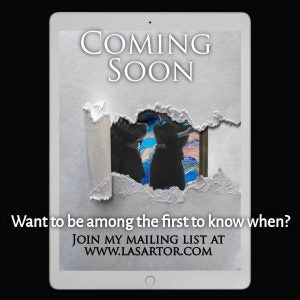
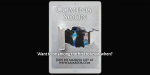
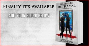
You can create a fast, teaser image using Book Brush’s torn paper reveal.
1. Start with Ad Size in the Custom Creator.
- I’m using the square Instagram Size
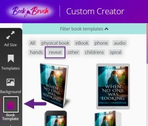
2. Then click Book Templates and filter under REVEAL.
I played with a couple of the templates to see how much of the cover I wanted to reveal, and chose the one with the least amount of reveal. It’s totally personal preference, but as I’m going to do a full reveal in the next month, this is a teaser.
I want people to wonder about the cover and want to be “in the know”, thus my “ask” for them to join my mailing list.
Once you choose your book template, click on the cover you want and presto, it’s ready to go on your ad.
3. Now add the text you want.
- I have 3 text boxes here.
- Be sure and use that # in the upper right corner of the canvas to line everything up.
4. Save as template.
5. Download and post to Instagram.
Idea 2
Since I liked this imagery so much, I decided to make a Face Book Ad size. Pretty easy!
1. With the ad you’ve just created still on the work surface, go up to the new size ad you want and double click.
- Now simply adjust the elements to the space. USE THAT GRID FOR CENTERING
For those of you who follow me on Facebook, you’ll see just how it looks!
I’m going to use the same image on Twitter so will create a Twitter size the same way as above.
1. Just click on the Twitter Ad Size and slightly rearrange.
How easy is that? Very.
Idea 3
Add to your original reveal.
You can use the same image you created to start the buzz, then reveal more and more. This is another fun way to tease your audience as you’re building to pre-release time.
1. Start with the template you made for the single reveal and add another torn reveal that shows a different part of the book.
- Add text to the top of the 3d book template just like I did on the center reveal
2. Add text on the right.
3. Add Arrow from stamps, sized and rotated.
Idea 4
Here you have three teaser reveals to keep people in suspense.
1. I did the same steps as above, brought in another book template from the reveal search.
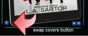
And if this idea resonates with you, remember you can easily swap out covers by using this little image that you’ll find in every book template Book Brush offers.
Here’s bonus fun idea.
1. Pick your ad size.
2. Search for Crane in Backgrounds.
3. Add a 3d template with a semi-reveal.
- rotated it to fit the swing of the crane
4. Add text boxes.
5. Add the two arrows from stamps, size and rotate as necessary.
PRE-ORDER IDEAS
Now that the buzz has started, and you have your pre-order all set up, let’s get people clicking on that buy button.
However you set up your pricing, I think it’s a good idea to put that price in the ad.
While I’m keeping the cover the same, each platform has unique needs, so I’ll changing each ad just enough to create a sense of consistency.
Idea 5
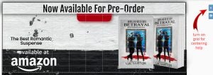
Are you going to sign up for a pre-release notification on BookBub? I think it’s a great idea. While there is a charge for this based on your follower numbers, it’s one way to get those presales up. This particular announcement ad is made by BookBub and consists of your cover, links and price and is sent via email.
But if we want to make a paid ad, here’s an idea.
- Remember, BookBub ads only look clear when seen in BookBub. They are tiny and will look blurry on any other site
- I enlarged this ad so it wouldn’t look blurry
- ps. I added an arbitrary price 😉
1. Choose BookBub for your ad size.
2. Find a background, or your cover.
- Don’t make the ad too busy, Book Bub doesn’t like text heavy ads
3. Added my 3d books.
4. Added stamps.
- Retailer, blood splatter, and red tag at top
5. Added text layers.
Idea 6
Create FB Cover Images
1. To simply switch my ad size, I left the BookBub ad on the canvas and just changed my ad size to Face Book Cover.
- double clicked twice on the new ad size
2. I had to reorganize my items a bit.
- Tip, remember, on your profile page, your image goes smack dab in the middle at the bottom. Leave room by using the hashtag on the right side to show you the center of your canvas
- On your Face Book Page, your image goes to the left side bottom with a small arc into the image, so leave room for that
- Use that GRID to help align your text and objects, like stamps and book templates.
By the way, the schedule you choose for preorder and when you want to start your ads is entirely up to you. I won’t go into this but there are several resources on the ‘net to help. And BookBub has many blog posts about releasing and pre-order stacking.
Idea 7
Remember, images generally make a stronger impact on the reader than words. Try to intersperse your newsletter text with images.
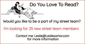
In case you have a Street Team or want to start one, add something like this in a newsletter prior to your preorder newsletter.
This was superfast to create.
1. FB ad size.
2. Plain white background with a red border.
- You set the border color in background edit screen
3. I used a stamp searching for person reading a book.
- Then just added my text
This is one of those evergreen images you can use whenever you need to. Just download to your computer and pull it when you need it.
Onward to presenting that the presale is now available to your core group, meaning your newsletter subscribers.
1. I used FB ad size.
- I use this all the time just in case you hadn’t noticed😉
2. I brought in the background watercolor texture of my book.
- Uploaded to backgrounds
- And since I didn’t want it stretched and it was a vertical image, and didn’t fit I added a black text box
3.Created a text box without text.
- Filled it with black
- Sized it larger by pulling out the one of the corners
- Rotated it and put in place
4. Added my 3d book.
5. Added text.
- It will be the blurb which I’m currently in the middle of writing
Make it easy for them to order with one click and add your link in the newsletter text.
Don’t forget your other social media! Remember Book Brush makes it easy to create images for all the major media sites, like Pinterest, Twitter etc.
Have fun playing with different styles, and then when you find one you like, be consistent throughout your social media and newsletters. This way, if a reader sees it on Twitter or FB or in your newsletter, there is recognition.
Play with some reveals of your own and post them to our Facebook group.
 Article by L.A. Sartor
I started writing as a child, really. A few things happened on the way to becoming a published author … specifically, a junior high school teacher who told me I couldn’t write because I didn’t want to study … urk … grammar… That English teacher stopped my writing for years.
But the muse couldn’t be denied, and eventually I wrote, a lot. I learned a litany of new things and published my first novel. My second book became a bestseller, and I’m absolutely on the right course in my life.
Please come visit me at www.lasartor.com, see my books, find my social media links, and sign up for my mailing list. I have a gift I’ve specifically created for my new email subscribers. And remember, you can email me at Leslie@LeslieSartor.com
