We’ve all heard of them. Facebook ads. To some authors, they’re a vital component of any successful marketing plan. To other authors, they’re this ethereal, mysterious thing to be feared—or at least looked at with suspicion. Well, I’m here to try to demystify them for you and show you a few tips to increase your ROI on your Facebook ads using BookBrush.
Note: Before I begin, I want to give you one very important tip about Facebook ads. You must test for yourself. There is no single solution for an amazing Facebook ad, even though there are some tried and true paths to success.
Ad Basics
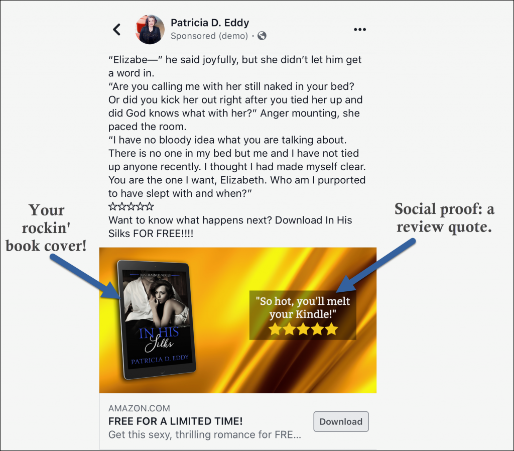
Before we can get into the guts of Facebook ads, let’s look at a couple of example ads. These ads are some of my most successful ads to date, and I created them exclusively with Book Brush.
What goes into an ad?
Primary Text: This is the text above the image. You can use a short snippet of your book, part of the blurb, or write something totally new.
As a general rule, Facebook will only display the first three lines of the text, especially on mobile, where most ads are seen and served. So make sure your first three lines are the best they can be.
One of the most common formulas for this text for the romance genre is the following:
- Who’s he?
- Who’s she?
- Why can’t they be together?
If you’re writing mysteries or thrillers, try something like this:
- Who died? (What was stolen? What went wrong?)
- Why should the reader care?
- What are the stakes?
If your book is non-fiction, perhaps the following:
- What’s the problem?
- How does it affect you?
- How can this book help?
Website URL: This is the destination of your ad. Usually, this will be your book’s Amazon page, but you can also use a universal link if your book is available on other platforms, an audiobook link, or a link to your website.
Headline: This is the bold text underneath the image.
Here’s one of my real-life headlines: Love romantic suspense? You don’t want to miss this!
The headline tells readers exactly what they’re getting. If you’re using a particular trope in your book, test out some ads with the trope listed.
- Second chance romance for lovers!
- You’ve never read an Academy romance like this before!
- Rock stars, a secret baby, and a world tour!
Other options for your headline? Talk about the book’s tension points.
- Survive. Fight. Find a way out.
- If I lose her, I’ll lose everything.
- He needs an heir. Love was never on the table.
- A murder. A locked room. An explosive ending.
Description: This text is only shown when your ad is viewed on a computer (not on a mobile phone). Often, I won’t even add a description, but when I do, I often add something like “FREE in Kindle Unlimited!” or in the case of my audio books, “Narrated by…”
Your image: This is what will make readers stop and check out your ad. A great image has dramatic colors or stark blacks and whites. Other items you can add to your images include:
- Your book cover
- Social proof
- Store icons
- A sale or FREE “stamp”
Social proof can take a variety of forms. If you’ve reached a milestone number of reviews on Goodreads or Amazon, call it out. “Over 1000 5-star reviews!”
However, one of the most effective types of social proof is a review quote. Readers want to know how a particular book is going to make them feel.
Here are some of the best review quotes I’ve seen while browsing Facebook ads:
- You’ll ugly cry!
- You’ll stay up all night!
- I couldn’t put this book down!
- Don’t start this book before bed!
- Characters so real, you’ll want to invite them home for dinner.
- I had to call in sick to work. This book wrecked me in the best way.
Some of those are a little long to put on an image, but you can always put them in the text for the ad or in the newsfeed description.
Facebook Ad ROI
So, now that we know some of the basics about Facebook ads, what’s ROI? And why should you care? Well, at its simplest, ROI means “return on investment.” If you spend $100 on a Facebook ad, you want to make more than $100 in book sales from that ad. That’s a 100% ROI.
On my Facebook ads, I strive for at least a 200% ROI. So if I spend $100, I want to see $200 in sales.
ROI is also related to conversion. Conversion, at its core, is a measure of how many of the people who clicked on your ad actually purchased your book. Unfortunately, Amazon doesn’t tell you which of your sales came from Facebook ads, AMS ads, also-boughts, or word of mouth. However, if you watch your sales and your ad spend carefully, you can generally get a sense of how well your ad is performing.
One of the best ways to increase conversion on a Facebook ad is to use an image with your book cover on it.
By putting your book cover on the ad, everyone you reach with your ad will know right away that they’re clicking to find out more information about a book. Not only that, but when your potential customer reaches your Amazon (or other eBook store) landing page, they’ll see the same cover, which will help them feel comfortable that they’re in the right place.
When it comes to adding your book cover to Facebook ads, here’s the bottom line:
Adding your cover will almost certainly increase your cost per click (CPC). However, as long as your book cover is on point for your genre and of good quality, it will also almost certainly increase your conversion.
How Book Brush Can Help
I use Book Brush for almost all of my Facebook ads. Here are some tips that will have you creating Facebook ads like a pro in no time at all.
Choose your image size
For years, Facebook ads were always 1200×628. Recently, they’ve introduced square ads that are 1080×1080. Personally, I’ve had better luck with square ads, but you’ll have to test for yourself to see which is best for your particular ads. Remember, the most important component of a successful Facebook ad is testing.
Pick a compelling background image
Your background image is going to be the first thing your potential customers see. Look for images that will stand out but are also easy to understand. Take a look at this image.
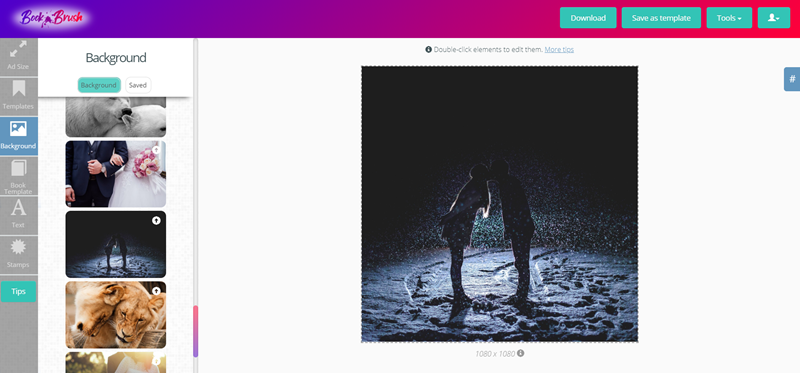
It’s a stunning image. However, when viewed on a mobile device, it’s dark and a little hard to understand. Is it a couple? Is it abstract art? Now, take a look at this second image option.
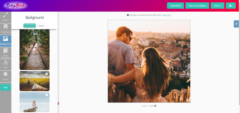
It’s much easier to see that this is a couple. In addition, they’re off center a bit, which leaves you room to add your book cover in the top right of the image. As a final bonus, the image has an orange flare to it, which will help it stand out on the Facebook mobile app.
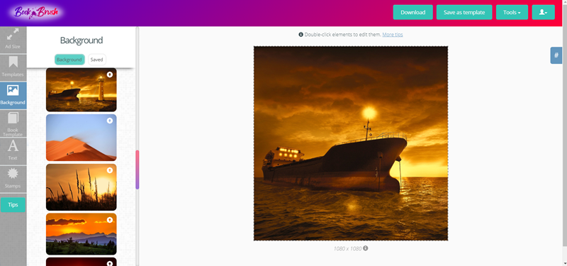
You can choose photos of people or scenes that are appropriate for your book, or you can use objects or textures. Here’s a fun one that could work for a mystery surrounding an abandoned ship at sea.
Book Brush offers you tons of free-to-use images in their search. But, sometimes image searches can be a little frustrating. Here are some tips for finding the best images.
- Use a variety of phrases. In other words, don’t just search for “couple.” Try love, romance, proposal, wedding, etc.
- Use colors. Searching for Orange, for example, will show you photos of oranges, sure. But it’ll also show you a lot of sunsets, orange patterns, and more.
- Look for textures. Silk. Satin. Mosaic. Patterns.
- Try emotions. One of the best searches I ever did? I searched for the word “scary.” That produces everything from ghosts to abandoned houses to creepy dolls to foggy streets.
Add your book cover
Next, add your book cover. Book Brush gives you a wide variety of templates to choose from. My favorites are the 3D templates for one main reason: Facebook doesn’t think the text on a 3D book cover counts towards the total amount of text you’re allowed to have on an ad image.
You want to choose a book cover template that fits with your image. Here are two Facebook ad images with the same background and two different book cover templates. Which one looks better?
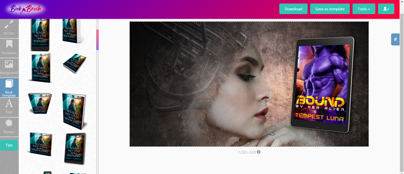
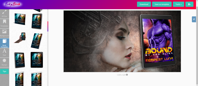
The first one, right? Because the book is facing the woman in the photo.
You can resize your book cover template easily by dragging the handles on the edges. To preserve the aspect ratio and avoid distorting your image, hold down the SHIFT key while you drag the cover bigger or larger.
Add some text
Here’s where you can really have some fun. Facebook has strict rules about how much text you can have in an ad image. Their max is 20% text. They have a handy little website where you can upload your image and see you’re over the limit. Just upload your image here: https://www.facebook.com/ads/tools/text_overlay
When you add text to a Facebook ad, you want to keep it short, to the point, and easy to read. I recommend avoiding a lot of the fancier fonts that Book Brush offers. Save those for teasers you post on your Facebook page or on Instagram.
A lot of images don’t lend themselves to text overly well. Take a look at this draft. I added the same text with three different stylings on a terrific image. But you can’t clearly read the top and bottom ones, can you? Nope. And the middle one, while readable, requires that background shading, which I think looks a little…odd (though that’s personal preference).
So, what are you to do?
Experiment! I love one of Book Brush’s newest features, the text shadow. Simply select a contrasting color, move the little slider, and voila! Take a look at those three options now!
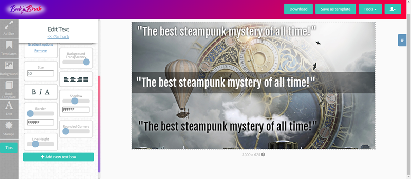
Definitely better. But maybe not quite good enough. So, other hacks?
Play with your background transparency.
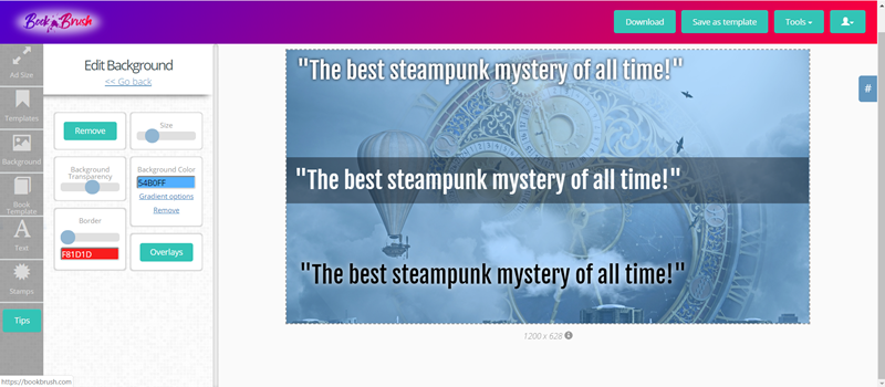
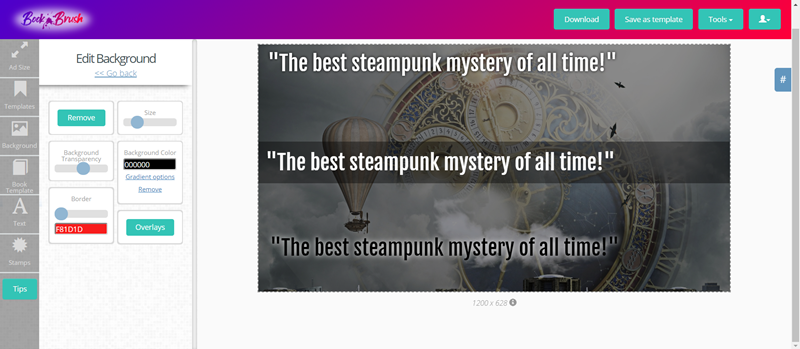
Now we’re getting somewhere.
Once you have text you can read easily, you’re ready for the last step.
Stamps
Book Brush includes a wide variety of stamps you can use to enhance your ad. Personally, I love adding the five stars to my Facebook ads. It’s an image that readers recognize, and paired with a review quote, those stars are pure gold social proof.
You can also add stamps for a $0.99 sale, a FREE sale, to denote an audio book, and more. One of my favorite new features, though, is Book Brush’s ability to let me add custom stamps.
Sometimes, those yellow stars just don’t mesh with my image. So I created my own star stamps. I’m going to share them with you too. Just right click on the images and choose Save Image As, and you’ll be able to save your own black stars, blue stars, and red stars. Then, you can upload them directly to Book Brush.


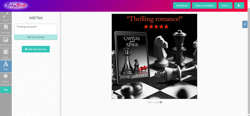
Here’s an ad I just created for this article. In this case, a black and white image can work really well because my book cover is mostly black and white. I accented it with a pop of color with the Social Proof quote and the stars.
Wrapping things up
We’ve covered a lot in this Facebook ads tutorial. “Let me explain… No, there is too much. Let me sum up.” (Bonus points for recognizing the quote and its source.)
Using Book Brush to create your Facebook ads can help you increase conversion and sell more books.
The best ads contain a striking image, a compelling quote or blurb-type short paragraph or couple of lines, social proof, and your book cover.
Test your Facebook ads regularly. Different quotes might work better with different images. A particular image might work better for one audience than another.
Above all, make sure everything on your image is legible, professional, and easy to read on a mobile device. According to some recent research, up to 96% of all Facebook users access the platform on their phones.
You wrote the books. Book Brush gives you the tools. Go forth and create those rockin’ ads!
![Headshot for Patricia Eddy]() Article by Patricia D. Eddy
Article by Patricia D. Eddy
Patricia D. Eddy likes to consider herself an unstoppable force. As long as there’s coffee. Then, the voices in her head come to life.
Her tales of werewolves, vampires and witches; Doms and subs; and battle-hardened, scarred military heroes feature characters so real, you’ll want to jump inside the pages of her books to be friends with them. Or just give them a hug.
When she’s not writing, she’s a professional freelance fiction editor and technical writer. On weekends, she loves to take on home improvement projects, especially if they involve power tools.
Patricia lives in Seattle with her husband and very spoiled cats. You can find Patricia all over the web, and she loves to hear from readers. Check out her website at https://patriciadeddy.com.

 Article by Patricia D. Eddy