The back cover is something not many authors really think about when getting their book designed. With the plethora of clients I’ve worked with, only about 98% have even mentioned the back cover design to me. It’s often something they don’t even consider until after I’ve sent them the first draft. But the back cover can be something really special when shown a little love.
In this post, I’ll discuss both design tips and writing tips to help you nail a back cover readers can’t resist.
Design Tips
Contrast matters.
As stated in a previous blog post, contrast is “is defined as the difference between two or more elements in a design or layout. The bigger the difference, the easier it is to read or understand.”
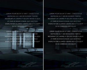
Readers need to be able to legibly read the blurb on your back cover. Ask your cover designer to incorporate fades, shadows, or subdued color on the back so your copy can be read clearly and without any difficulty. Here’s an example from one of our Book Brush cover templates:
See how much easier it is to read that back cover copy when there’s a black shadow added behind the text. The higher contrast makes that text pop! I did this by simply using one of the color blurs available in the Cover Creator (they are located under “Community Images”) and lowering the opacity so just a hint of the background image shows through.
Less is more.
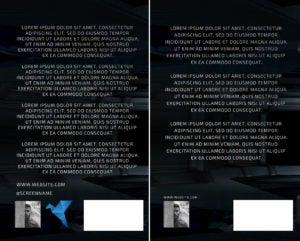
Don’t overwhelm your back cover. Keep it simple. Keep it clean. If you have a long blurb, try not to also add things like your website, your logo, author photo, and social media handles. It’s a lot of clutter. You need some negative space to really shine, especially since a barcode box will be printed back there as well. Here’s an example of too much and just right, using the same back cover as above (with a white box added to simulate the barcode).
See how a shorter blurb gives the words more room to breathe. Also, deciding on one or two things to feature on the back (in this case the author photo and website) looks so much better than piling everything back there. It’s cleaner and more professional.
Tie your front cover into your back.
Nothing is more boring to me on a cover design than a plain back cover that’s nothing more than a color. Sure, it ticks the boxes of contrast and readability. But it’s also incredibly unexciting. Bring elements of your front cover design into the back. This creates something fun and interesting to look at. This is especially great if your blurb is on the shorter side.
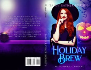
Above is an example from a client of mine. Her blurb was very succinct and left a lot of room to play with. So I wrapped around the wall behind the main character and added a cute little cauldron to continue the witchy theme. Your entire print wrap should be a complete work of art, not just the front cover. Don’t neglect the fun you could be having and giving your print readers!
Blurb Writing
Now we’re going to talk about the back blurb itself. Writing a blurb that hooks readers matters even more than all the design tips in the world combined. Unless you’re a traditional author with books in physical stores where readers can actually flip it over to check them out, your blurb (not the back cover design itself) is what readers will encounter first with online retailers.
Don’t write a story summary.
Many authors still think that the best way to write a blurb is to basically summarize the entire story. That’s great for a synopsis, but that’s not a back cover blurb. A blurb is marketing copy. Its sole purpose is to entice and hook your targeted reader, causing them to buy your book. This is the place where you put down your author hat and put on your business hat. Don’t give the plot away. Tease it. Become friends with the word succinct. Create a sense of urgency and leave them wanting more (which can only be found by buying your book).
Focus on tropes, if possible.
Commercial fiction is full of tropes. Chock full. This is what readers love and adore, even if they themselves don’t realize it’s causing them to gravitate toward something. Tropes can be found in characters, scenarios, or worldbuilding. “Grumpy antihero.” “Friends-to-lovers.” “The chosen one.” “Found family.” “Buddy cop partners.” “The powerful artifact.” “Witty sociopath.” And the list goes on. A good site to help you hone in on what your story includes is TV Tropes. (This can be good for plot bunnies as well 😉)
Of course, if you tend to write more literary fiction, you’ll focus less on tropes in both your story and your blurb, but tropes do still exist even in literary fiction.
Avoid passive voice and create intimacy.
Active voice creates a sense of movement and urgency. Just like in your book writing, you need to immerse the reader in your blurb. Don’t use filter words like saw, felt, thought, wondered, seemed, etc. These create distance between the story and your reader. For more information and examples, this blog post or this article.
Book recommendations for learning more:
- Got High Concept by Lori Wilde
- Romance Your Brand by Zoe York
- How to Market a Book by Ricardo Fayet (free on Kindle)
- Successful Self-Publishing by Joanna Penn (free on Kindle)
- Writing Killer Blurbs and Hooks by Adam Croft
 Article by Teresa Conner
Teresa is a freelance cover designer and lead graphic designer here at Book Brush. When not creating graphics for Book Brush or book covers for indie authors and traditional publishers, Teresa can be found writing erotic romance under her pen name Torrance Sené.
You can find her social media accounts and learn more about her at https://www.wolfsparrowcovers.com/ or https://www.torrancesene.com/.
