It’s well known that images capture the eye and attention faster than words. When you add movement to that image, you’ll often have that reader stay for the entire sequence of the ad because they’re interested in what will happen next.
Book Brush, who is all about images, is now giving us the ability to not only add a video to the background, we have the ability to add movement to the video or still ad. This increases our viewer’s attention span.
LET’S DIVE INTO THIS NEW TOOL
When you create animations, each element that you want to animate will be done individually. I usually begin by creating my ad completely, then adding each animation to the element.
My Standard Operating Procedure is to:
1) Pick my ad size
- For all these ads, I’ve chosen FB ad size
2) Add my background
- Searched under Christmas for this ad
3) Add my book(s)
- Chosen and created from Book Templates
4) Add stamps
- Search in Community stamps using keyword “retailer”
5) Add the text box(s)
A QUICK VIEW OF THE ANIMATIONS PANEL
Once your ad is made, pick an element you want to animate then scroll down the Options Panel for that element until you reach Animations.
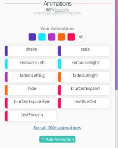
If you click on “See All 100+ animations” you’ll see everything available which are also color coded:
Blue ~ Attention Grabber
Turquoise ~ Backgrounds
Purple ~ Entrances
Orange ~ Exits
Red ~ Text
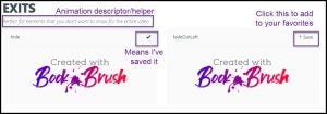
To select a favorite, click the upper right “save +” and it will add it to your Animations panel.
Also, in the animations panel, you can see your favorites in action as a reminder if you hover over them!
Now for the fun part.
However, don’t get carried away and make everything move. You lose the impact and the viewer will get weary quickly and click off!
SIMPLE 2-ANIMATION AD
These are the steps you’ll take on each element you want to animate
1) Click on the element
As this is a simple first animation for you to practice with I’m only animating the background and the text, so when it starts playing, the book, the mailing list CTA (call to action) and the Amazon stamp are visible.
FOR THE BACKGROUND
For the background animation I chose kenburnsRight
- Ken Burns came up with this method of making a still image move as if it’s panning (moving sideways) and zooming (growing larger)
After the effect is chosen you’ll set your animation times.
Duration ~ How long the Animation takes
- I have it set for 7 seconds, which means the background will take that long to pan and zoom
FOR THE TEXT ANIMATION
I wanted the western style text to fade in exactly where I’d set in as I was creating the ad.
- I searched in fonts and found Rye
The Duration is set to 1 meaning it’ll take 1 second for it to show and it will remain on the screen for the duration of the ad which is 7 seconds (remember, that’s what I set up above)
- Notice also that I have no EXIT animation as I want the text to remain.
If I wanted it to blur out, I’d use textBlurOut and set a delay for the number of seconds I wanted the TEXT TO Show and then blur out.
Simple, Fast and Effective
ANIMATION WITH VIDEO BACKGROUND
This is how I built it.
As with all animations, the first steps are the same,
1) Added my background, this time it’s a video
- I searched under video backgrounds, water
2) Added my book template
- I picked the white iPad as I wanted the colors to be simple
3) Added my 3 text boxes
- Note the “~Amazon Reviewer” is its own text box because I wanted a smaller font size
4) Added the Amazon Stamp in all white
- Search using keyword Retailer
The Book and the review quote are not animated. I want those to stay in the viewer’s mind!
NOW TO SET THE ANIMATIONS
The background was a 20 second video, I cut it 12 seconds. Remember people have short attention spans.
1) Double click on the background layer
You’ll see the options panel on the left come up
- Change the duration
- You can subtract time, you can’t add time
Here is the full animated video
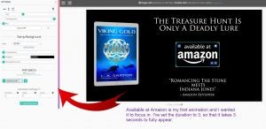
2) The first animation I want to appear is the Amazon stamp.
And for it to appear in the middle, exactly where I placed as I was building the animation
- I set the duration for 3 seconds, meaning it takes 3 seconds to become fully visible.
- Also notice I don’t have an EXIT animation for it, because I want it to be there for the rest of the time left which should be 9 more seconds (12 second play – 3 second entrance leave 9 seconds for it to show)
3) Now for the final animation, the tag line for the book.
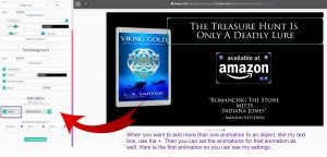
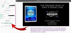
The tag line animation is a bit different. Remember, it didn’t show up until AFTER the Amazon Stamp. That’s because I used HIDE as my first animation for the tag line text box.
- I set the duration of HIDE to 1 second
Remember DURATION is how long the Animation takes to fully appear or to happen.
Now I’ve added a second animation to the tagline text. And I can set the settings for this one so it appears exactly as I want.
4) The animation recipe is:
- TextFocusIn
- Duration 3 seconds
So now it hides for 1 second (which I set under the HIDE animation)
And reveals or comes into focus in 3 seconds.
I’ve left off the exits again because this is what I want people to absorb for the 12 seconds they watch it (I don’t want it to disappear).
Remember, it’s important to not to clutter up your screen with too much, let it breathe and let viewer absorb it without the “squirrel” concept of dragging their attention all over.
MULTIPLE TEXT BOXES MOVING IN AND OUT
This one is fun, but a bit more complicated only because of the math. Don’t shriek, I’ve got your back.
Here is the animation and then I’ll dissect it for you.
As usual, I set up all that I wanted on the animation
1) Added a video background
- Searched for Palm Trees under video backgrounds
2) Added the 2 book templates
3) Added the 5 text boxes
- Including my small CTA under the covers
4) Added the Amazon stamp
- Search under keyword Retailer
Now look at the amination above again.
The only things that remain static are the book covers and my text box for my CTA.
TEXT BOX ANIMATION 1
First Book in The Kahuna Group Series
The animation is FadeInDown and the duration is 7 seconds which means it’s taking 7 seconds to fully appear.
TEXT BOX ANIMATION 2
Her daughter is missing…
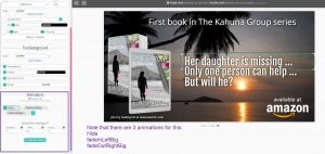
There are 3 animations for this sequence.
The first animation is hide
- Its duration of 7 seconds is because I want it to become visible AFTER the drop down box is done
The second animation is fadeInLeftBig
- Duration of 4 seconds
The third animation is fadeOutRightBig
- Duration of 4 seconds.
NOW you have 7 seconds (first animated text box) and 4 seconds (for this one) = 11 seconds (the exit time adds overall video length time, but not to the animation flow.)
TEXT BOX ANIMATION 3
Only one person can help…
Now that I have what I want to happen, the rest is easy. We’re using the same animations just changing the times.
The first animation is again Hide
- And remember, we just added the times together so this text box has to hide for 11 seconds.
The second animation is fadeInLeftBig
- Duration of 4 seconds
The third animation is fadeOutRightBig
- Duration of 4 seconds.
TEXT BOX ANIMATION 4
But will he?
And easy again. Same animations just changing the times!
The first animation is Hide
- Remember, we’re adding the time of the last animation HIDE to this one, so 11+4=15 seconds for hiding this text box to scroll in last
The second animation is fadeInLeftBig
- Duration of 4 seconds
The third animation is fadeOutRightBig
- Duration of 4 seconds
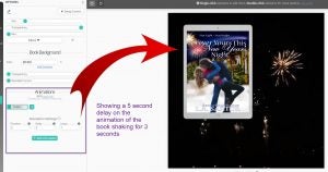
WHAT ABOUT DELAY
What does Delay do?
It simply adds a delay to your animation. Say you wanted a book to shake 3 seconds into your full animation?
WHAT ABOUT LOOP
It plays the animation over as many times as you want.
I hope this post gave you some fun ideas for ways to use animation and capture your audience’s attention faster while keeping them glued to the screen.
Want to add animation to your marketing toolbox? Upgrade to a Platinum on your account page.
 Article by L.A. Sartor
I started writing as a child, really. A few things happened on the way to becoming a published author … specifically, a junior high school teacher who told me I couldn’t write because I didn’t want to study … urk … grammar… That English teacher stopped my writing for years.
But the muse couldn’t be denied, and eventually I wrote, a lot. I learned a litany of new things and published my first novel. My second book became a bestseller, and I’m absolutely on the right course in my life.
Please come visit me at www.lasartor.com, see my books, find my social media links, and sign up for my mailing list. I have a gift I’ve specifically created for my new email subscribers.
