Wow, how fun and fast are premade animated templates? You get music, movement and your book cover all in one short meme!
Book Brush has created Animated Community Templates as a new approach to get movement into your ads, a mini book trailer if you will. And I will!
Let’s Get Started
Start with the Custom Creator Tool
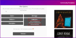
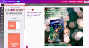
Then find Community Templates and filter to Collections then Animated Mockups.
- Tip: Be sure to turn on your speakers, these have music!!
Examples 1 & 2
Once you choose an Animated Mockup, the editing process is so fast. You can change the book cover, the text, add retailer stamps which you can animate or leave it as a static image, and even add a filter or overlay to the video background.
Example 1
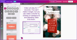
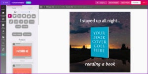
Here is the original animated mockup:
You can change the length of the video, although this one shouldn’t be shorter, as it would hard to process by the viewer.
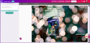
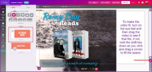
If you want to move the background video, you can by first turning on the eyeball to see the entire workspace, then click the background and move it.
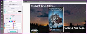
Here is the finished meme!
I ended up adding a new text box at the bottom. I love that Text7 animation on top, but for the bottom, I wanted a simple FadeIn. The cool part is you try an animation and if it doesn’t totally suit you, you can quickly change it.
The trick with these templates are to KISS them ( Keep it Simple Simple), thus making the most of your time.
Example 2
I can hear you all now … I love this meme, but I need a different size! At Book Brush we’ve got you covered.
Once you’ve picked your new ad size it’s then simply a matter of moving and sizing the elements to fit.
- Pro Tip: use my favorite eyeball tool to see what may not show on the workspace in the new size.
Example 3
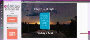
Here is the screen shot of the Animated Mockup I’ve chosen. You can see it’s 11 seconds. And it’s a square shape!
I want to make this a rectangular Facebook Size, so as above, I click on the AD SIZE and choose Facebook.
Again, that amazing eyeball tool allows me to see the borders so I can move or size the background to fit.
Then I edited the elements, and I added in a retailer stamp, having it FadeIn. Fast and simple!
- Tip: You have 100 animations to choose from
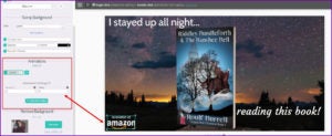
Once you’ve chosen the animation, then what? Duration means how long the animation takes to become fully visible on the screen. And Delay means how long it will take before it starts to appear. So in this video below, the Amazon stamp will wait 5 second before it begins to appear and will take 2 seconds to become fully visible.
Here is the completed animation.
Examples 4 & 5
Example 4
I wanted to bring in a book series, so I looked at templates that might lend themselves to my concept. I loved the popcorn template, but the music as too “romantic” for my adventure series, then I found this one. (You know I’ll use that popcorn meme some how!)
And here is the finished product. I added a FadeUp animation to the text box at the bottom and a static bar of retailer stamps. I moved the “READS” so it is behind the RAINY DAY just for fun (remember to use that up or down ^ to change the layer position.) This animated mockup runs for 20 seconds. And with the 4 text boxes I have, I think I’ll leave it that long to allow people to have the time to read what I’m showing.
- Pro Tip: you can make a set of retailer stamps in Book Brush. I used FB size, added what retailers I wanted, sized them, and then lined them up. I saved as a PNG which kept the transparency, downloaded it and brought it into my images to use whenever I want. I have a whole series of them, for dark and light background placement.
Example 5
Twitter size
Now I want to make this meme a Twitter size. And Book Brush, as you’ve seen, makes this easy.
Then I moved elements around a bit and added another element my CTA (call-to-action) for my mailing list. Both the CTA and the retailer stamps are static. While the music is a bit dreamy, the background of dark rain I think makes up for that.
- Pro Tip: I moved the video background so the puddle was in a strategic spot for my text box!
My Takeaway:
Book Brush’s Animated Mockups are fast and fun to play with. Great for creating social media memes. Try them all, remember, they are editable, so while one may seem a bit off for your initial concept, bring it into the workspace and see what you can do it. Keep the KISS concept foremost in your mind as you’re editing. And above all, have fun.
![Leslie Sartor photo]() Article by L.A. Sartor
Article by L.A. Sartor
I started writing as a child, really. A few things happened on the way to becoming a published author … specifically, a junior high school teacher who told me I couldn’t write because I didn’t want to study grammar.
But the muse couldn’t be denied, and eventually I wrote, a lot. I learned a litany of new things and published my first novel. My second book became a bestseller, and I’m absolutely on the right course in my life.
Please come visit me at www.lasartor.com, see my books, find my social media links including my YouTube Channel for writers, and sign up for my mailing list. I have a gift I’ve specifically created for my new email subscribers.
