I’ve said it many times, images often create more interest than words, and when you add motion, meaning animation, you exponentially increase your viewer’s interest.
I’m going to show you 3 simple animations using Book Brush’s animation tools in their Custom Creator.
- Tip: The animation tools in Book Brush are simple to use, just remember to add the animation Hide when you don’t want your object to show.
Example #1
I decided to make a Face Book sized ad, so picked that ad size to set up my workspace.
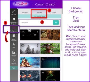
Of course, my first fun task is to find the animated background.
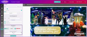
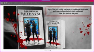
Then once selected, I find it easier to put everything on the workspace and then figure out my animations. Oh, I feel like a movie director 😊 Below is the layout I’m going to animate.
I decided not to animate the review quote because I thought it would be better to be a still object as the background is already moving, and I wanted the books to fade in one after another, with the retail stamp as the last animation. I think it would have been too much.
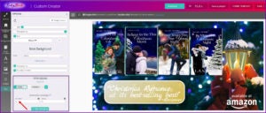
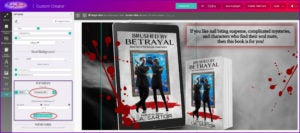
To set your animations, click on the object you want animated. In this case, the far right book, and your Options Panel opens.
Scroll down to find Animations.
I already knew I wanted my books to fade in exactly at the spot I’d placed them. They didn’t need to bounce or shake, just appear.
- Tip: use the eyeball tool to help line up anything, in this case the books.
And I knew I wanted to wait 3 seconds before the first book was revealed which would give the reader time to digest my text that was already on the screen.
Then I set each of the other books. Here is book two.
The trick now is to Hide it first for 3 seconds, then the FadeIn starts.
Remember, the first book started in 3 seconds, no Hide.
Third book.
I set the duration (remember it’s for the Hide feature) for 6 seconds. And did the same for the fourth book, setting Hide for 8 seconds.
I wanted the retailer stamp to show after the 1st book, so I set the duration for the Hide exactly as the second book is set.
To be honest, it really went fast once I had everything set the way I wanted it look on the screen. I played a bit with the timing to get the look I wanted.
- NOTE: On these animations I added music using Window’s photo program. See this post to find out how. Easy. And of course, you don’t have to add the last page like I did. I just wanted to show it was possible and why it may be important if you’re giving attributions.
It’s a simple animation and I can change out the retailer stamp to any of my other retailers and use this animated ad over and over. Don’t you just love Book Brush? I do.
(All the assets you’re using from Book Brush are licensed for you to use, nice.)
You can count the seconds and see when each comes up (*I realized I made the 4th book only 8 seconds, but it works, so I left it). Be sure to turn on your speakers 🙂
Example #2
This is a twitter sized ad. And it wasn’t any more complicated than the first one. In other words not complicated at all.
Again, I laid out all the images the way I wanted, moving some behind or in front of other images.
- Tip: Remember those arrows on each object that look like this ^ either pointing up or down are moving that object behind or in front the other object. So in the case, I moved the iPad image behind the blood splatter.
I searched the video backgrounds for smoke and found one that lasted about the amount of time I wanted.
- Tip: Remember you can shorten a video background but NOT lengthen it.
You’ll see I still used Hide for all of 1 second, but it was enough. And then I used a ZoomInLeft.
Then I just continued what I did in the first animation, adding the times that felt right for me. The blood splatters come in at the same time.
I also added music and an outro (ending) card at the end, but again that’s not necessary, it’s just a fun step. (See link for this above.)
When you want to search for just the right animation if over the 100 Book Brush has, click Add Animation and browse, remembering to scroll down to see them all!!
The finished ad.
Example #3
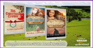
This time, I wanted a pastoral mountain ranch scene to play behind the books.
So again, I laid out all the elements and the timing for the all the reveals and realized the scenery plays a big part in the ad. I ended up leaving the books static, so they’d get more attention, and then added the animation for the text and retailer images.
In this final video you can see what I mean by the background playing such an important role.
Here is a short video Book Brush has made showing you the steps I talked about above.
Last Words
There is a lesson to be learned when you create animated ads. DON’T try to animate everything as the eye has nowhere to settle. More is not better in this case.
Also remember, you don’t have to have a video background to animate an ad, you can have a static background and still move in your objects. I just think having the video background adds another dimension to keep your viewers’ attention.
How long you make your ad is up to you, but as this TikTok blog has shown us, shorter seems to be better.
Have fun, play with the timing, the animations and just enjoy the process. After all, you’re the director.
 Article by L.A. Sartor
I started writing as a child, really. A few things happened on the way to becoming a published author … specifically, a junior high school teacher who told me I couldn’t write because I didn’t want to study grammar.
But the muse couldn’t be denied, and eventually I wrote, a lot. I learned a litany of new things and published my first novel. My second book became a bestseller, and I’m absolutely on the right course in my life.
Please come visit me at www.lasartor.com, see my books, find my social media links, and sign up for my mailing list. I have a gift I’ve specifically created for my new email subscribers.
