One of the most important tasks you can undertake to support your authoring career is to create a compelling, easy to use, and informative website for your readers.
Do I really need a website?
Won’t readers find me on Amazon, Barnes & Noble, Apple Books, etc.?
Your readers will absolutely find you on the various eBook, audio, and paperback retail sites. However, your author website is like a one-stop-shop where your readers will be able to check out your books, sign up for your newsletter, and more.
What should I include on my website?
Your author website should reflect who you are as an author and a brand. Key components might include:
- Covers and descriptions of your books with purchase links
- Your author bio
- Your social media links
- A newsletter signup form
- Anything cool or special that sets you apart from other authors
- Have a podcast? Link to it!
- Do you love to make book trailers? Show them off!
- Send your visitors to your Facebook reader group!
When you’re designing your website, it can help to check out other phenomenal author websites for inspiration. The 10 websites I’ve included here are some of my favorites both because I happen to love the authors but also because their sites are easy to navigate, visually stunning, and have all the information I need to know about the author and their books at my fingertips—or my mouse.
#1 – Colleen Hoover
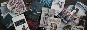
Colleen’s website is simple, romantic, and clean. Her header is just her signature and tagline – Professional Make Believer. Her carousel of images is clean, and I loved the artfully arranged photo of her books.
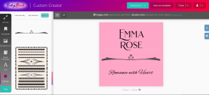
If you don’t have professional photography experience—or an easy way to take a picture of all of your books in one place—you can use Book Brush’s Custom Creator to make one.
#2 – Susan Stoker
It’s no secret that I’m a huge Susan Stoker fan. But that’s not why I’m including her website. She has an amazing amount of information packed in to well-organized and easy-to-navigate pages.
Plus, her header image is striking. What romance reader wouldn’t want to stare at that header?
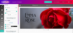
It’s incredibly easy to make a dramatic website header in Book Brush. The dimensions you use will vary by the theme you choose for your site, but you can upload your author logo as a custom stamp in Book Brush, and then pair it with a dramatic image for maximum impact.
My other favorite feature of Susan’s website? Her downloadable list of all of her books. She’s a very prolific writer, and her books span multiple series. Having a series reading order is a must for anyone with long series. Your fans will thank you for it.
#3 – Melissa Storm
This author of cozy mysteries, women’s fiction, and inspirational romance has a website that ties all three genres together with a heck of a lot of personality. Her color scheme, easy navigation, and fun, breezy style (as seen in both her fonts and her prose) make her visitors feel welcome from the very first click.
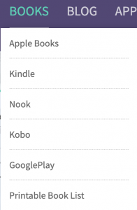
Melissa also utilizes a printable book list, and one of the most interesting things about her website design in my eyes? She breaks out her books not by series, but by retailer. Want to see everything she has available on Kobo? You can do that with one click.
#4 – Ilona Andrews
Ilona Andrews is the pseudonym for a husband-and-wife writing team, and they’ve long been another of my one-click authors. There are two eye-catching pieces to their website that stand out above all the rest.
First, their top level menu is beautiful. The fonts are lovely, but more than that, they complement the Lion head logo. You can almost believe the Lion was “typed” in the same font as the rest of the menu items.
If you have custom fonts that you love, you can upload them to Book Brush and use them in all of your teasers, your website header, and more.
The second thing I love about their site? Take a look at their newsletter signup banner.
They tell you right up front that you’re joining 30,000 people! Who wouldn’t want to join a list that was that popular? Not only that, but you can choose how often you want to receive their messages.
#5 – Wendy Webb
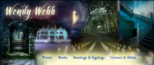
Wendy Webb is the author of several bestselling gothic novels, and her website bucks the recent trend towards clean, simple, and bold. Her header is actually what most designers would call “busy.” Yet it works on every level. At least four different images are all blended together to create a dramatic and very gothic look. Her books are front and center, with clear buttons that tell you exactly how to buy.
#6 – Alyson Santos
The very first time I went to Alyson’s website, I was struck by how perfect her header is.
It’s time to believe.
One sentence. Black and white. Over her name.
Striking. Emotional.
You can create something similar using Book Brush and custom stamps.
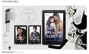
Alyson has a beautiful main graphic with her latest release that also features the previous two books in the series and links directly to Amazon. Most of the rest of the site almost fades into the background in the face of that gorgeous image.
While one of the best reasons to have an author website is to share a good amount of information about your books, series, schedule, and more with your fans, there’s also something to be said for having a site that puts only the most recent release front and center.
After all, we all want our most recent releases to shine, right?
All her other information is still present, still accessible. It’s just not right in your face.
#7 – S.L. Scott
S.L. Scott writes small town romance, and my favorite part of her site? The rotating carousel showing all of her books. What better way to get you excited to click around?
She focuses on her latest release next with a large cover image, the blurb, and links to buy.
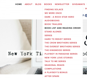
Her book list is easily accessible from her header, and she lists her most recent three releases first, followed by a breakdown by format, series reading order, and information about her various series.
#8 – Jayne Frost
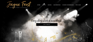
Jayne writes Rockstar romance, and her website reflects her brand perfectly. Her header image is black and white with just a brief ribbon of golden color in the musical notes.
The LET’S ROCK button takes you directly to a trio of images with a coming soon teaser and her last two releases.
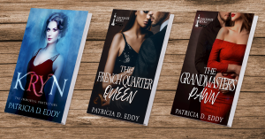
You can create those stunning 3D book images with Book Brush using the Custom Creator or 3D Book tool. It only takes a couple of clicks!
#9 – Kylie Scott
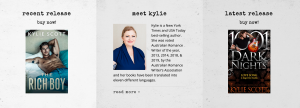
Kylie Scott’s website features a revolving carousel of her books front and center. The header is simple and striking, and her typeface for her menus looks like an old-school typewriter.
But my favorite part of her website is right below the carousel. She showcases her two latest releases, but in the middle is her photo with the header: Meet Kylie. This gives the whole site an approachable, down-to-earth feel. Like this is a woman you could be friends with, even though she’s a New York Times and USA Today Best-selling Author.
#10 – Dean Koontz
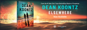
Dean Koontz is a household name and has been for some time. He writes suspense, and his website reflects that vibe on every page. From the dark background to the clean font choices, to the dramatic banner image—at the time this article was written, an advertisement for his book Elsewhere—every page is designed for maximum impact and efficiency.
You can create a stunning banner image much like the one for Elsewhere using Book Brush. To match your background image to your book cover, try searching for an image by color! For example, entering the search term “orange” will show you images of oranges, but also sunsets, orange flowers, and more.
Whatever website vibe you choose, Book Brush can help you create stunning graphics for the header, your book pages, and your social media accounts.
 Article by Patricia D. Eddy
Patricia D. Eddy likes to consider herself an unstoppable force. As long as there’s coffee. Then, the voices in her head come to life.
Her tales of werewolves, vampires and witches; Doms and subs; and battle-hardened, scarred military heroes feature characters so real, you’ll want to jump inside the pages of her books to be friends with them. Or just give them a hug.
When she’s not writing, she’s a professional freelance fiction editor and technical writer. On weekends, she loves to take on home improvement projects, especially if they involve power tools.
Patricia lives in Seattle with her husband and very spoiled cats. You can find Patricia all over the web, and she loves to hear from readers. Check out her website at https://patriciadeddy.com.
